Design trends-2017-websites-in-split-layouts
•Download as DOCX, PDF•
0 likes•52 views

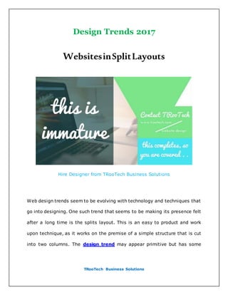
Web design trends seem to be evolving with technology and techniques that go into designing. One such trend that seems to be making its presence felt after a long time is the splits layout. This is an easy to product and work upon technique, as it works on the premise of a simple structure that is cut into two columns. The design trend may appear primitive but has some spectacular advantages to it. If you want to give equal importance to two aspects, you can do so by using this design. There are millions of ways in which you can use the split layout and define your website. Here we will discuss some amazing ways in which designer have managed to use the split layouts creatively.

Recommended
More Related Content
Similar to Design trends-2017-websites-in-split-layouts
Similar to Design trends-2017-websites-in-split-layouts (20)
Recently uploaded
Recently uploaded (20)
Design trends-2017-websites-in-split-layouts
- 1. TRooTech Business Solutions Design Trends 2017 WebsitesinSplitLayouts Hire Designer from TRooTech Business Solutions Web design trends seem to be evolving with technology and techniques that go into designing. One such trend that seems to be making its presence felt after a long time is the splits layout. This is an easy to product and work upon technique, as it works on the premise of a simple structure that is cut into two columns. The design trend may appear primitive but has some
- 2. TRooTech Business Solutions spectacular advantages to it. If you want to give equal importance to two aspects, you can do so by using this design. There are millions of ways in which you can use the split layout and define your website. Here we will discuss some amazing ways in which designer have managed to use the split layouts creatively. The Square This website has brilliantly represented the split layout. The welcome screen has been broken into two parts, where the left one has a slider with images while the right one displays the opening speech. With a square logotype and boxy vibe, this column design looks well for the website. Begona Monasterio A modern and stylish looking eCommerce site, Begona Monasterio has the one screen homepage built using the split layout. The top is split wherein it demonstrates two products at the same time, so that equal priority is given to them both. The inner pages for the product are also designed along the same lines.
- 3. TRooTech Business Solutions Jan Dlugosz The unbalanced structure in the website design makes it look aesthetic and well designed. It has an asymmetric layout to its credit, which makes it desirable. This page is built using split layout, wherein the page is broken into two pieces, making it look uneven. The first part is narrow as compared to the other split part. This definitely catches some eyeballs. HireLevel The hero image on this website is where the split design has been pleasantly added. The hero image has been defined to talk about the core of this company, for which it works. The image is divided into two segments- the candidate and the employer, talking about the two people involved in hiring process. The image background and the primary color for the two sections are distinct, making it clear that they want to make the audience look at it separately. Tanweer
- 4. TRooTech Business Solutions This website has a full-screen multimedia slider on the homepage. This slider is designed using the split design, such that it is divided into two boxes. The refreshing take on this trend gives the design a modern approach. One section consists of an excerpt on the company with a link to know more about what they have to say, and the second section is an image with the home page tab next to it. The homepage design is different, and must say have adopted the trend brilliantly. Bump The desktop version of Bump has a slider image on the home screen, which has been designed with the split trend. The content on the slider has been divided in unequal ways. The left section carries an image related to the application while the right section contains relevant text that will help the users understand what this application is all about. Visually appealing and very aesthetic are two words that describe the home page for bump. Ana Vicente This website is a personal portfolio of Ana Vicente. It is quite spacious and well-balanced. With minimalist design, it adds personality and charisma to the website. The home screen has been designed on the lines of split layout,
- 5. TRooTech Business Solutions which gives the balanced and harmonious outlook to the website. It also adds a personal touch to it, making it more attractive to the viewers. Brux Brux is the ideal example of asymmetrical two-column welcome page that combines the image and title along with the logotype and makes it take the center space. The right section comes with a big sidebar that hosts some information. The other part is mere design that works in a traditional way. The content has been worked upon to make it appear professional and attractive. These websites are great examples of how split layout works for websites. It is definitely a good trend to include in websites, if you want to get some attention. The usage should be relevant to your content and the brand image. Contact sales@trootech.com & +919033266951 for any Development in Australia?