2. Top left of the page is where readers
eyes are typically first drawn to. I have
positioned a strapline here telling the
reader of merchandise of a band, this
will be a very well know, iconic band
such as Paramore or Fall Out Boy to
interest the reader and help sell the
magazine. There is also an image of
the poster so the reader knows what
they’re getting and also acts as a visual
stimulus, which is very typical of music
magazines aimed at my target
audience (15-25 years old). This can be
seen in rival magazines such as
Kerrang! and Rocksound.
Image of band members slightly overlap the masthead as they are easily recognisable
artists, making them stand out more. This is essential as they will be the first feature of
the cover that grabs the readers attention, a key selling point.
Typography is rough and beaten,
appealing to an audience of rock
fans, as this represents their
stereotype of rebelliousness.
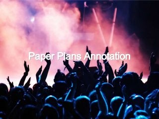
‘Posters’. Buzz word for my
audience. As they typically have
‘teenage/student bedrooms’
consisting of mostly posters. This
is a selling point of my front cover.
Models will be dressed in typical
clothing of the rock genre, clothing
that readers will wish they had.
They will be staring straight into the
camera to meet audiences gaze and
grab their attention. Images of both
males and females on the cover to
help attract a mixed gender
audience.
Name of band that corresponds
with main image so the reader
knows that there will be a feature
within the magazine involving this
band. Helping to sell the magazine.
Tagline and website of magazine so
readers can access the magazine on
different media platforms, such as
the internet (cross media
convergence) appealing to the age of
my target audience (15-25 year olds).
A band name
Band name
image image
image
Puff advertising the possibility to
win free merchandise. The
opportunity of FREE ‘stuff’ appeals
to my audience age as they are
most likely students who do not
have a lot of money for luxuries.
image
image image
image
image
image image
Quote from interview
Puff relating to the
bottom strapline helping
to sell the magazine as
readers will believe that
they can’t find this
interview anywhere else.
Strapline at the bottom of cover including a quote from the interview and an image
to inform readers of other content in the magazine other than the main image.
3. The magazine title header
will be in the same font as
the front cover as this is the
magazines trademark.
There will be small descriptions in the top left of each picture (as this is typically the first
place people are drawn to) to help sell the best bits of the magazine. There will also be a
page number to allow the reader to easily navigate to any of the primary/secondary features.
The main headline story on
the front page will relate to
this main and largest image
on the contents page, as this
feature will be the key selling
point of the magazine,
highlighting its importance.
The smaller images will
relate to the secondary
features on the front cover.
Still acting as selling points
but not distracting from
the main image. The
contrast in the size of the
images (large and small)
highlights to the reader
which feature is the
best/most important, and
tells them which to read.
The contents tells the reader every
feature in the magazine and the
corresponding page number so they
can go straight to it.
The page header will remain
small so as all the important
information can fit on the page.
image
image
image
image
image
image
These headers and numbers will
either be a dark red or purple,
relating to the decisions made
during the creation of my
moodboard. They are contrasting
to the colour of text of the actual
feature making it easy to read,
helping readers to easily navigate
around the magazine.
A subscription notice encouraging
readers to subscribe by offering
them a free Vans backpack (as
shown in the picture). The brand
Vans is majorly popular with rock
fans, (this is illustrated on my
moodboard). This encourages my
readers to subscribe by appealing
not only to their music interests but
with their fashion interests also.
4. I have placed the name of the band in the top left of the page. This
is known as the Primary Optical Area. If my reader if flicking
through the magazine they will see this band name. As this is a
well known band, this will lead to the reader stopping and reading
the article. The strapline at the top makes this stand out as it will
be a contrasting colour (purple) to the white background. (This
band title is currently undecided).
The first letter of the text has been made purple and larger and more bold
than the rest of the article. Making it stand out on the page and attract the
audience’s interest, therefore leading them to read the article. This will also
occur at subject paragraph changes to help break up the text, as readers
can sometimes be discouraged to read an article if it is just constant
writing. This will also be done with the quotations and album cover art.
This is the name of the
bands new album
(currently undecided).
The text is at an angle,
this gives off a more
casual and laid back feel
appealing to my target
audience of teens and
young adults.
Quote
from text
Album
cover
These two lines will
be a brief
description of the
content of the
article. I will use
emotive language
for this to make the
reader feel excited
about the article,
encouraging them to
read on.
My models will be
wearing clothing which
annotates to the rock
genre, anchoring my
magazine’s genre of rock.
Quote
from text
My models will be smiling and looking as though I
have taken a picture mid conversation. This gives
a more relaxed and casual feel for the reader. This
is also the side of the band that fans want to see,
‘the real side’ as opposed to the band posing. This
makes my readers feel connected with the band,
encouraging them to read the article.
There is an image of the
bands album cover, this
enables the reader to be
able to stop it in shops. A
form of advertising.
I will be using purples,
blacks and whites on
this page.
Contributing to my
house style of this
issue. (Also explored
in my moodboard).
The colour purple also
‘sums up’ the band on
this page. They are a
pop punk band (this is
within the rock genre)
so the use of purple
here is perfect for
them.
Quotations will be taken
from the text of the article
and positioned amongst
the text in a larger and
bolder font. This stands out
to the reader and lets
them know of the kind of
content in the article. The
quotes will be quite
humorous and quirky,
which appeals to the target
audience as it is informal
and fun.