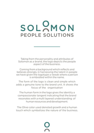
1. Taking from the personality and attributes of
Solomon as a brand, the logo depicts the people
aspect of the business.
Coming from a background which reflects and
believes strongly in harnessing the talent in people
we have given the logotype a tweak where a person
is embodied within the name.
The form of the logo is clean and simple which
adds a genuine tone to the brand unit. It shows the
focus of the organisation
The human form in the logo gives the identity a
compassionate tangent indicating that the brand
resonates with a multi layered understanding of
human resourcesand development.
The Olive color used denoted growth and a human
touch which symbolizes the nature of the business.