
Recommended
Recommended
More Related Content
What's hot
What's hot (20)
Similar to Studying and Interacting:The Food's New Clothes ——Artem Movsesyan, Partner, Neom
Similar to Studying and Interacting:The Food's New Clothes ——Artem Movsesyan, Partner, Neom (20)
More from Simba Events
More from Simba Events (20)
Recently uploaded
Recently uploaded (20)
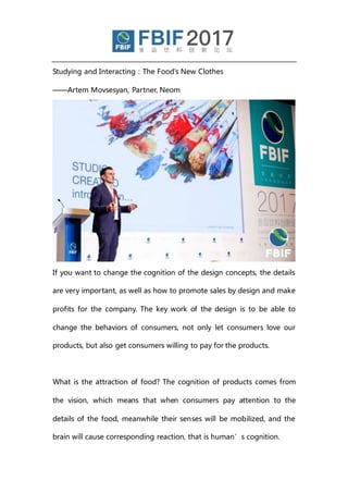
Studying and Interacting:The Food's New Clothes ——Artem Movsesyan, Partner, Neom
- 1. Studying and Interacting:The Food's New Clothes ——Artem Movsesyan, Partner, Neom If you want to change the cognition of the design concepts, the details are very important, as well as how to promote sales by design and make profits for the company. The key work of the design is to be able to change the behaviors of consumers, not only let consumers love our products, but also get consumers willing to pay for the products. What is the attraction of food? The cognition of products comes from the vision, which means that when consumers pay attention to the details of the food, meanwhile their senses will be mobilized, and the brain will cause corresponding reaction, that is human’s cognition.
- 2. Why eyes can "eat"? All countries have different cultures, and people’s preference for what they see is influenced by their own culture. Although there seems homogenization and similarities all over the world, cultural differences still exist, for example, some countries pay attention to the eye contact while talking, but it is embarrassing in other cultures.
- 3. Family, society and religion are unique elements to build the society, arousing different feelings. The mechanism decides our reaction, although the inside of humans is the same, the ways of expression are different, so the strategy is important before communication. So when designing the package, we should consider whether the impacts of brands or packaging design for people from different countries are the same. Anyone who sees the food, his brain consciousness will judge whether the food is delicious, and send out the signal, but different nations have different reactions. If the customers think themselves love the food by seeing it, their love for the products can be explained from the rational level. The packaging design is finding the origin of the physiological mechanism, which is Food Appeal. How do we convert the concept of Food Appeal, so it can have effects on more customers? The answer is through the pictures illustration, photography and the adjustment after photography. Faced with unfamiliar products, customers are constantly trying to look for the factors they are familiar, once finding a familiar picture, the brain will immediately analyze whether the food is attractive to them.
- 4. The concept of Food Appeal is expressed through the combination of many elements including logo, fonts, images, structure, collocation, layout, whether the elements are distinctive and the harmony of the overall packing, and then the brain makes rational judgments whether to buy. The human brain is divided into two parts, and one half is about the emotion, which can feel the food or the attractiveness of the products. The other half is about rationality, analyzing all kinds of information about the food. However, the mission of design and the role of advertising are to tell customers what the product actually is, and what
- 5. kind of impact it can bring to the customers’ body and life. Which set of the brain the product design should be actually based on, depends on two conditions. First of all, which stage of the life circle are the products in, the beginning, the middle time or the end? Secondly, what is the sales funnel of products, to mobilize more rationality or sensibility? If sensibility, customers can experience the brand firstly, try it, and then start to emphasize rational elements after establishing the brand impression. THE market competition has become much fiercer, and large retailers are
- 6. pushing their own branded products. Therefore, it is not enough to only emphasize the functions of brands, but to arouse people's emotions. And the quality of the products is in the homogenization, so the brand and packaging design must constantly evolve and be able to engage and excite. The same product must convey different information to the market, and as long as we seize the users’ friendly information, we can apply it to all products. The brand can actually be thought as a beam of light, which is "brand vision" for the whole system. What the customers see is a beam of light, but the design emphasizes that there must be different colors in a beam, and the whole is more than the sum of its parts, which is similar to decomposing the light of product information into different details.
- 7. In addition to good quality, products should have the following aspects: the first is the quality, which contains the quality of raw materials, the quality of manufacturing process, the quality of environmental relationship and even each procedure of the supply chain. The second is the beauty of products, and products convey a sense of beauty to people through the packaging. The third is the function. The fourth is the transparency, such as consumers know the production and the whole process of the supply chain. In addition to the products, we should grasp the target market, such as calculation of the expected sales according to the target market. The enterprise design must have the insight, finding something different from the competitors, which has taken a step forward in the brand vision.
- 8. The brand can transfer market positioning, consumers may be not able to identify the best products, they may need the help of some experts, which can be reflected in the packing, so the brand design can help consumers choose products correctly. But the packing must provide customers with faith in quality, a good package will give people confidence, and quality is equivalent to how it looks. How can consumers believe the products? This is based on the platform constructed by the keywords, including the quality of products, customer's values and vision, as well as the keynote and way of communication of products. But why do customers choose a product? The pleasure and enjoyment of food come from the quality of raw materials, and the visual temptation of finished products, which is a process of creation. Based on the beautiful appearance called color, aroma and taste, then quality should be emphasized, as Italy food brings us beauty and enjoyment.
- 9. Consumers in different cultures perform differently about the packaging design, not only to eat well, but eat in style, at any time the design needs to put eating and style together, which is the brand vision. How do we create a food brand concept? We need to design a logo with classic color of black and white, plus the visual simple effect to show naturalism.
- 10. How to create the products conforming to the brand? Once creating the concept, many products can be attributed to this brand, including food purchasing, design and experts, etc., even it can extend to the quality label of products, the label of products like water or olive oil, the label of restaurant, the label of coffee and so on. Therefore, once putting the ideas into the basic concept and transferring it out, we then choose different manufacturers and put up labels. In many cases, a brand can be only linked to a specific manufacturer, but we link our brand to more manufacturers, which has a greater productivity.
- 11. In the case of Italy cookies GRISBI, it hoped to promote the brand and packaging. We must firstly analyze the current brand value, and adjust it to better pass it to the target consumers. Then we analyzed whether the law of Food Appeal was applicable. What is the easiest way to find the problem of a brand packaging design? The answer is the shelf test, which is that we put the product on the shelf, and see whether the product is found quickly. Many brands on the shelves have changed, but GRISBI has a great brand value with its own target consumers, so it does not change a lot. The shelf testing is the best test, because the customers can not only pay attention to their own brand, they also pay attention to that of competitors, but they don't really compare the relationship between
- 12. competitors and their brands in stores. In fact, it only takes consumers 3-5 seconds to choose biscuits, and they don't spend a lot of time deliberating. So if the packaging design cannot make the product come out on top within 3-5 seconds, the product is a failure. The essence and beautification are fit for the product at the beginning of the life circle, and the brand awareness should be created in growing and mature period, meanwhile making greater profits, but GRISBI needs greatly change. The first step was analyzing the target consumers, as well as the peculiarity of the product, the property and value of the brand, and whether the market trend could be used to enhance our brand. The
- 13. second step was analyzing the brand vision, whether the value and ideas of the brand could be redesigned. The third step was creating a path, on the one hand, it could create an additional value for the brand, on the other hand, beyond what the customers need, we should design what is acceptable to the customers, and know what they need now. The product design should not only check the cognition of consumers, but also check the brand extension. Customers may choose the products which have elevated in the value cognition, brand or the food attraction, as well as performed more intuitively on the shelf, and in addition, we also need to simplify the packaging of products.
- 14. After adjusting the packaging, the taste of products has become more prominent, at the same time, the logo on it is clearer. For the redesign of another orange biscuits, the first step was conducting an internal shelf test, trying to imitate the situation consumers go to the store shelves, to find what is in their first sight and what they see after they step more closely. Such simulation should be conducted when designing, repeating the behaviors of consumers. The logo of the brand should be firstly considered in the brand creation, then we need to consider whether to place the taste label, and the text should be considered at last.
- 15. What kind of packaging is an iconic or symbolic packaging? The iconic packing can be identified quickly with clear characteristics. So in the design of the packaging of another GRISBI product, each single element needs to be carefully considered. Firstly, the logo should be not only elegant but also strong; Secondly, we should consider whether we keep the background accustomed to the common characteristics of different products, so as to be found quickly on the shelf. Especially, in GRISBI, we conducted a slight adjustment of the logo to make it clearer. Then we designed a new background to make it easier to attract people's attention. Finally we marked different tastes with different background colors.
- 16. How to attract customers when the food is not displayed? In the case of formula milk, we need to find a trademark acceptable to people in each region, and the trademark should not be registered. "MAMO" can make people immediately think of the mother and babies. For children before the age of 3, the balance of nutrition is essential, therefore, the target consumers are often some mothers who are experienced and pursuing in baby care. The baby products in the market are concentrating on nutrition, but do not arouse the mother's emotions and maternal lifestyle, for example, mothers will feel better when they feed children by themselves. The goal of MAMO is to realize the sense of warmth of the interpersonal relationship through the brand, which is a sense of joy and peace of the products. For the baby food, what should be guaranteed is
- 17. the nutrition and health, MAMO hopes to become a reference when mothers search the baby food with excellent quality and reasonable price. But how can it guarantee for mothers? ——That is emotion. It is because of food that the relationship between mother and baby becomes warmer and closer. The brand needs to be reflected and transmits the market information through language and description. The design of brand, on the one hand, emphasizes care, efficiency and science, on the other hand, it emphasizes pleasure, favor and confidence. So although baby food is a kind of scientific product, in the aspect of the concept creation, what MAMO emphasized is different.
- 18. Firstly, MAMO emphasized the relationship between the mother and baby through the packaging, but the simplest way is through games, at the same time we must ensure the high quality and creativity. Secondly, we emphasized the vitality, letting mothers believe that products can bring vitality to the children like music. Thirdly, we emphasized the quality contacted by mother and baby, so the product has used many cartoon characters, and even around which to write stories, according to different ages from 1 to 3, there are three different packaging. When mothers choose the powdered milk, they think that the cartoon characters are telling stories, emphasizing the safety and health of the product, and bringing the enthusiastic relationship between mother and child.