1. Interest-Graph
Visualization in Macademia
http://macademia.macalester.edu
https://github.com/shilad/macademia
Rebecca
Gold
Margaret
Giesel,,
Ben
Hillmann,
Matt
Lesicko
Yulun
Li,
Samuel
Naden,
Jesse
Russell,
Ari
Weiland,
Zixiao
Wang
Faculty
sponsor:
Shilad
Sen
ssen@macalester.edu
Technologies we used
•
Grails
web
framework.
•
The
WikAPIdia
data
mining
API
(created
by
our
team).
•
The
D3.js
JavaScript
visualization
framework.
Interest Graph
The
interest
graph
relates
people
based
on
related
interests.
Sites
such
as
Twitter
and
Facebook
rely
on
the
interest
graph
to
connect
users
with
people
and
things
they
will
like.
One
major
challenge
when
mining
the
graph
is
identifying
related
interests
(e.g.
“web
2.0”
and
“social
computing”).
We
developed
the
WikAPIdia
Java
library
to
address
this
problem.
What is Macademia?
•
Macademia
connects
colleagues
who
share
research
interests.
•
2500
researchers
have
created
profiles
from
250
institutions.
•
Visualizes
the
research
interest
graph
to
display
information
to
our
users
visually
about
people
with
similar
interests.
•
Serves
as
experimental
research
platform.
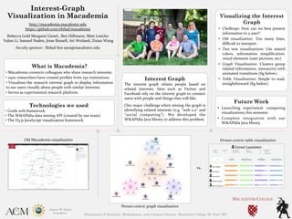
vs.
Old
Macademia
visualization
Person-‐centric
graph
visualization
Visualizing the Interest
Graph
• Challenge:
How
can
we
best
present
information
to
a
user?
• Old
visualization:
Too
many
lines,
difficult
to
interpret.
• Two
new
visualizations:
Use
muted
colors,
information
simplification,
visual
elements
(user
pictures,
etc)
• Graph
Visualization:
Clusters
group
related
information,
interactive
with
animated
transitions
(fig
below).
• Table
Visualization:
Simple
to
read,
straightforward
(fig
below).
Future Work
• Launching
experiment
comparing
visualizations
this
semester.
• Complete
integration
with
our
WikAPIdia
Java
library.
Person-‐centric
table
visualization
Department of Statistics, Mathematics, and Computer Science, Macalester College, St. Paul, MN