
Recommended
Recommended
More Related Content
Similar to Rishabh UI Presentation - HDFC Mutual Fund App.pdf
Similar to Rishabh UI Presentation - HDFC Mutual Fund App.pdf (20)
Recently uploaded
Recently uploaded (20)
Rishabh UI Presentation - HDFC Mutual Fund App.pdf
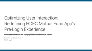
- 1. Optimizing User Interaction: Redefining HDFC Mutual Fund App's Pre-Login Experience Crafting a More Intuitive and Engaging Entry Point for Financial Success Presented By: Rishabh Tiwari Mobile App UI
- 2. The pre-login screens of an app serves several important purposes and carries significant importance: 01 Introduction and First Impression It serves as an introduction to your app and makes the initial impression on users and helps in captivating users' attention and generate interest. 02 User Engagement It's an opportunity to engage users who haven't created accounts yet. Through compelling content and visuals, you can motivate potential users to explore further, register, or log in. 03 Building Trust Trust is crucial in financial apps. The pre-login screen can include trust-building elements such as testimonials, or a privacy policy link to reassure users about data protection. 04 User Onboarding For users who haven't registered yet, the pre-login screen can guide them through the onboarding process, including account creation steps. 05 Branding The app's branding is done through visuals, & color schemes. Consistency in branding helps in creating a recognizable & memorable app. 06 User Guidance You can provide guidance on what users can expect from the app, how to get started, and where to find help or support. Step 1 Purpose of Pre Login Screens Page 001
- 3. Step 2: Design Screens 2.1 Loading Screen Page 002 Loading Screen 01 Balanced Color Palette The loading screen embraces a balanced color palette that appeals to both millennial and Gen Z users. It combines trendy Gen Z colors with sophisticated millennial tones, creating a visually pleasing and inclusive experience. 02 Dynamic and Minimalist Design Designed for both generations, the screen maintains a clean and minimalist layout while incorporating subtle animations. These design element adds excitement without overwhelming the user, ensuring an engaging yet distraction- free loading process. 03 Inclusive Messaging To resonate with millennials and Gen Z users alike, the screen portrays individuals from various backgrounds confidently managing their finances, emphasizing the app's universal appeal and its role in helping users achieve their financial goals.
- 4. Step 2: Design Screens 2.2 Welcome Screen Page 003 Welcome Screen 1 Welcome Screen 2 Welcome Screen 3 01 Innovative Design Elements The screen features innovative design elements that align with brand guidelines while appealing to Gen Z's preference for fresh and contemporary aesthetics. These elements include custom icons, typography, and layouts, enhancing the screen's visual appeal. 02 User-Centric Messaging The screen communicates directly with users' financial aspirations, emphasizing the app's commitment to helping them achieve their goals. Its messaging is concise, engaging, and inclusive of both millennial and Gen Z audiences. 03 Trust-Building Brand Consistency Brand consistency is a hallmark of the Welcome screen. By adhering to established color guidelines, it reinforces trust among users, fostering familiarity and conveying reliability.
- 5. General Description: The pre-login screen is meticulously designed to cater to both millennial and Gen Z users. Innovative design elements, such as custom icons and typography, align with our brand while appealing to contemporary aesthetics. Additionally, the screen presents an array of features and utilities, showcasing the app's value upfront. This cohesive design approach not only captures attention but also fosters trust with a fresh and inviting look and feel. Style 1- Description: The scene heading is styled with a trendy and contemporary design, making all essential product features readily accessible to users even before logging in. Unlike the conventional approach of using separate bottom tabs, this design offers a fresh and streamlined user experience. Style 2- Description: This design incorporates an attention-grabbing Ad slider, strategically placed to engage users and share promotional content effectively. The design now includes convenient bottom tabs, enhancing navigation and user experience by providing easy access to essential features and sections. Step 2: Design Screens 2.3 Pre Login Screen Design Description Page 004
- 6. Step 2: Design Screens 2.3 Pre Login Screen Without Bottom Tab Page 005 Style A1 Style A2 01 Style A1 Trendy styling is applied to the scene heading, and all key product features are presented in this contemporary fashion, accessible to users before login. Two prominent full-width buttons for "Login" and "New Investor" at the bottom streamline user interaction. 02 Style A2 Designed for both generations, the screen maintains a clean and minimalist layout while incorporating subtle animations. These design element adds excitement without overwhelming the user, ensuring an engaging yet distraction- free loading process.
- 7. Step 2: Design Screens 2.4 Pre Login Screen With Bottom Tab Page 006 Style B1 Style B2 Style B3 01 Style B1 Tabs have been integrated at the bottom of the design, offering intuitive navigation and access to key sections. Additionally, the title prominently features the company logo, reinforcing brand identity and recognition. 02 Style B2 This design features user-friendly bottom tabs for effortless navigation. The title area is dedicated to a welcoming message with space reserved for advertisements. The color scheme is light, creating a pleasant and inviting visual atmosphere. 03 Style B3 In this design, bottom tabs offer convenient navigation, while the title section showcases a welcoming message with an allocated space for advertisements, following the style of B2. Notably, a dark-colored separator is employed in this version, adding a distinctive visual element to the screen.