Pantone color trends 2018 : By Lee Eisman
•
1 like•368 views

Pantone color trends 2018 : By Lee Eisman

Recommended
More Related Content
What's hot
Recently uploaded
Recently uploaded (20)
Pantone color trends 2018 : By Lee Eisman
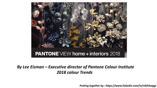
- 1. Putting together by : https://www.linkedin.com/in/nikhilsaggi By Lee Eisman – Executive director of Pantone Colour Institute 2018 colour Trends
- 2. Putting together by : https://www.linkedin.com/in/nikhilsaggi VERDURE – This palette features vegetal kinds of colors like Celery and Foliage being combined with berry- infused purples and an eggshell blue. “This palette is so symbolic of health,” said Eiseman, but it updates the profusion of greens with some bright and contrasting hues.
- 3. Putting together by : https://www.linkedin.com/in/nikhilsaggi Resourceful – Complementary colors on the color wheel – oranges and blues – are combined in this palette that is clever and “resourceful” in re-using and or re-furbishing what consumers may already own. “This is quite an interesting color combination,” said Eiseman. “It combines warm and cool tones that you just can’t avoid looking at it.”
- 4. Putting together by : https://www.linkedin.com/in/nikhilsaggi Playful – Speaking to our need for whimsy (“People need to stop and smile” said Eiseman), the Playful palette is out-of-the ordinary and quirky. The colors are “bright-hearted more than light-hearted” with names to match, like Minion Yellow, Lime Popsicle, Green Flash and adventurous blue Skydiver.
- 5. Putting together by : https://www.linkedin.com/in/nikhilsaggi Discretion – Low-key and subtle, Discretion is the opposite of Playful. Nostalgic hues such as Elderberry, Burnished Lilac and Hawthorne Rose combine with strengthening tones to offer newness to a subtle palette. “Pink has developed more power than ever before,” said Eiseman.
- 6. Putting together by : https://www.linkedin.com/in/nikhilsaggi Far-fetched: With warm, earthy hues such as Cornsilk Yellow blending with rosy tones, this palette “reaches out and embraces many different cultures,” said Eiseman.
- 7. Putting together by : https://www.linkedin.com/in/nikhilsaggi Intricacy: his palette reflects the popularity of intricate designs that Eiseman discussed earlier. It features the “new neutrals,” aka metallics, but a florid Holly Berry Red and yellow Sulfur add a layer of drama.
- 8. Putting together by : https://www.linkedin.com/in/nikhilsaggi Intensity – Providing an eclectic mix of colors, Intensity conveys “a certain strength, power, depth and sophistication,” said Eiseman. Coolly composed shades of plum, blue and blue-green quell the fires of orange Emberglow, Molten Lava and Bossa Nova. Golds and black complete the palette.
- 9. Putting together by : https://www.linkedin.com/in/nikhilsaggi TECH-nique – In a nod to the proliferation of technology, this palette features hues “that seem to shine from within.” Colors include a vibrant blue, green, fushia and purple, along with iridescent peacock tones in both turquoise and hot pink, that are offset by Brilliant White and Frosted Almond.
- 10. Putting together by : https://www.linkedin.com/in/nikhilsaggi https://www.pinterest.com/kitchann/ Ann Porter IHA website Lee Eisman – Executive Director Pantone colour Institute Reference Links :