Recommended

Recommended
More Related Content
Similar to Hilti.pptx
Similar to Hilti.pptx (20)
Recently uploaded
Recently uploaded (20)
Hilti.pptx
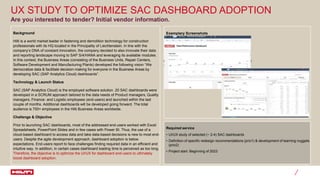
- 1. UX STUDY TO OPTIMIZE SAC DASHBOARD ADOPTION Background Hilti is a world market leader in fastening and demolition technology for construction professionals with its HQ located in the Principality of Liechtenstein. In line with the company’s DNA of constant innovation, the company decided to also innovate their data and reporting landscape moving to SAP S/4/HANA and leveraging its available modules. In this context, the Business Areas (consisting of the Business Units, Repair Centers, Software Development and Manufacturing Plants) developed the following vision “We democratize data & facilitate decision-making for everyone in the Business Areas by developing SAC (SAP Analytics Cloud) dashboards”. Technology & Launch Status SAC (SAP Analytics Cloud) is the employed software solution. 20 SAC dashboards were developed in a SCRUM approach tailored to the data needs of Product managers, Quality managers, Finance- and Logistic employees (end-users) and launched within the last couple of months. Additional dashboards will be developed going forward. The total audience is 700+ employees in the Hilti Business Areas worldwide. Challenge & Objective Prior to launching SAC dashboards, most of the addressed end-users worked with Excel Spreadsheets, PowerPoint Slides and in few cases with Power BI. Thus, the use of a cloud-based dashboard to access data and take data-based decisions is new to most end- users. Despite the agile development approach, dashboard adoption is below expectations. End-users report to face challenges finding required data in an efficient and intuitive way. In addition, in certain cases dashboard loading time is perceived as too long. Therefore, the objective is to optimize the UI/UX for dashboard end-users to ultimately boost dashboard adoption. Are you interested to tender? Initial vendor information. Required service • UI/UX study of selected (~ 2-4) SAC dashboards • Definition of specific redesign recommendations (prio1) & development of learning nuggets (prio2) • Project start: Beginning of 2023 Exemplary Screenshots