1. PAPYRUS SUMMER–FALL 2015 9
I
f the timeline of the Universe were
to be used as an analogy for the
development of LED lighting, we
surely must be in the first millisecond
of the Big Bang—when all the potential
exists, but improvements are still
coming at a rapid pace. Because the
technology is so new, this certainly
isn’t the first, last, or even best, article
you’ll read about LED lighting. Instead,
it is a look at how an examination of
new lighting technologies really turned
into a discussion of the role of lighting
designers, the magic of light, and the
ways that humans interact with art.
At the University of Arizona Museum
of Art (UAMA), we share a campus
with the College of Optical Sciences—
one of the top schools of light science
in the world. It occurred to me that
this proximity to a top optics school,
with a strong research department
and fabrication capabilities, was an
incredible opportunity for any museum
that wanted to be on the forefront
of exhibit lighting. I reached out to
Dr. John Koshel, Associate Dean of
Students, and he was very enthusiastic
about the research opportunities.
We decided to start with one very
specific challenge: designing and
fabricating a “perfect” light source for
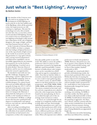
our Mark Rothko painting, Green on
Blue (Earth-Green and White). As the
exhibits designer, I’ve always found
this work incredibly difficult to light
properly. Its large size (911/4Љ ¥ 643/8Љ)
and lack of focal point create some
unique challenges. Depending on
where it’s hung in the Museum, I
always find the dark green to be too
muddy, or the translucent whites to
be over-saturated. Ali Khan, a college
senior who has since graduated with
degrees in mathematics and optical
sciences, met with me, and was willing
to take on the task.
After recording everything from
the angle of our existing lighting to
the reflectivity of our waxed cork floors,
Ali noted that we had missed a key
component: at what color temperature
does the public prefer to view this
work? The ability to survey the public’s
preference when it comes to color
temperature seemed to be logistically
difficult, until I found LIFX, a manu-
facturer of bulbs whose color temper-
ature can be controlled via a Wi-Fi
chip and an app for a smartphone or
tablet. Now that we had the ability to
remotely control the color temperature,
we were ready to start gathering data.
For about a week, we asked UAMA
visitors to rate their preference in color
temperature, with 2750K, 3000K, 3200K,
3500K, 4000K, and 4500K as the options.
The survey consisted of two tests, and
for each test, respondents were asked to
select the color temperature that they
found to be most pleasing. In Test 1,
we scrolled through each of the six
settings, from warmest to coolest.
In Test 2, we cycled through the six
settings in a completely random order,
to help offset any bias. Interestingly,
individual respondents were only con-
sistent in their preferences 20% of the
time. In other words, 4 out of 5 people
chose a different preference when the
options were presented in a different
order. When all responses were tallied,
preferences in both tests peaked at
3000K. However, this preference was
by no means a clear majority. In Test 1,
only 27% preferred that setting, and
in Test 2, that number climbed
moderately to 38%.
Although our casual study didn’t
provide earth-shattering results, the
process had a profound effect on me.
Within the first day of running the
survey, I discovered something amazing
that even 20 years as an exhibit designer
and art installer hadn’t prepared me
for: small shifts in color temperature
fundamentally changed the nature
of this painting.
At 3000K, the painting was warm,
soothing, even inviting. At 3200K, it
went flat; neither the blues, greens,
nor whites really had much life to them.
At 4000K, I would almost characterize
the painting as aggressive: the blues
were vibrant, and the contrast with the
white section reminded me of our skies
during an Arizona summer, during
which one can’t even look upward for
fear of being blinded by an oppressively
bright sky.
This discovery was at first fascinating,
and then was followed by a startling
Just what is “Best Lighting”, Anyway?
By Nathan Saxton
University of Arizona Museum of Art.
2. 10 PAPYRUS SUMMER–FALL 2015
realization: maybe I’ve been lighting
this—and all of our other paintings—
wrong all this time. Now that we have
an ever-expanding range of lighting
options, we museum professionals also
have a constantly growing chance of
getting it wrong.
Now my existential crisis really
began to set in. As a museum lighting
designer in the year 2015, what exactly
is my responsibility? Am I to try to
replicate the lighting conditions in
the artist’s studio, so our visitors can
of the established museum standard
of 3000–3500K. Can I really be satisfied
that two-thirds of my visitors felt that
our Mark Rothko painting was lit
improperly? Eventually, the cloud of
confusion in my mind began to clear,
and I decided to focus on the positives:
we live in a time of unprecedented
technological advances, and I have both
a museum that is willing to tackle some
of these questions, and a very able optics
college excited about using the UAMA
as a venue for lighting research.
We set out to design and fabricate a
so-called perfect lighting source for a
particular painting. Instead, we realized
that it might be time to take a broader
look at the role of lighting in our
museum. Perhaps, in the foreseeable
future, technology may advance to the
point that it is economically feasible to
custom-design light sources specifically
for individual objects and works of art.
This informal study on one painting
in our collection, rather than being an
end in itself, has started us down a
long road of research. I can’t wait to
see what the future holds.
Nathan Saxton is the Exhibitions Specialist
at the University of Arizona Museum of Art.
He is also pursuing a B.S. in Optical Sciences
and Engineering, in part to discover new
ways that art is affected by emerging
light science. Nathan can be reached at
nsaxton@email.arizona.edu
see exactly what the artist saw? Is it
better to strive for consistent lighting
conditions throughout the museum?
Or, is it my job to find the best
lighting for each work, regardless of
artist intent or unity with the rest of
the gallery space?
And just what is “best lighting”,
anyway? As discussed above, we could
not reach a strong consensus on what
the “best” light was for this painting.
A strong majority seemed to enjoy a
variety of color temperatures outside
Mark Rothko’s Green on Blue (Earth-Green
and White) lit with LIFX Wi-Fi-enabled
bulbs at approximately 3000K.
The same painting lit at about 4000K.