Color interaction
•
0 likes•425 views

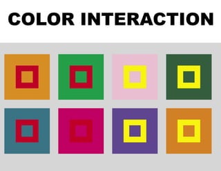
Designing with color means controlling color contrast. How do colors interact with each other to make an effective design?

Recommended
More Related Content
What's hot
What's hot (20)
Similar to Color interaction
Similar to Color interaction (20)
Recently uploaded
Recently uploaded (20)
Color interaction
- 2. COLOR CONTRAST Designing with color means controlling color contrast. How do colors interact with each other to make an effective de- sign? Color can be used to imply harmony or discord, flatness or depth. It can convey emotion or a lack thereof. Every color has its own special character. This character can be modi- fied through alterations of saturation and value, but the most surprising and effective manipulations of color can be seen when colors interact with each other. This document is a brief introduction to the seven varieties of color contrast as outlined by the Bauhaus teacher and color theorist Johannes Itten (1888-1967).
- 3. VARIETIES OF COLOR CONTRAST CONTRAST OF HUE CONTRAST OF VALUE CONTRAST OF TEMPERATURE (COLD-WARM COLORS) COMPLEMENTARY CONTRAST SIMULTANEOUS CONTRAST CONTRAST OF SATURATION CONTRAST OF EXTENSION
- 4. Colors exert an influence on each other. A color’s expressive char- acter can be changed by placing it in a context with other colors. The example below shows how the nature of red-orange can be altered by surrounding it with other saturated hues. See the follow- ing page for the same illustration using yellow.
- 6. Contrast of Hue This is really what it sounds like. The difference between colors in their most saturated state. The greatest amount of Hue contrast is between the three additive primaries. Any other combinations have a comparatively decreased contrast BLUE- GREEN BLUE VIOLET RED
- 7. Henri Matisse Henri Matisse Contrast of Hue (examples)
- 8. Contrast of Value Each color in its most saturated state has its own value. If we look at the hue circle it is clear that some hues are lighter or darker than others. Value plays an important role in the way that colors interact. YELLOW MAGENTA CYAN YELLOW-ORANGE YELLOW-GREEN GREEN BLUE-GREEN RED VIOLET BLUE-VIOLET BLUE RED-ORANGE
- 9. Contrast of Value “Equality of light and dark relates colors to each other, tying or bracketing them together. Light-dark contrast between them is extinguished. This is an invaluable resource of artistic design.” – Johannes Itten This illustration places the 12 hues in relation to their relative value (found in the value scale on the leftr) A fully saturated hue can have an entirely different impact than another hue which has been modified to match its value.
- 10. Contrast of Value The Black dot repre- sents the hue’s place- ment next to its relative value. Look at the difference in character between the fully saturated yel- low and the red which has been tinted to match its value. Look at the fully saturated blue and its equivalent yellow orange Y E L L O W Y E L L O W - G R E E N G R E E N B L U E - G R E E N C Y A N B L U E B L U E - V I O L E T V I O L E T M A G E N T A R E D R E D - O R A N G E Y E L L O W - O R A N G E
- 11. Contrast of Value (examples) Andy Warhol Caravaggio
- 12. Contrast of Value (examples) Paul Klee
- 13. Contrast of Temperature (cold-warm) Colors are said to be either warm or cool. Generally yellow to violet in the hue circle are assumed to be warm colors while yellow-green to blue violet are thought to be cool colors. It is more accurate to say that colors are cool or warm in relation to each other. See the examples at right of temperature con- trast within a range of red and a range of green. The vertical axis of the Hue circle contains Yellow & Blue Violet, the extremes of value contrast. The Horizontal axis contains the extremes of temperature contrast: Red & Blue-Green Temperature Extremes Temperature Modulation Red Temperature Modulation Blue-Green
- 14. Contrast of Temperature (cold-warm) (examples) Andy Warhol A cool red (magenta) and a warm red Andy Warhol A Cool Yellow and a Warm Violet
- 15. Contrast of Temperature (cold-warm) (examples) Claude Monet
- 16. Contrast of Temperature (cold-warm) (examples) Claude Monet Claude Monet
- 17. Complementary Contrast Every hue has a compliment. It exists across the hue circle, but, as we have seen, it also exists as an afterimage of that color. While the compli- ment of a color appears as the color’s opposite, they also exert a kind of balance. The pairs of colors and compliments in the hue circle have very different effects. Note the variations of value, saturation and temperature con- trasts between the primaries and their compliments.
- 18. Complementary Contrast (examples) Henri Matisse Ernst Ludwig Kirchner
- 19. Simultaneous Contrast “Simultaneous contrast results from the fact that for any given color the eye simultaneously requires the complementary color, and generates it spontaneously if it is not already present. By virtue of this fact, the fun- damental principle of color harmony implies the rule of complementaries. The simultaneously generated complementary occurs as a sensation in the eye of the beholder, and is not objectively present. It cannot be pho- tographed. Simultaneous contrast may with reason be placed on a par with successive contrast.” - Johannes Itten web link: Color Illusions click on the applet link
- 20. Simultaneous Contrast Simultaneous contrast is when one color is made to look like two. When one color surrounds another it effects that color by mixing in its after-image The gray square on the left shifts towards blue violet (yellow’s compliment) and the gray square on the right shifts towards yellow (blue violet’s compli- ment). There is a hue shift and also a value shift which makes the gray on the left seem darker and the gray on the right lighter.
- 21. The gray square on the right shifts towards the light color yellow (blue violet’s compliment) The gray square on the left shifts towards the dark color blue-violet (yellow’s compliment)
- 22. Simultaneous Contrast The two grays are identical. The shift in hue and value is purely perceptual.
- 23. Simultaneous Contrast Simultaneous contrast can be affected by shifts in Hue, value and saturation. Hue - The center color appears to change in hue Value - The center color appears to change in value Saturation - The center color appears to change in saturation
- 24. Simultaneous Contrast Simultaneous contrast can be affected by shifts in Hue, value and saturation.
- 25. Simultaneous Contrast Joseph Albers Joseph Albers
- 26. Contrast of Saturation Increasing or decreasing saturation can be an effective way to contrast colors in a composition. Pure colors that are mixed with gray will yield desaturated colors, colors can also be diluted by adding white, black, or the color’s compliment. Contrast of satu- ration is most easily seen when the variations are executed in a single hue (see below), the examples that follow show contrast of saturation with a number of different hues.
- 27. Contrast of Saturation (examples) Paul Klee Ad Reinhardt
- 28. Contrast of Saturation (examples) Paul Klee Joseph Albers
- 29. Contrast of Saturation (examples) Andy Warhol Joseph Albers
- 30. Contrast of Extension This is contrast of the size and intensity of color shapes, the contrast of proportion. Factors of extension are the proportional size of the color areas and the intensity of the colors. Hue, value and saturation are all important in determining the proportional strength of different color areas. What is the visual impact of a pure color? Goethe devised a numeric ratio for the visual balance of the primary and secondary colors. His goal was to find the proportions by which the colors could be organized so that no one color would dominate the others. The Hue cir- cle at right (using the traditional primaries) is a visual representation of these proportions. The sizes of the color areas are based on a combination of the color’s value and satura- tion. Yellow, therefore is the strongest and receives a smaller portion of the circle while violet being much darker is the largest area. Balancing areas of colors in this way ac- tually minimizes the contrast of extension since it creates harmony.
- 31. Contrast of Extension The proportion of yellow to violet allows for the perception that the yellow shape is in front of the violet shape. The proportion of yellow in this illustration encourages the per- ception that the violet is a frame in front of the yellow shape. Equal measures of red and green A small area of red can have a great visual impact on a large field of green.
- 32. Contrast of Extension (examples) Ellsworth Kelly Piet Mondrian
- 33. Contrast of Extension Henri Matisse
- 35. Successive Contrast Successive contrast occurs when a color is viewed on one background and then another in rapid succession. BACK NEXT
- 36. BACK
- 37. Simultaneous Contrast: Chromaticity Created on 12 June 1997. Last modified on 5 August 2000. Simultaneous Contrast: Chromaticity ● Your browser does not appear to be capable of running Java applets. ● Introduction ● Applet instructions ● Discussion ● Main illusion index ● Next stop: full tour -:- influence of context Introduction The term simultaneous contrast is often used to describe variations in luminance between objects and their surroundings, but simultaneous contrast effects can also be demonstrated for differences in chromaticity (referred to more informally as hue, or, more informally still, colour) alone. This can be demonstrated, often very convincingly, with a pattern in which two large X characters are drawn in the same colour on backgrounds of differing hue. The colour of the X's is in fact a perceptually equal mixture of the two surrounds. When the colours of the backgrounds are equiluminous, a reverse ground effect occurs in which each X is perceived as being the colour of the opposite background. The demonstration applet allows you to explore this effect by adjusting the luminance of each background in the pattern. You can also use it to determine how robust the illusion is with a couple of controls that aim to destroy or interfere with it. The interactive demonstration When the applet window first appears you will see two large X characters, one drawn against a yellow background and the other against a gray background. Depending on the characteristics of your display (and to some extent the ambient lighting) you may need to adjust the luminance of one or both backgrounds in order to achieve the colour reversal effect. The Yellow and Gray sliders can be used for http://www.cs.ubc.ca/nest/imager/contributions/flinn/Illusions/YG/yg.html (1 of 3)1/6/2004 5:32:06 PM
- 38. Simultaneous Contrast: Chromaticity this purpose. In most cases you will find that the gray slider must be set to the left of the yellow slider for the effect to occur. You should set the gray slider just left of center, then move the yellow slider from that position towards the right until it appears reasonable to describe the left X as gray and the right X as yellow. (Some fine tuning is in order at this point to achieve the strongest possible effect.) When showing this illusion to an audience, it has proven effective to quietly set the yellow and gray sliders with neither explanation nor introduction to the effect. Then state the claim that the two X's are the same colour and ask the audience to tell you whether they believe you. (This is of course a trick question, as explained in the discussion section below.) If enough people are willing to agree that the colours of the X's are apparently different, you can then use the remaining controls to test the strength of that perception. The Thickness slider simply adjusts the thickness of the X characters. (The original author of this page has not found this control to be particularly useful, but your mileage may vary.) Selecting the Connected switch usually elicits the first "Ahh" from the audience as it becomes possible to trace the pattern from a point where it is apparently yellow to one where it is apparently gray. The White top switch replaces the backgrounds in the top half of the pattern with white on both sides. This is usually sufficient to destroy the illusion, although you may be able to cause it to return by focusing your attention solely on the bottom half of the pattern. As for all demo applets, the Dismiss button at the bottom of the applet window will remove the window from the screen. Selecting the APPLET link at the top of this page will then return it to the screen just as you left it. Discussion Although this illusion is very simple, it deals directly with a very important issue in Computer Graphics and Human-Computer Interaction. Namely, are the two X's the same colour? The pixels of both X characters are generated by storing identical colour values in the frame buffer. In this sense they certainly are the same colour. On the other hand, what does "colour" really mean? We know to describe the left hand background as "yellow" because we have learned to attach that label to the perceptual experience it evokes. In this sense, we describe the left X as gray and the right X as yellow (assuming that the illusory effect has been achieved) because those are the labels we have learned to associate with the perceptual experience each X provides. In this sense, the two are definitely not the same colour. At this point you may find yourself thinking that it is still more sensible to say that the two X's are in fact the same colour. The fact that they appear to be different is, after all, only an illusion. To do this, however, is to elevate the importance of the frame buffer to a level greater than that of the observer. It is humans who give names to colours based on what they perceive. If it looks yellow, then it is yellow, regardless of what its tri-stimulus values may be. Ideally, when human and computer disagree, it should be the computer that compensates for the predictable properties of the human visual system, not the http://www.cs.ubc.ca/nest/imager/contributions/flinn/Illusions/YG/yg.html (2 of 3)1/6/2004 5:32:06 PM
- 39. Simultaneous Contrast: Chromaticity observer that must adapt to the rigid behaviour of the machine. It may never be possible to incorporate all of the visual system's subtleties into rendering algorithms, if only because these properties differ somewhat from one observer to another. On the other hand, anticipating the larger and more predictable effects should not be difficult. Scott Flinn(flinn@cs.ubc.ca) http://www.cs.ubc.ca/nest/imager/contributions/flinn/Illusions/YG/yg.html (3 of 3)1/6/2004 5:32:06 PM