
Recommended
More Related Content
More from MollyKey
More from MollyKey (17)
Deconstruction 2
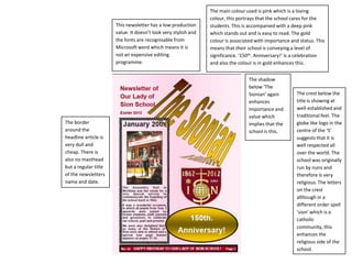
- 1. The main colour used is pink which is a loving colour, this portrays that the school cares for the This newsletter has a low production students. This is accompanied with a deep pink value. It doesn’t look very stylish and which stands out and is easy to read. The gold the fonts are recognisable from colour is associated with importance and status. This Microsoft word which means it is means that their school is conveying a level of not an expensive editing significance. ‘150th. Anniversary!’ is a celebration programme. and also the colour is in gold enhances this. The shadow below ‘The Sionian’ again The crest below the enhances title is showing at importance and well-established and value which traditional feel. The The border implies that the globe like logo in the around the school is this. centre of the ‘S’ headline article is suggests that it is very dull and well respected all cheap. There is over the world. The also no masthead school was originally but a regular title run by nuns and of the newsletters therefore is very name and date. religious. The letters on the crest although in a different order spell ‘sion’ which is a catholic community, this enhances the religious side of the school.