AEA poster heatmap - V13
•
0 likes•33 views

This document discusses and compares 6 free or low-cost interactive data visualization tools: Adobe Acrobat Pro, BEAM, Power BI, Invision, D3.js, and datamatic.io. It provides a brief overview of each tool's capabilities, ease of use, learning curve, design control, data sources, and cost. The document encourages readers to consider these options when looking for a tool to meet their evaluation reporting needs, skills, and resources.
Recommended

Recommended
More Related Content
Similar to AEA poster heatmap - V13
Similar to AEA poster heatmap - V13 (20)
AEA poster heatmap - V13
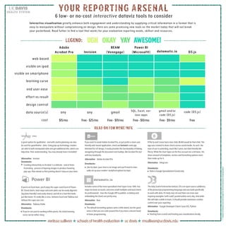
- 1. 6 low- or no-cost6 low- or no-cost interactive dataviz tools to considerdataviz tools to consider melissasullivan schoolsofhealthevaluation ucdavis msullivan@ucdavis.edu >>>thankstoflaticon.comandfreepikforthefreeawesomevisualgoodies! YOUR REPORTING ARSENALYOUR REPORTING ARSENAL Interactive visualization greatly enhance both engagement and understanding by supplying critical information in a format that is easy to manipulate without compromising on design. Here are some promising new tools on the market today that will not break your pocketbook. Read futher to find a tool that works for your evaluation reporting needs, skillset and resources. Adobe Acrobat Pro BEAM (Venngage) Power BI (Microsoftl) datamatic.ioInvision D3.js web-based visible on ipad learning curve visible on smartphone end user ease effort vs result design control cost data source(s) any any gmail SQL, Excel, var- ious apps gmail and/or code (D3.js) code (D3.js) Free-$25/mo$15/mo Free-$19/mo Free-$10/mo Free-$9/mo Free ughugh okayokay yayyay awesome!awesome!legend:legend: (PRO) Agreatoptionforqualitative-andwithcarefulplanningcanalso beusedforquantitative-data.Usingpop-uptechnology,readers areabletobothmanipulatedataandgetadditionalinfo,whichcan helpdrive theirunderstanding.Youmayalreadyhaveitinstalled! Drawbacks: CreatinginteractivityonAcrobat isadelicate-andattimes frustrating-processoflayeringimagestoproducehovering pop-ups.Planaheadsothatprintingdoesn’tobscureyourdata. Alternative: Invision IfyouwanttoavoidAdobeAcrobatPro,orjustpreferamoreuser friendlyweb-basedapplication,checkoutInvision’swebapp. IntendedforUXdesign,iteasilyprovidesthefunctionalityoflinking, navigatingthroughthedocumentandtooltips,likeAcrobatProbut withlessheadache. Drawbacks: LikeAcrobat,yourchartisanimageandyou’llneedtoman- uallysetupyourreaders’analyticaloptionsbylayer. Alternative: AdobeAcrobatPro IfPlot.lyandCanvahadalovechild,BEAMwouldbethatchild.The appwascreatedtosharechartsacrosssocialmedia.Assuch,the easeofuseisoutanding,muchlikeCanva,butdatafriendlylike Plot.ly.Whilethecharttypesonthefreeaccountareabitbasic,the sheeramountoftemplates,vectorsandformattingoptionsmore thanmakeupforit. Drawbacks: DataisGoogleSpreadsheets/Gmailonly. Alternative: Infogr.am Ifyou’reanExcellover,you’llenjoythesuper-sizedExcelofPower BI.Chordcharts,heatmapsandasterplotscanbeeasilydigested (bigdatafriendly!)andeasilyshared,andallonatoolthatlooks justlikehome.It’sreallylikeacross betweenExcelandTableaubut withoutthesupersizecost. Drawbacks: Ifyou’renotusedtoworkingwithinpivots,theinitiallearning curvecanberathersteep. Alternative: TableauPublic TheHolyGrailofinteractivedataviz,D3isanopensourcesublibrary oftheJavascriptprogramminglanguageandwasbuiltspecifically toworkwithdata.It’sfairlynew-ishandtherearemoreawe inspiringexamples(withcode!)postedonlineeveryday.Andwhile thiswilltakeawhiletolearn,itshouldprovidemaximumcreative controloveryourreporting. Alternative: GoogleDeveloperCharts(usesD3),Python Drawbacks: Startingfromscratchandhostingyourvisualizationslocally. datamatic.io Drawbacks: Thedefaultformattingoptionsseemalittledated,butthegood newsisthatyoucancodearoundthisifyouhaveadecenthand atbasicprogramming. Includessomeofthemorespecializedcharttypes(rose,SNA,tree mapsforbasicaccounts,andevensmallmultiplesanddualcharts forprofessional). UsestheGoogleAPItopublish,solinkingand embeddingthechartsareprettyeasy. Alternative: Raw read on for more inforead on for more info