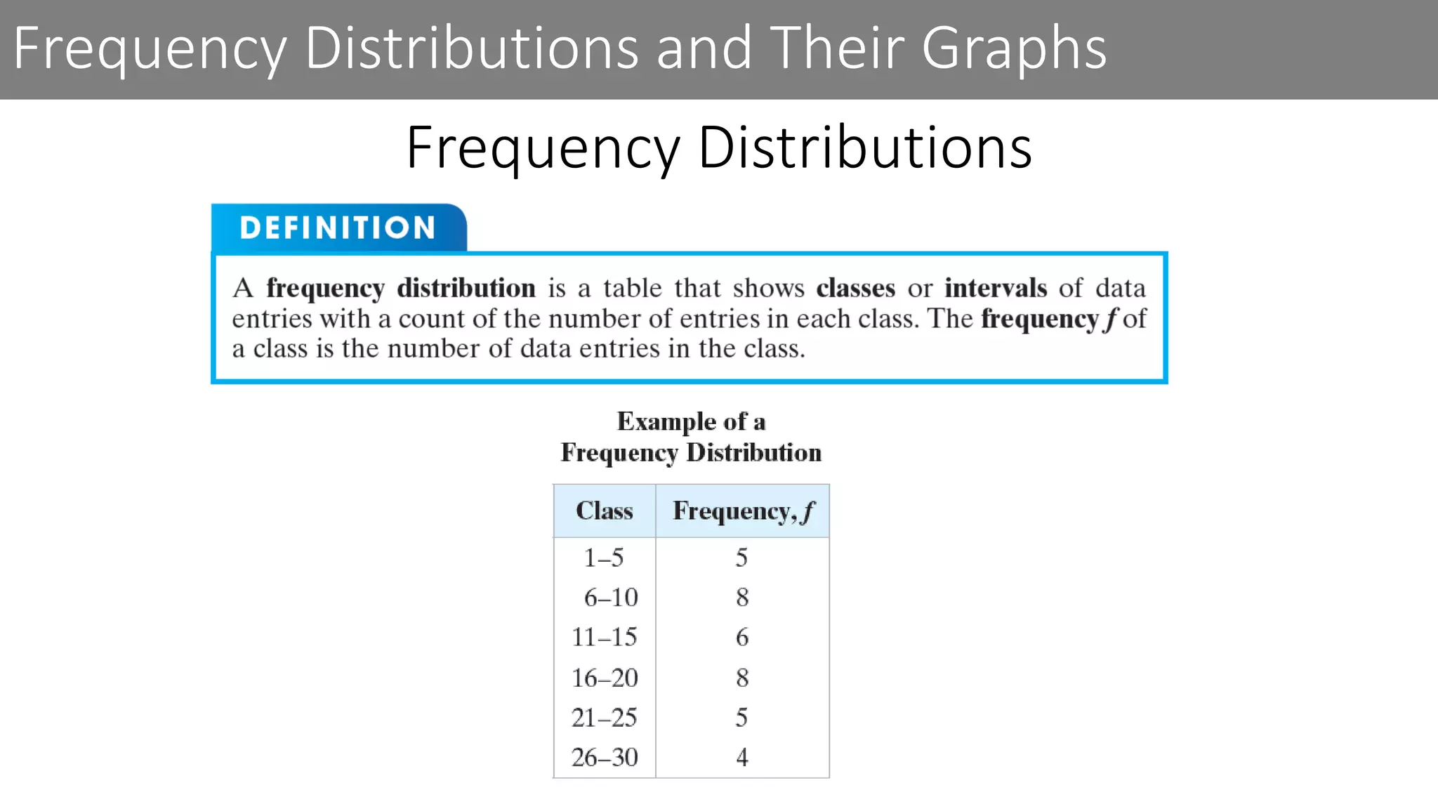
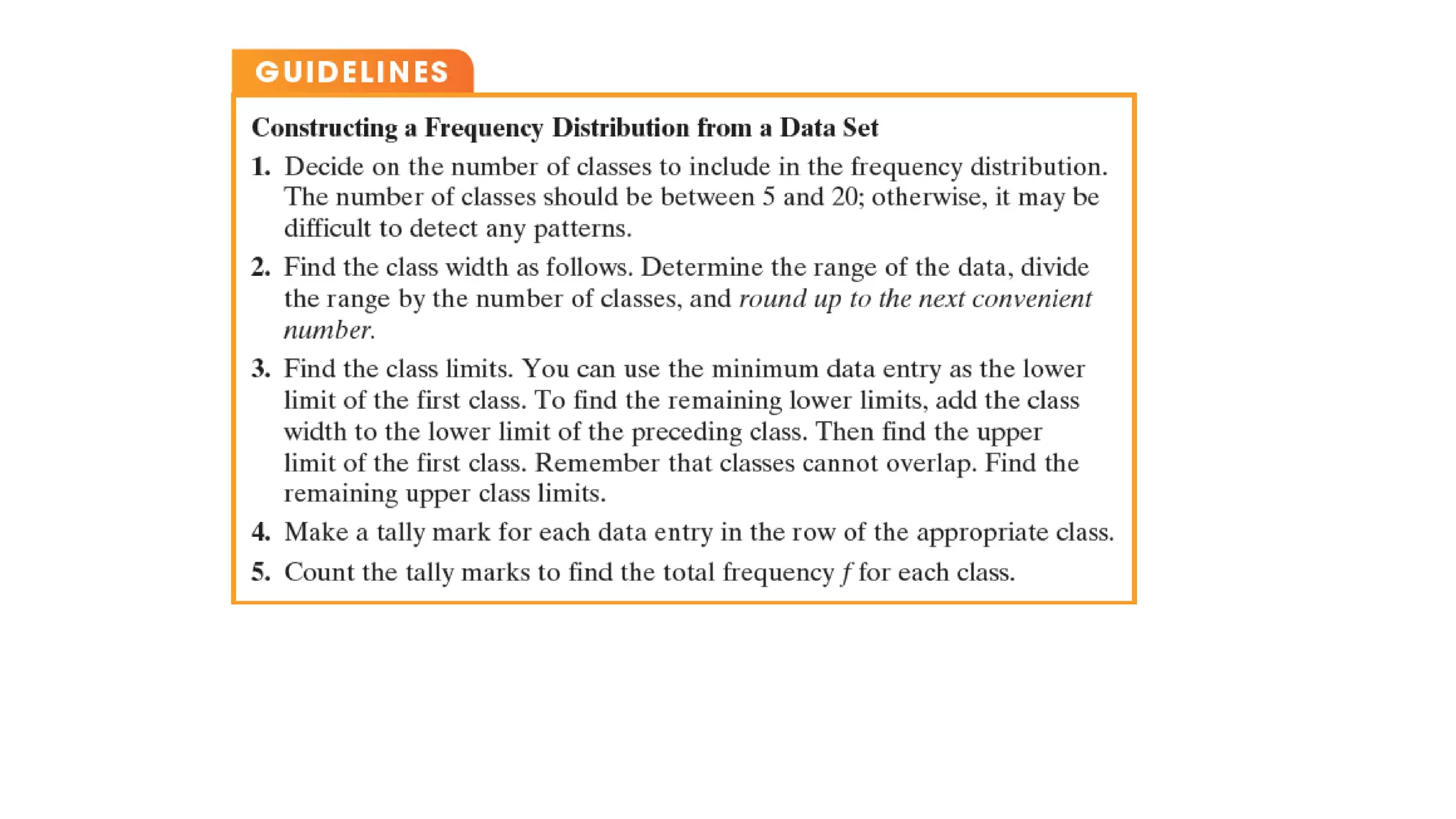
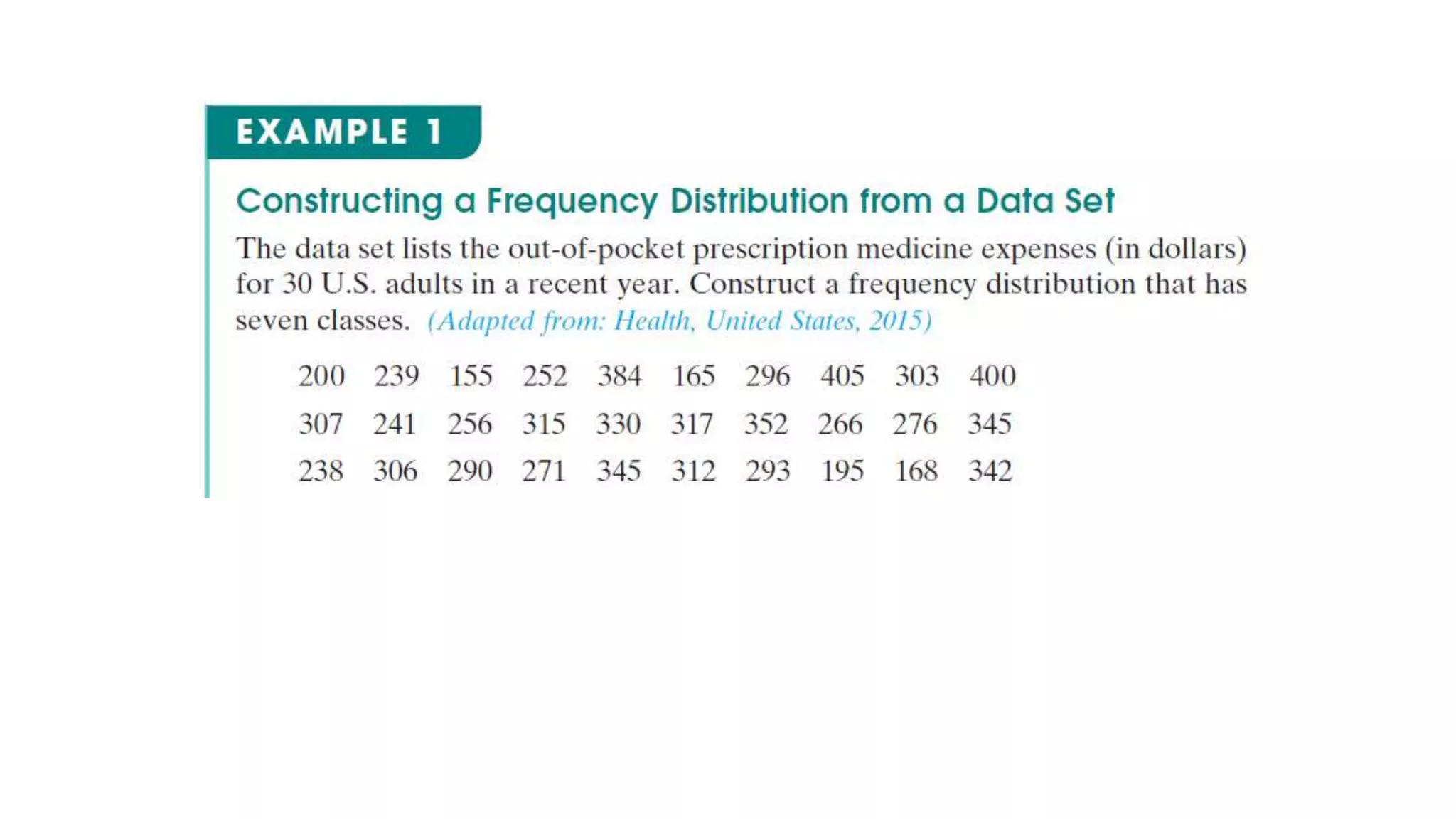
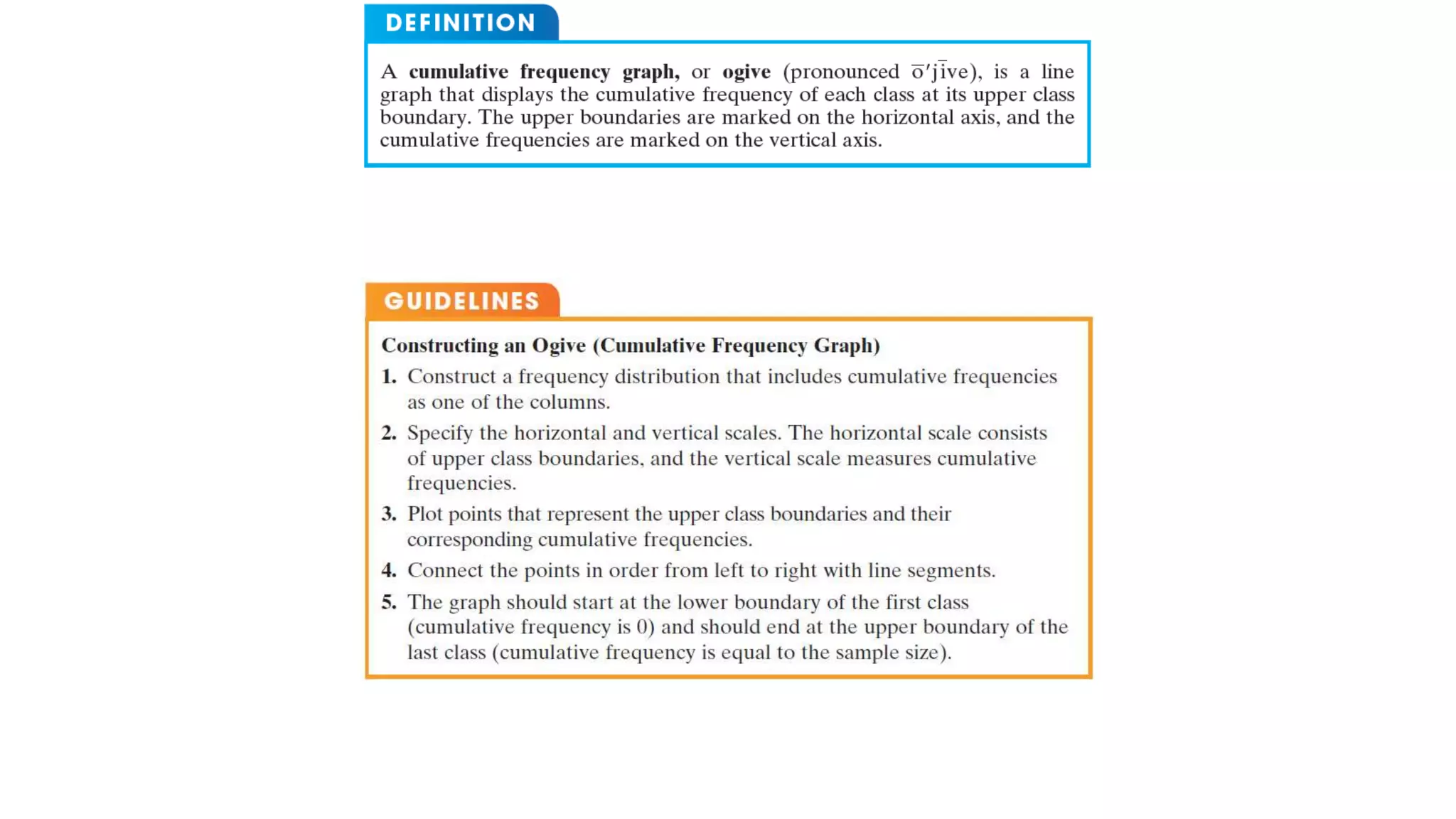
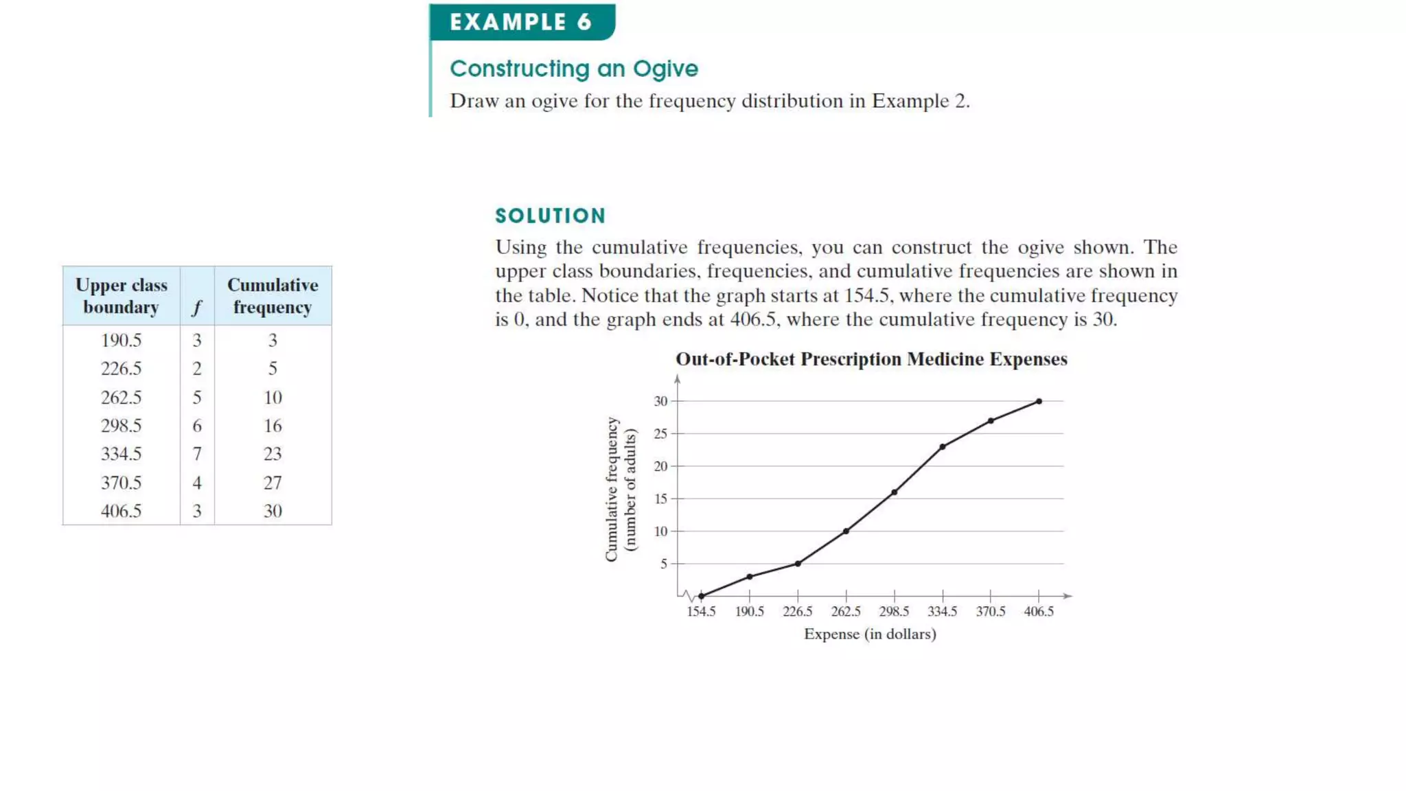
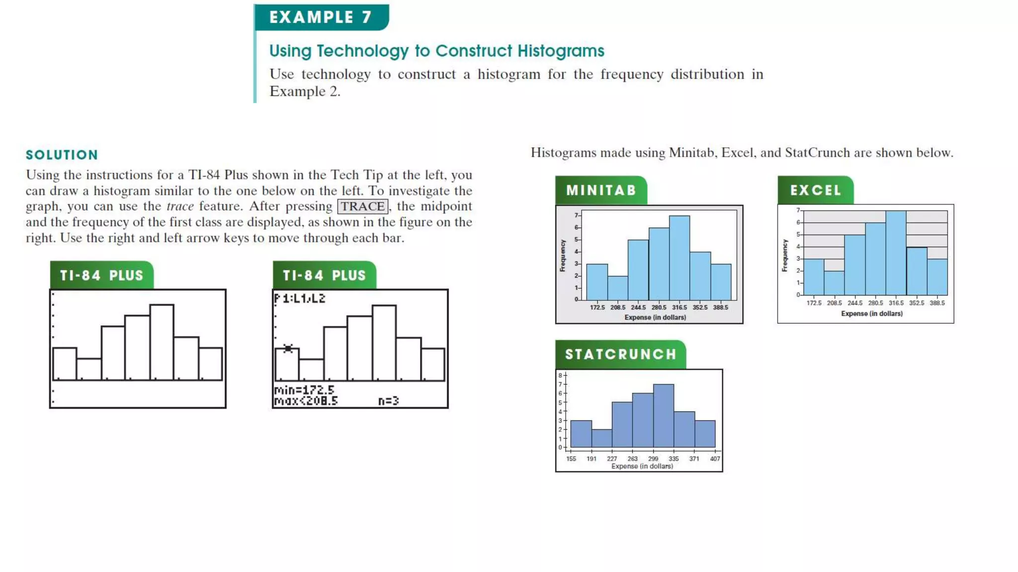
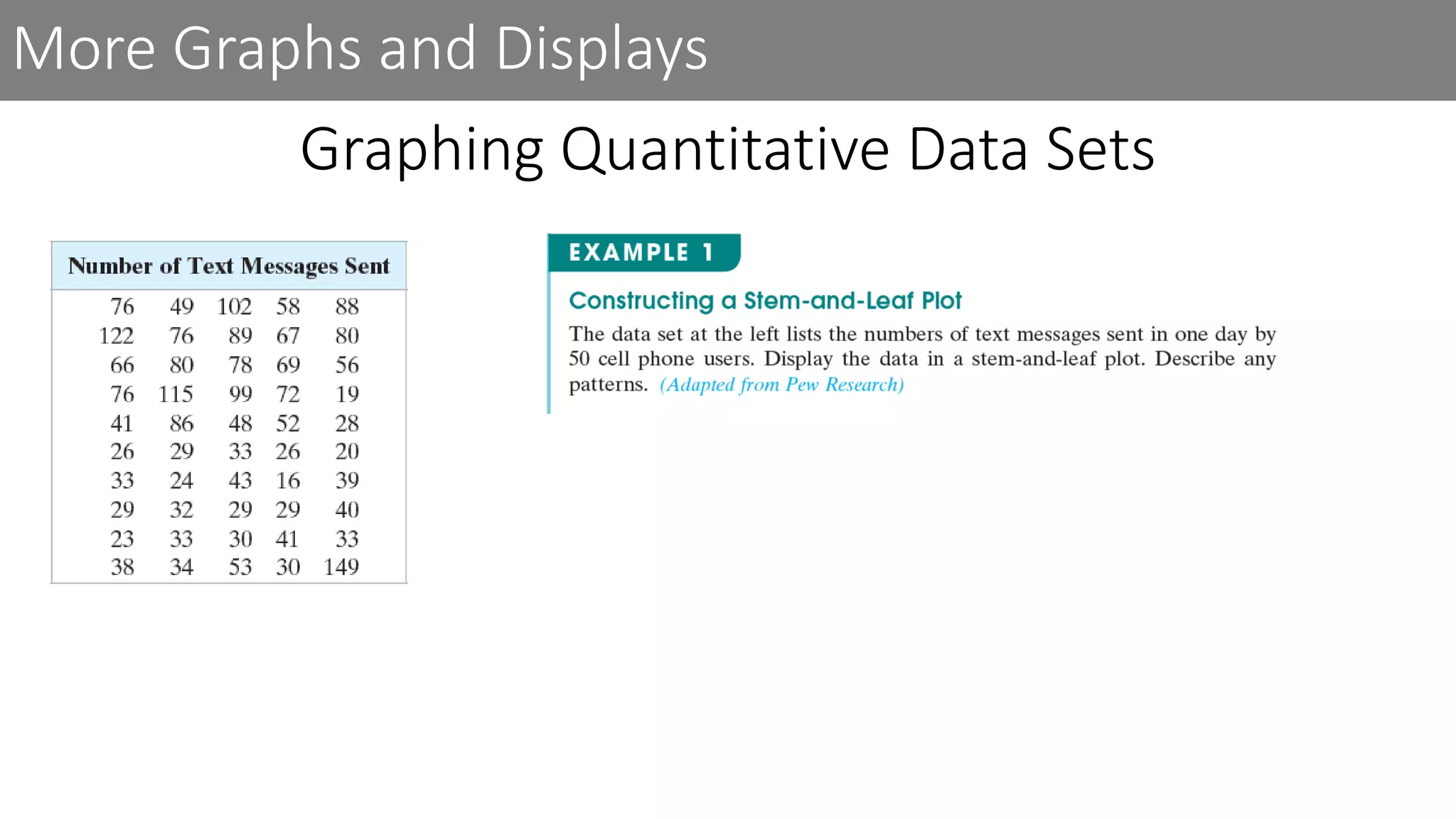
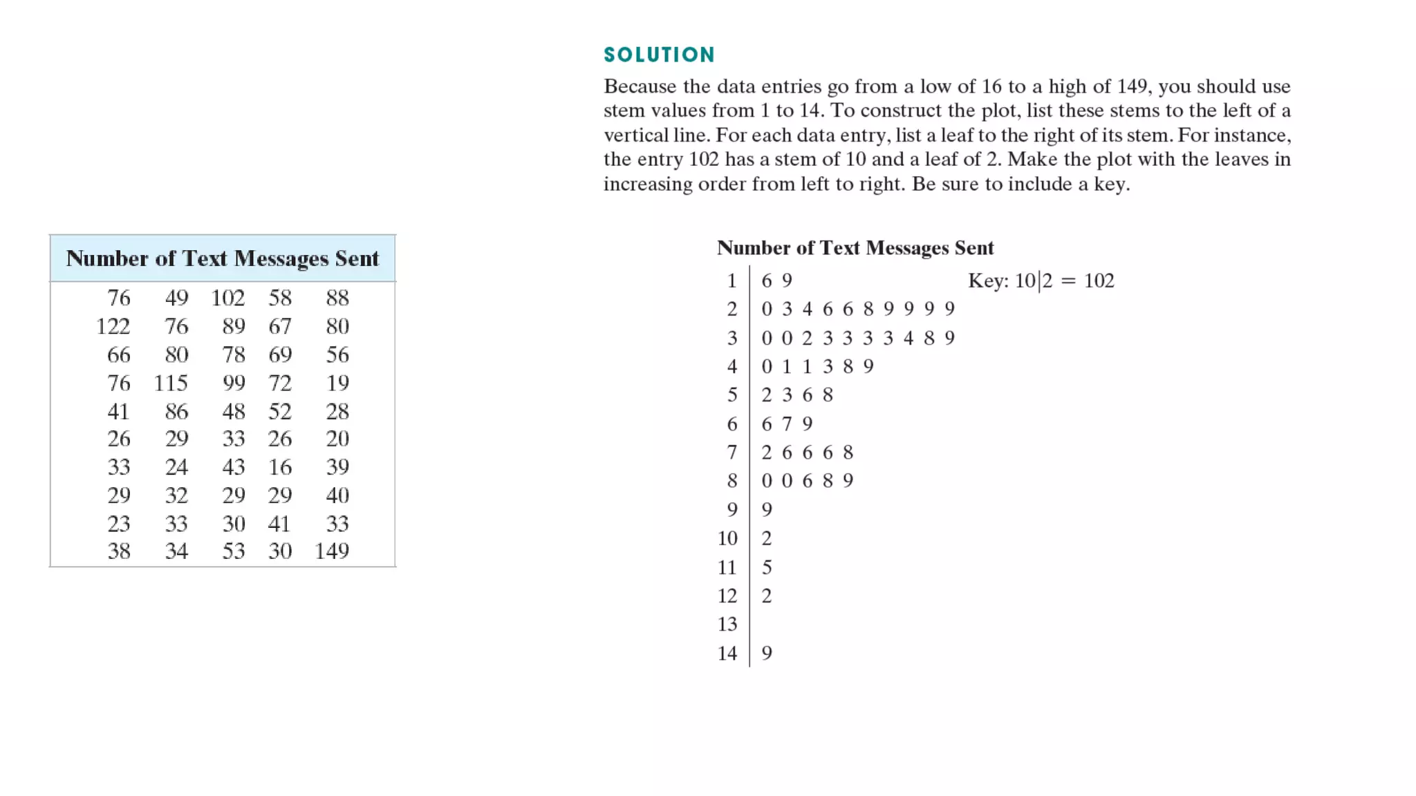
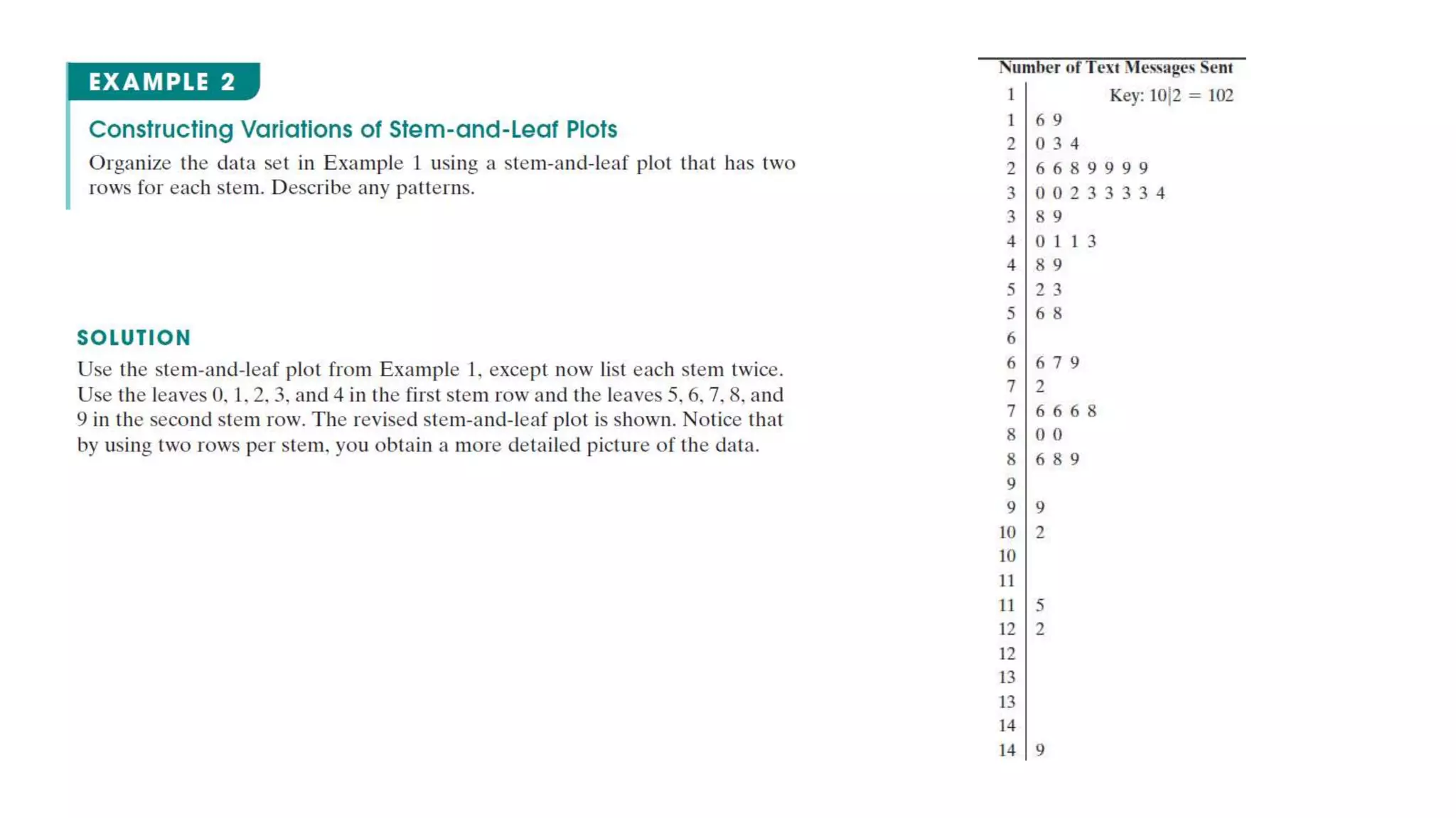
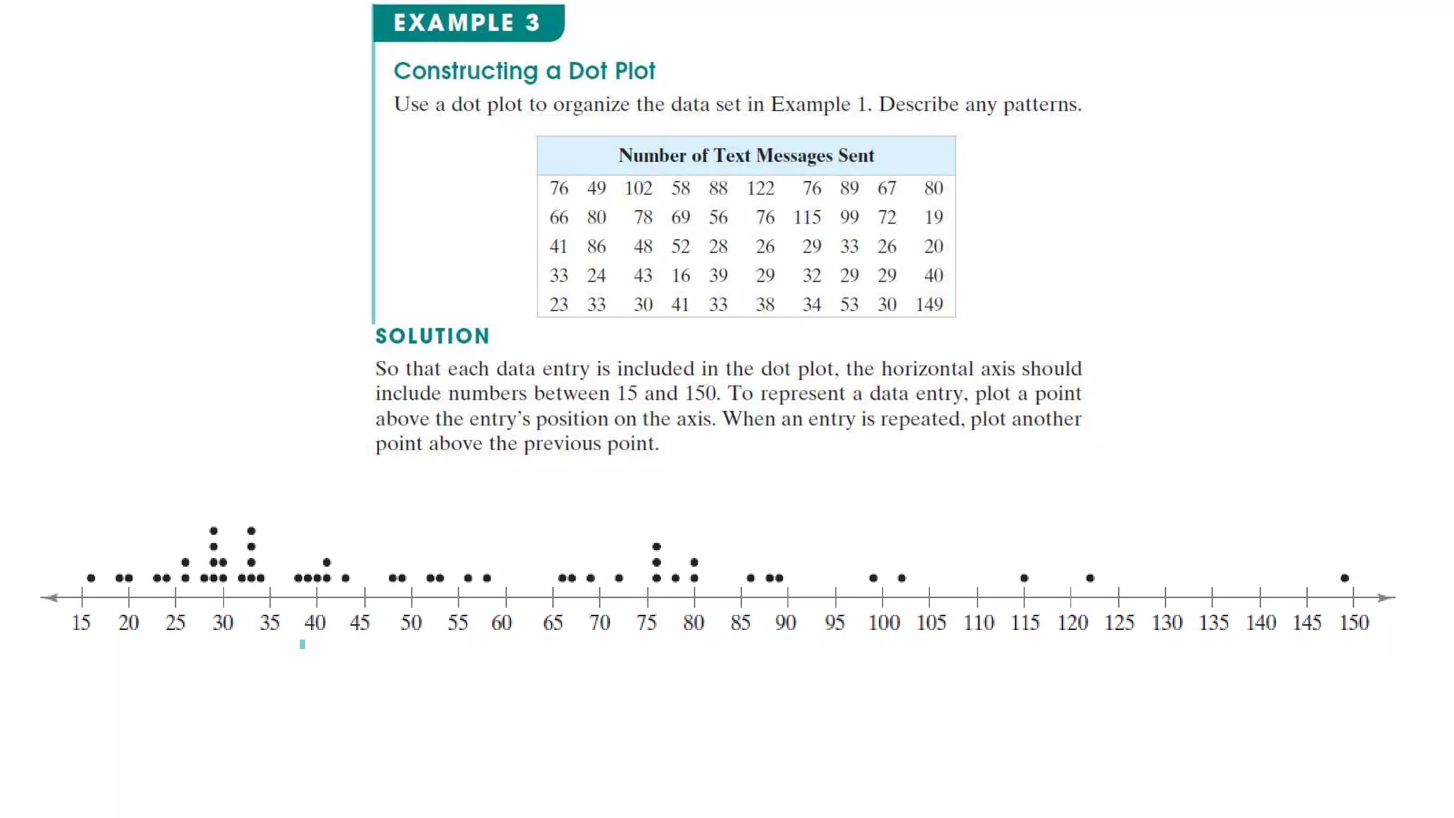
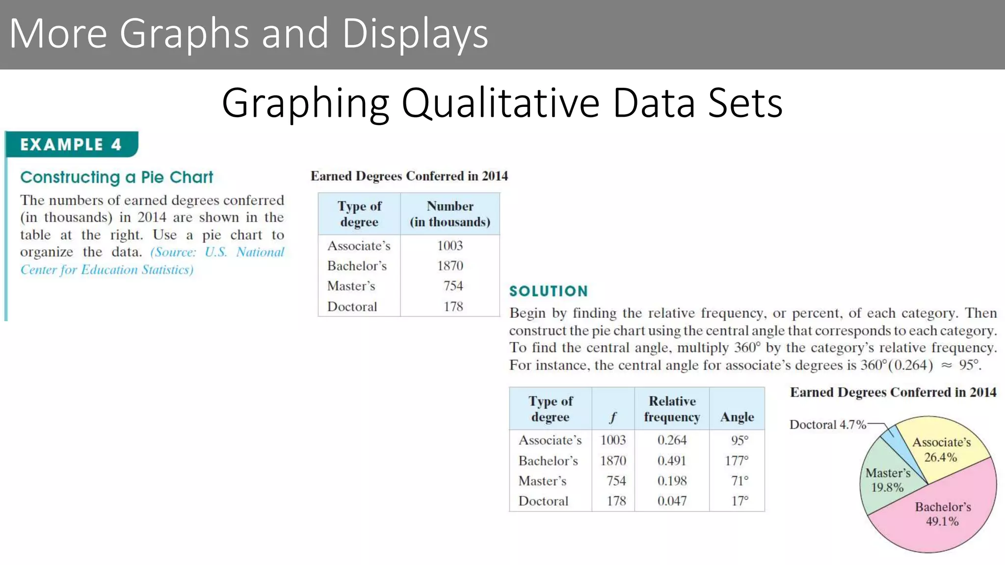
In the frequency distribution shown, there are six classes. The frequencies for each of the six classes are 5, 8, 6, 8, 5, and 4. Each class has a lower class limit, which is the least number that can belong to the class, and an upper class limit, which is the greatest number that can belong to the class. In the frequency distribution shown, the lower class limits are 1, 6, 11, 16, 21, and 26, and the upper class limits are 5, 10, 15, 20, 25, and 30. The class width is the distance between lower (or upper) limits of consecutive classes. For instance, the class width in the frequency distribution shown is 6 - 1 = 5. Notice that the classes do not overlap.
The difference between the maximum and minimum data entries is called the range. In the frequency table shown, suppose the maximum data entry is 29, and the minimum data entry is 1. The range then is 29 - 1 = 28
After constructing a standard frequency distribution such as the one in Example 1, you can include several additional features that will help provide a better understanding of the data. These features (the midpoint, relative frequency, and cumulative frequency of each class) can be included as additional columns in your table.
You can write the relative frequency as a fraction, decimal, or percent. The sum of the relative frequencies of all the classes should be equal to 1, or 100%. Due to rounding, the sum may be slightly less than or greater than 1. So, values such as 0.99 and 1.01 are sufficient.
Interpretation There are several patterns in the data set. For instance, the most common range for the expenses is $299 to $334. Also, about half of the expenses are less than $299.
Because consecutive bars of a histogram must touch, bars must begin and end at class boundaries instead of class limits. Class boundaries are the numbers that separate classes without forming gaps between them. For data that are integers, subtract 0.5 from each lower limit to find the lower class boundaries. To find the upper class boundaries, add 0.5 to each upper limit. The upper boundary of a class will equal the lower boundary of the next higher class.
Interpretation From either histogram, you can see that two-thirds of the adults are paying more than $262.50 for out-of-pocket prescription medicine expenses.
Another way to graph a frequency distribution is to use a frequency polygon. A frequency polygon is a line graph that emphasizes the continuous change in frequencies.
Interpretation You can see that the frequency of adults increases up to an expense of $316.50 and then the frequency decreases.
A relative frequency histogram has the same shape and the same horizontal scale as the corresponding frequency histogram. The difference is that the vertical scale measures the relative frequencies, not frequencies.
Interpretation From this graph, you can quickly see that 0.2, or 20%, of the adults have expenses between $262.50 and $298.50, which is not immediately obvious from the frequency histogram in Example 3.
Interpretation From the ogive, you can see that 10 adults had expenses of $262.50 or less. Also, the greatest increase in cumulative frequency occurs between $298.50 and $334.50 because the line segment is steepest between these two class boundaries.
If you have access to technology such as Minitab, Excel, StatCrunch, or the TI-84 Plus, you can use it to draw the graphs discussed in this section.
In a stem-and-leaf plot, each number is separated into a stem (for instance, the entry’s leftmost digits) and a leaf (for instance, the rightmost digit). You should have as many leaves as there are entries in the original data set and the leaves should be single digits. A stem-and-leaf plot is similar to a histogram but has the advantage that the graph still contains the original data. Another advantage of a stem-and-leaf plot is that it provides an easy way to sort data.
Interpretation From the display, you can see that more than 50% of the cell phone users sent between 20 and 50 text messages.
From the display, you can see that most of the cell phone users sent between 20 and 80 text messages.
You can also use a dot plot to graph quantitative data. In a dot plot, each data entry is plotted, using a point, above a horizontal axis. Like a stem-and-leaf plot, a dot plot allows you to see how data are distributed, to determine specific data entries, and to identify unusual data entries.
Interpretation From the dot plot, you can see that most entries occur between 20 and 80 and only 4 people sent more than 100 text messages. You can also see that 149 is an unusual data entry.
Pie charts provide a convenient way to present qualitative data graphically as percents of a whole. A pie chart is a circle that is divided into sectors that represent categories. The area of each sector is proportional to the frequency of each category. In most cases, you will be interpreting a pie chart or constructing one using technology. Example 4 shows how to construct a pie chart by hand.
Interpretation From the pie chart, you can see that almost one-half of the degrees conferred in 2014 were bachelor’s degrees.
Another way to graph qualitative data is to use a Pareto chart. A Pareto chart is a vertical bar graph in which the height of each bar represents frequency or relative frequency. The bars are positioned in order of decreasing height, with the tallest bar positioned at the left. Such positioning helps highlight important data and is used frequently in business.
Interpretation From the Pareto chart, you can see that the leading cause of death in the United States in 2014 was from heart disease. Also, heart disease and cancer caused more deaths than the other three causes combined.
When each entry in one data set corresponds to one entry in a second data set, the sets are called paired data sets. For instance, a data set contains the costs of an item and a second data set contains sales amounts for the item at each cost. Because each cost corresponds to a sales amount, the data sets are paired. One way to graph paired data sets is to use a scatter plot, where the ordered pairs are graphed as points in a coordinate plane. A scatter plot is used to show the relationship between two quantitative variables.
Interpretation From the scatter plot, you can see that as the petal length increases, the petal width also tends to increase.
A data set that is composed of quantitative entries taken at regular intervals over a period of time is called a time series. For instance, the amount of precipitation measured each day for one month is a time series. You can use a time series chart to graph a time series.
Interpretation The time series chart shows that the number of motor vehicle thefts decreased until 2011 and then remained about the same through 2015.