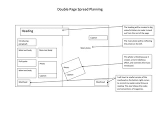
1. Double Page Spread Planning<br />This photo is tilted because it creates a more rebellious effect, and connotes the music introduced.CaptionPhotoI will insert a smaller version of the masthead on the bottom right corner, to remind my readers what they are reading. This also follows the codes and conventions of magazines.MastheadMastheadThe main photo will be reflecting the article on the left. The heading will be created in big colourful letters to make it stand out from the rest of the page.CaptionCaptionPhotoMain text bodyMain text bodyPull quoteMain text bodyIntroducing paragraphHeadingMain photo<br />