
Recommended
More Related Content
Recently uploaded
Recently uploaded (20)
Featured
Featured (20)
Colors in Email for Dummies
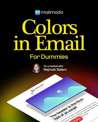
- 1. Colors in Email For Dummies Co-created with Najmah Salam T h e h e a d e r i s t h e f i r s t - f o l d o f a n e m a i l i p s u m d o l o r s i t a m e t , c o n s e c t e t u r a d i p i s c i n g e l i t , s e d d o t e m p o r i n c i d i d u n t u t l a b o r e e t d o l o r e m a g n a a l i q u a . U t m v e n i a m , q u i s n o s t r u d e x e r c i t a t i o n u l l a m c o l a b e a c o m m o d o c o n s e q u a t . t o A c t i o n t o A c t i o n A c t i o n t o A c t i o n
- 2. Colors can affect mood & emotions. And that can make all the difference to your email. Color shouldn’t be an afterthought.
- 3. Anatomy of colors in Email The header is the first-fold of an email Lorem ipsum dolor sit amet, consectetur adipiscing elit, sed do eiusmod tempor incididunt ut labore et dolore magna aliqua. Call to Action Background color Header text color Canvas color CTA color Body text color
- 4. Convey excitement, passion, energy, and urgency. Bring a sense of calmness, trust, and reliability. Color psychology Reds Product announcement Blues Health and tech products Yellow Festive or Welcome emails Green Eco-friendly or freshness Orange Promotional emails Purples Dreamy or rich and premium Warm colors Cool colors
- 7. Color combinations Warm+Cool Combining warm and cool colors in an email creates visual interest and balance.
- 8. Color contrast & accessbility Choose a theme - Dark-on-Light or Light-on-Dark? Try and maintain 4.5:1 contrast ratio between text and background colors Here is an easy reference frame 4:1 1:4:1 8:6:1 Tools to check contrast WEBAIM Contrast checke Colourcontrast.cc Dark-on-Light Light-on-Dark Good contrast Bad contrast Best contrast
- 9. Building color palette Dominant brand color Complements primary color White, Black, Grey Header text, CTA Secondary CTA, Links, H2, H3 Background, Canvas, Body text Primary color Primary color Secondary colors Neutral colors Secondary color Neutral color #5C46E1 #20C58B #130759 #101828 Mailmodo’s color palette
- 10. Secondary colors Primary color #666666 #009CDE Color palette of popular brands
- 11. Secondary colors Primary color #5551F #A259FF #FFC700 #009CDE Color palette of popular brands
- 13. Hot tip When you’ve finished your design, zoom out until you can see the entire email. If your CTAs stand out, great! If not, consider changing email to a different color.
- 14. Access the entire Email Design for Dummies series. Click the link in the comment to learn more. Co-created with Najmah Salam