1. Production Logos
The history of Paramount
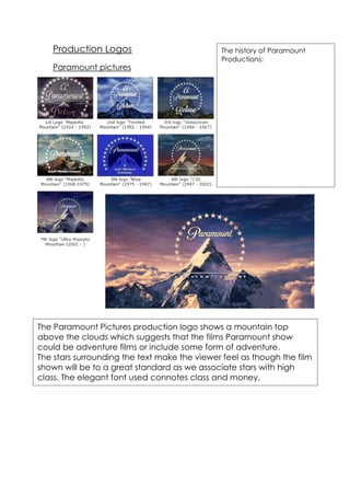
Paramount pictures
Productions:
The logo began as a charcoal
rendering of the mountain
ringed with superimposed stars.
The logo originally had twenty-
four stars, as a tribute to the
then current system of
contracts for actors, since
Paramount had twenty-four
stars signed at the time.
In 1952, the logo was
redesigned as a matte painting
created by Jan Domela.
The Paramount Pictures production logo shows a mountain top
above the clouds which suggests that the films Paramount show
could be adventure films or include some form of adventure.
The stars surrounding the text make the viewer feel as though the film
shown will be to a great standard as we associate stars with high
class. The elegant font used connotes class and money.