
Recommended
More Related Content
Viewers also liked
Similar to General conventions
Similar to General conventions (20)
Recently uploaded
Recently uploaded (20)
General conventions
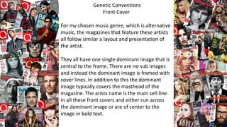
- 1. Genetic Conventions Front Cover For my chosen music genre, which is alternative music, the magazines that feature these artists all follow similar a layout and presentation of the artist. They all have one single dominant image that is central to the frame. There are no sub images and instead the dominant image is framed with cover lines. In addition to this the dominant image typically covers the masthead of the magazine. The arists name is the main sell line in all these front covers and either run across the dominant image or are of center to the image in bold text.
- 2. Genetic Conventions Contents Page All the contents pages, that are featured in alternative music magazines, have the heading across the top of the page and features running in a column format down one side of the page, in addition to this, there is usually one dominant image with 3-5 sub images surrounding the features and the dominant image. There are also page numbers connected to each feature or picture, some are often larger and bolder than others, to ensure that the audience know what pages certain features are on.
- 3. Genetic Conventions Double Page Spread The conventions that alternative music magazines follow, typically, for their double page spreads are o have a dominant image that covers an entire page with a full detailed article rather than a question and answer style article. I addition to this these magazine usually use the artists name or initial, in large bold text, as the article title. Another convention used is to start paragraphs with a drop capital to ensure the audince knows where to begin reading. Finally most of the magazines use a pull quote as a strapline to entice the audience to read more.