1. Fitworxs, a fitness company, approached me to create
the company’s image and branding. The theme of the
company’s image is based on the Earths core, a source
of stored potential in energy, warmth and strength.
The 4 components of the company are Personal
Training, Sports Massage, Pilates and Injury
Rehabillitation. I designed these elements into a logo
as symbols of the visual components of a human form.
The use of circles represents the natural curvature
of the body and a triangle is the strongest geometric
structure. In the logo it is where the torso would be,
often referred to as our ‘core’ . Here it highlights the
main focus of the company, Injury Rehabilitation. I also
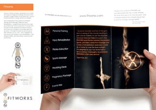
designed leaflets, (pictured) posters, business cards
and banners.
F I T WOR X S
Fitworxs
2. The photographic identity for the brand utilises
shadows to add definition and movement to the
athelete’s body, creating a dynamic aspirational
image. I projected the symbols for each part of the
logo onto the contours of the people as opposed
to being photoshopped. Using this real process, I
wanted to convey the brand ethos Fitworxs have
to personalise and adapt their fitness sessions
and rehabilitation techniques individual to each
client.
Designing the colour pallette, logos, taking and
editing the photography, as well as developing the
brand identity and public collatoral, a cohesve and
succesfful outcome was acheived for my client.
Photography: Laura Pratley