3. Jing Chen Info-I300 HCI/Interaction Design Spring 2016
Pop app link: https://popapp.in/projects/56b2a7803d66c2c04d7be561/preview
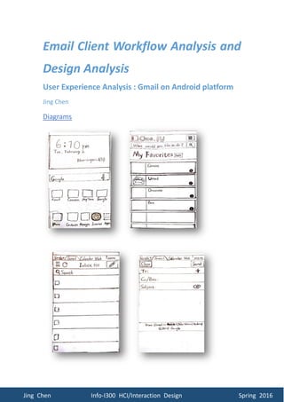
Analysis
Affordance – The icon of Internet browser takes advantage of images rather than just
words to appeal the visual habit of users
Constraint – the process of getting access to Gmail (Umail) is constrained in the
To access Gmail through Internet web browser and One.IU
4. Jing Chen Info-I300 HCI/Interaction Design Spring 2016
particular way that could be achieved
Metaphor – the use of envelope is a metaphor of getting mail in the envelope in the
physical world
Affordance – The icon of a pen explains the
function of the button, which is better than
using language
– The Greek letter xi-like button
“ ” is commonly used in other apps in the
Android platform and websites with the same
similar function
– The microscope icon indicates
the function of the search box
– The word “search” in the search
box next to the microscope icon is simple and
explicit, expressing the idea without using
sentences
Constraint – the functions in the interface is
constrained with the designed buttons and area to direct what users could interact
with the interface
Metaphor – the idea of edit icon (pen) and search icon are taken from how people use
pen and microscope in the physical life
Layout – most of elements are shown in the top area of the interface, which is more
likely to be noticed that other areas. It saves the time of finding and using these
buttons, and facilitates the usability of Gmail on the Android platform.
The inbox interface of the Gmail
5. Jing Chen Info-I300 HCI/Interaction Design Spring 2016
Affordance – The icon of a paper clip points out the button is for attachment, because
paper clip is used to attach files together the physical world
– The word “close” and “send” are designed to pass the messages they
are for stopping editing, closing the interface and finishing editing sending email
respectively in the way that is concise and easy to understand
– The version of Gmail is allowed to be switched to “older version” or
“desktop version” to satisfy those who are more comfortable with
other versions when users are editing
– The current version, mobile version, is bolded to inform users what
kind of version of editing interface they are interact with
Constraint – the “close” button lead to the “save/ discard/canel” interface, serving as
a warning to make sure content user edited is saved or discard and users are aware of
the action, which prevents the loss of file
Metaphor –The icon of a paper clip points out the button is for attachment, because
paper clip is used to attach files together the physical world
Layout – the version switch setting is at the bottom of the interface because for users,
it is not important in the process of editing unless they are looking for the specific
information to switch version. So it will only be noticed when users need it.
The email editing interface of the Gmail
6. Jing Chen Info-I300 HCI/Interaction Design Spring 2016
Affordance – the”+” icon in the recipient
box shows the list of saved recipient for
further use, which is impressive in user
experience and makes users previous
behaviors into preferences
– When users type letter(s) in
the recipient address box, the list of saved
recipient starting with typed letter(s) will
show up and highlighted to help users to
select recipient in a more efficient way than
typing every single letter of the email
address. Also it reduces the risk of users
forgetting the email address if they used
that address before
Constraint – the email address list is only
available for those addresses that are used
before
– Due to the screen limit, only part of the list could be seen
Affordance – The use of image and the brief name for each button clearly explain the
function of the button and effectively prevent confusion. And the same time, that will
makes user believe they are smart enough to figure out how to finish a task with more
The recipient email address editing interface of the Gmail
The attachment adding interface of the Gmail
7. Jing Chen Info-I300 HCI/Interaction Design Spring 2016
than one steps self
– The process of adding an attachment breaks into several steps to reduce
the complexity to achieve and increase the possibility to finish the task easily
– The “scribble” button creates the space for customized selection and
helps to build up more personal connection with users. Meanwhile, it provides the
chance for user to feel the sense of control and enables the excellent experience of
making thing controllable by themselves
Constraint – the options are limited within the range of provided selections
Metaphor – the idea of paper clip, scratch, camera, folder, file and recorder are taken
from how people use them in the physical life
Affordance – Files with solid circle are differentiated from those with outlined
circle to show users selection
– The “cancel” and “done” button at the top of the interface
remind users to double check and confirm after they makes selections.
– After file selection interface gets back to editing interface, there
is indication about if the selected file is attached successfully, to meet the
expectation of users.
Constraint – Confirmation for attachment will only be shown in particular areas
The attachment confirmation interface of the Gmail
8. Jing Chen Info-I300 HCI/Interaction Design Spring 2016
Design Recommendations
Elements in the Gmail on Android platform are generally well designed from
user experience perspective. With icons and brief language, metaphors are widely
applied in a natural and proper way correlating traditions in the physical life.
Affordances and constraints explicitly show among different interfaces to make them
easier to understand and act in the process of editing and sending an email with
attachment.
However, there are places needs to be improved to provide better user
experience. The accessibility to part of the Gmail (Umail) requires too much time and
interfaces interaction. It would be the best to have access to Umail with user name
and password through Gmail login interface. Also, there is no reminder for important
email in the Gmail account. To highlight those emails that are time-sensitive, with
important content from others, there should be a visual or audial reminder to match
the idea that people want to stay focus while do not like to be bothered all the time.
Furthermore, to create better user experience, an appealing surface, animation or
sound effect could surprise users with extra enjoyment.