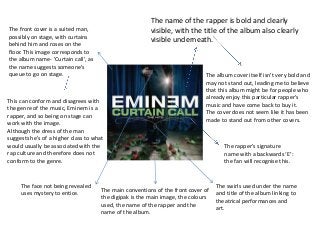
1. The front cover is a suited man,
possibly on stage, with curtains
behind him and roses on the
floor. This image corresponds to
the album name- 'Curtain call', as
the name suggests someone's
queue to go on stage.
This can conform and disagrees with
the genre of the music, Eminem is a
rapper, and so being on stage can
work with the image.
Although the dress of the man
suggests he's of a higher class to what
would usually be associated with the
rap culture and therefore does not
conform to the genre.
The name of the rapper is bold and clearly
visible, with the title of the album also clearly
visible underneath.
The album cover itself isn't very bold and
may not stand out, leading me to believe
that this album might be for people who
already enjoy this particular rapper's
music and have come back to buy it.
The cover does not seem like it has been
made to stand out from other covers.
The rapper’s signature
name with a backwards ‘E’:
the fan will recognise this.
The swirls used under the name
and title of the album linking to
theatrical performances and
art.
The face not being revealed
uses mystery to entice.
The main conventions of the front cover of
the digipak is the main image, the colours
used, the name of the rapper and the
name of the album.
2. The back cover carries on the theme of the
roses and man in a suit.
It is complex but with a bold white
font, we are able to see the
writing, the larger being the songs
or people who contributed to the
album, and the smaller writing the
production details which the fans
do not need to see and contains
the legal information such as copy
right.
Not seeing the man's face
on both covers is mysterious
and could add an element of
the unknown, something
which could be big in the rap
world.
The conventions of the back of the digipak are the
track names, the running order, an image, colours
used throughout and the production details.
3. The CD panel and CD itself also follows the theme of the
roses, but have been removed of colour, so the entire CD is
in black and white, bar the name of the album.
This may have been done for the name of the album to
stand out as its the name the consumer will be seeing when
putting the CD into the CD player.
The green used is a bright colour and stands out among a lot
of other colours, so to use it for the name of the album
would have been done to stand out.