How to build a good typography
•
0 likes•79 views

A really short introduction to the basis elements of a typography. 29 pages with minimal text and a lots of examples.

Recommended
More Related Content
Similar to How to build a good typography
Similar to How to build a good typography (20)
More from IDF761
Recently uploaded
Recently uploaded (20)
How to build a good typography
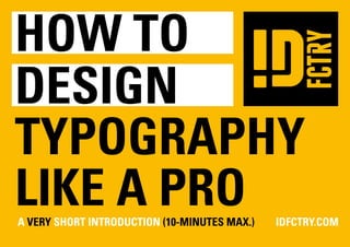
- 1. how to design TYPOGRAPHY like a pro a Very Short Introduction (10-minutes max.) IDFCTRY.COM
- 2. I am Occupation : CREATIVE AT IDFCTRY.COM Education : The Dutch Academy of Art and Design Rietveld Academie Amsterdam. Philosophy : Everything is a chance. Thinks : Reality is chaos. Naïeve belief : Everybody is creative. Motivation : Let’s make better mistakes tomorrow.
- 3. “Write here..right now” by Gemma O’Brien. http://www.youtube.com/watch?v=Nz3lXu3VxVg 8 hours of writing, 5 markers, 3 baths and 2 showers to get clean.
- 4. WHAT IS TYPOGRAPHY Typography (from the Greek words (typos) = form and (graphy) = writing) is the art and technique of arranging type, type design, and modifying type glyphs. Type glyphs are created and modified using a variety of illustration techniques. The arrangement of type involves the selection of typefaces, point size, line length, leading (line spacing), adjusting the spaces between groups of letters (tracking) and adjusting the space between pairs of letters (kerning). http://en.wikipedia.org/wiki/Typography CHUNGKONG.NL
- 6. ONE RULE TO RULE THEM ALL Break any rule if nessary. All of the following rules are kind of a beginners guide to typography. Stick to them and you can’t go far wrong. Remember however, to break all of them at least once. There’s no excuse for making boring designs over and over again, just some rules dictate CHUNGKONG.NL
- 7. TERMINOLOGY BASICS font 8-point 10-point weight roman / antique italic serif sans serif / grotesque scripts proportionalspaced monospaced baseline UPPER CASE lower case Dingbats / ✁f,h∑✈d© descender = t,f,h,k and l ascender =q,y,p,g and j http://en.wikipedia.org/wiki/Typeface CHUNGKONG.NL
- 8. 3 FONTS Don’t use too many typefaces A good rule to follow is to not use more than 3 different typefaces in one document. It makes it clean and tidy. Be consistend in this. CHUNGKONG.NL
- 9. “Less is a bore” . http://en.wikipedia.org/wiki/Dada
- 10. A HIERARCHY OF 4 FONT SIZES Use no more than 4 font sizes in a document. Again this is a case of consistency. Too many copy sizes make a document disjointed. 4 also allows enough variation to emphasise certain text and categorise text together. CHUNGKONG.NL
- 11. USE 8 - 10 PT FOR BODY COPY Do not go over 11 pt. 12 pt is only allowed making childerens book. Grown up’s can read smaller fontsizes. CHUNGKONG.NL
- 12. KEEP ARTISTIC TYPEFACES ONLY FOR HEADING OR LOGO’S There is a place for all kinds of artistic typefaces, but not all of them (most infact) make good body copy. CHUNGKONG.NL
- 13. This is a typefase based on the bestkown logo of the world. Completely unreadable in body text.
- 14. LEADING, DON’T OVERLAP The vertical space between lines of type as measured from baseline to baseline. NEVER stick to auto settings and always align to a fixed baseline grid. In general keep the baseline around a 120% or 130% above your font size. CHUNGKONG.NL
- 15. Baseline mayhem. Creating a stylisch image by breaking leading rules.
- 16. K E R NIN G The spacing between letters. It is prefered to keep body text a little mote manually tightened. But in general the kerning of most typefaces if proportional spaced are oke. Only for larger variants like headings or large text on for example billboards, shout be manually tightened by eye. CHUNGKONG.NL
- 17. ACCENT OR EMPHASISE Large chunks of copy tend to be quite scary, and ideally people like to skim. So a subtle emphasis can bring out key words or sentence. Use bold, italic or underlined Special note: Do not over emphasise! Emphasis in a body of text should be kept simple and elegant. NOBODY LIKES A LOUDMOUTH. CHUNGKONG.NL
- 18. By playfully using accents and emphasise text, you can create a dynamic look and feels
- 19. NO CAPS IN BODY TEXT Simple enough. Never use capitals in body copy, it is just not as legible. WHAT IS LOREM IPSUM? LOREM IPSUM IS SIMPLY DUMMY TEXT OF THE PRINTING AND TYPESETTING INDUSTRY. LOREM IPSUM HAS BEEN THE INDUSTRY’S STANDARD DUMMY TEXT EVER SINCE THE 1500S, WHEN AN UNKNOWN PRINTER TOOK A GALLEY OF TYPE AND SCRAMBLED IT TO MAKE A TYPE SPECIMEN BOOK. IT HAS SURVIVED NOT ONLY FIVE CENTURIES, BUT ALSO THE LEAP INTO ELECTRONIC TYPESETTING, REMAINING ESSENTIALLY UNCHANGED. IT WAS POPULA- RISED IN THE 1960S WITH THE RELEASE OF LETRASET SHEETS CONTAINING LOREM IPSUM PASSAGES, AND MORE RECENTLY WITH DESKTOP PUBLISHING SOFTWARE LIKE ALDUS PAGEMAKER INCLUDING VERSIONS OF LOREM IPSUM. WHERE DOES IT COME FROM? CONTRARY TO POPULAR BELIEF, LOREM IPSUM IS NOT SIMPLY RANDOM TEXT. IT HAS ROOTS IN A PIECE OF CLAS- SICAL LATIN LITERATURE FROM 45 BC, MAKING IT OVER 2000 YEARS OLD. RICHARD MCCLINTOCK, A LATIN PRO- FESSOR AT HAMPDEN-SYDNEY COLLEGE IN VIRGINIA, LOOKED UP ONE OF THE MORE OBSCURE LATIN WORDS, CONSECTETUR, FROM A LOREM IPSUM PASSAGE, AND GOING THROUGH THE CITES OF THE WORD IN CLASSICAL LITERATURE, DISCOVERED THE UNDOUBTABLE SOURCE. LOREM IPSUM COMES FROM SECTIONS 1.10.32 AND 1.10.33 OF “DE FINIBUS BONORUM ET MALORUM” (THE EXTREMES OF GOOD AND EVIL) BY CICERO, WRITTEN IN 45 BC. THIS BOOK IS A TREATISE ON THE THEORY OF ETHICS, VERY POPULAR DURING THE RENAISSANCE. THE FIRST LINE CHUNGKONG.NL
- 20. ALWAYS ALIGN TO A BASELINE Keep text in simple horizontal lines. Again pretty obvious. Ideally you use one a baseline grid throughout. What is Lorem Ipsum? Lorem Ipsum is simply dummy text of the printing and typesetting industry. Lorem Ipsum has been the industry’s standard dummy text ever since the 1500s, when an unknown printer took a galley of type and scrambled it to make a type specimen book. It has survived not only five centuries, but also the leap into electronic typesetting, remaining es- sentially unchanged. It was popularised in the 1960s with the release of Letraset sheets containing Lorem Ipsum passa- ges, and more recently with desktop pu- blishing software like Aldus PageMaker including versions of Lorem Ipsum. Where does it come from? Contrary to popular belief, Lorem Ipsum is not simply random text. It has roots in a piece of classical Latin litera- ture from 45 BC, making it over 2000 years old. Richard McClintock, a Latin professor at Hampden-Sydney College in Virginia, looked up one of the more obscure Latin words, consectetur, from a Lorem Ipsum passage, and going through the cites of the word in classical literature, discovered the undoubtable source. Lorem Ipsum comes from secti- ons 1.10.32 and 1.10.33 of “de Finibus Bonorum et Malorum” (The Extremes of Good and Evil) by Cicero, written in 45 BC. This book is a treatise on the theory of ethics, very popular during the Renaissance. The first line of Lorem Ipsum, “Lorem ipsum dolor sit amet..”, comes from a line in section 1.10.32. CHUNGKONG.NL
- 21. FLUSH LEFT RAGGED RIGHT Always keep the text left aligned. This is legible and does not look messy. CHUNGKONG.NL
- 22. ONLY JUSTIFY ACROSS LARGER COLUMS Justifying text across a smaller column creates massive gaps or ‘rivers’ in the type. Don’t do it. http://en.wikipedia.org/wiki/Logo CHUNGKONG.NL
- 23. LINES NOT TOO LONG OR NOT TOO SHORT Line length is important. It helps legibility and prevents your eye from slipping up or down a line in a large body of text. Use columns in a page to make this structured and easy. Rule is: do not have less than 6 words. CHUNGKONG.NL
- 24. Complet chaos of colums sizes. “ ... ”
- 25. PUNCTUATION AND BULLET POINTS Bullet points and punctuation marks should ideally be in the page margin. CHUNGKONG.NL
- 26. THE FIBONNACI FONTSIZE SEQUENCE Use the ‘golden ratio’ to structure your chosen point sizes. It will give your whole document a natural elegance. 0 1 1 2 3 5* 8 13 21 34 55 89 144 etc. 8 13 21 34 55 89 144 * to small for normal use CHUNGKONG.NL
- 27. BONUS RULE: NEVER USE COMICS SANS Breaking all the rules? No this one. This is the unbreakable rule. There is no justifaction for the use of comic sans. It’s just pure evil and intented to distroy any esthic ambition for mankind. Only lesser gods will think it’s a good idea to give your design a boost with that funny looking typeface. CHUNGKONG.NL
- 28. Users of COMIC SANS can be reported at http://www.comicsanscriminal.com/
- 29. Disclaimer The information in this document is intended for informational and educational purposes only, to provide readers better understanding about Graphic design and corporate design. all Designated trademarks and brands are the property of their respective owners. please respect them.