2. 4
5
6
7
9
11
15
16
18
19
20
TABLE OF CONTENTS
Introduction
Write Good Headlines
Headline Best Practices
How Your Buyer Personas Play
Into Your Landing Page Strategy
Landing Page Campaigns
Tips for Effective
Landing Page Design
Elements on a Landing Page
Campaign Killers
Landing Page Development
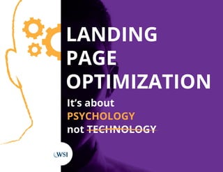
Conclusion: Don’t Neglect
Landing Page Optimization
25-Point Landing Page Checklist
About WSI 21
3. ABOUT THE AUTHOR
Chuck Bankoff is an International speaker, author and
trainer to Internet Consultants in over 8 countries.
With degrees in graphic design, digital electronics and an
MBA from Keller Graduate School of Management, his
areas of expertise are search engine marketing, social
media management, website design, landing page design
and conversion technologies.
Chuck holds a variety of digital certifications including
Google Adwords, SEMPO, HubSpot and eCommerce from
USC Marshal School of Business. Chuck is based in Orange
County, California, USA where he has been practicing
digital marketing since 1999.
4. 4
Introduction
“Advertising is the art of getting people to buy
things they don’t need with money they don’t
have.” This statement predates the Internet by
decades, yet still rings true today. While it might
be a bit cynical, let’s not forget that in the digital
world people rarely stumble across a website
without actively searching for something. If you
have what people are looking for, it’s your job to
help them find it.
The problem is most websites and landing
pages are so ill conceived and poorly
constructed that they’re little more than
monuments to their owners.
Let’s make something transparently clear:
people do not read on the Internet, they
scan. They see headlines, images and bullet
points. Depending on the personality type of
your visitor, you have between two and eight
seconds to convince them to stay on your
website. Searchers click in, take a quick peek,
and click out. Those are the conditions in which
business is conducted on the Internet.
And when it comes to the landing pages you’re
using to drive conversions for your online
campaigns, you have to be even more strategic
with how the page is laid out and reads to a
visitor.
Let’s take a
look at the
elements that
make for good
landing page
optimization.
5. 5
Write Good Headlines
Since we all have a tendency to scan before we
read, one of the few things that are guaranteed
to be seen and actually read is the headline. A
successful landing page is a combination of many
elements, but if your headline fails, your entire
landing page will fail. You need to spend more
time on your headline than on any other element
of your landing page.
“You HAVE to crap out 25 headlines for every
piece of content”
- David Ogilvy
Awesome Heading
Awesome Heading
Awesome Heading
Awesome Heading
Awesome Heading
Awesome Heading
Your headline should be either clever, shocking
or interesting. It should be focused, relevant and
address your target audience’s pain. The truth is any
headline you come up with is some variation of one
that has been used successfully multiple times over.
Think of it as a formula:
• The Secret: The 5 Secrets of [Retail Success]
• Be Done: Be Done with [Procrastination] Once
and For All
• Need to Know: What You Need to Know About
[Training Your Cat]
• Play on Words: Urine Good Hands with
PowerPlus! (about a generator that runs on urine)
• You Can Have It All: Now You Can Have
[Financial Freedom…And Keep Your Job]
• The Hush-Hush: 5 Little Known Ways to
Dominate [Your Office Cubicle]
You get the idea; there are scores of formula-driven
examples out there. If you’re having trouble coming
up with something completely original, take a look as
some of the headlines that got your attention, and
play around with substituting your offer.
6. 6
Headline Best Practices
Keep Your Headline to One or Two Lines:
Remember, people aren’t reading your headline,
they’re scanning it. It isn’t body copy, it’s an
attention grabber at a glance.
Center Your Headline:
This gives it the special emphasis it deserves. It
stands out as important. DO NOT ever center
body copy. Anything longer than two lines that is
centered is harder to read.
Make Them Big:
No BIGGER! Your Headline should be
disproportionately larger than any other text on
the page, not just the next font size up.
Make Them Bold?
Maybe, maybe not. Depends on the overall size
differential between the headline and the body
copy and the font selection.
Ready to start scribbling down some headlines? Not just yet… Exactly who are you writing that headline for?
Certainly not for yourself. You’re writing it to appeal to your next best customer, and that customer should be
a very specific person.
Use a Different Font:
Reserve separate fonts for the headline and the
body copy. You might try mixing serif and san
serif fonts.
Use Title Case:
Make the first letter of each word capitalized. You
can keep spacer words like “to” and “the” lower
case to put more emphasis on the important
words.
Quotation Marks:
In some cases you might consider putting
quotation marks around your headline to further
make it stand out.
Use a Sub-Headline:
Make it the same size as the body copy (or much
smaller than the primary headline) and perhaps
make it bold.
7. 7
How Your Buyer Personas Play
Into Your Landing Page Strategy
We’ve already talked about the importance of
establishing your buyer personas in our Content
Marketing whitepaper. But your buyer personas come
into play at every point of your digital marketing strategy,
which means they are a critical component to the success
of your landing pages as well.
If you’re like most business owners, marketing managers
or sales reps, you probably have your ideal customer
pegged… at least in your head. But ask yourself this: is
the image of your ideal customer an amalgamation of all
your buyers rolled into one? If so, you are doing yourself
a disservice and probably losing out on a lot of leads.
Sure, I bet your product or service is perfect for all sorts
of consumers, but how do they know that? Unless
you’re able to appeal to them on their own terms, it’s
likely your message will go unnoticed. How can you
create a landing page that converts visitors into leads
unless you know who you are trying to convert? To
appeal to your customer, you need to first know their
goals and challenges and address those specifically
with your landing page copy and your offer.
Identifying personas means identifying who you
want to reach. And where they hang out online.
Once you know that, you can fine-tune your landing
page(s) for your ideal customer(s). You may have
more than one buyer persona, so you will want to
prioritize. That might mean having different landing
pages for each persona.
Here is an actual example of a buyer persona from one
of our clients. As you read through “Suzie Shopkeeper”
pay close attention to finer details of the persona. It
doesn’t have to be perfect, but the more detailed and
specific your buyer personas are, the easier it will be to
create highly targeted marketing (and landing pages)
that will appeal to them.
8. 8
Roles: Business owner, wife and mother to three
adolescent children.
Goals: Being a successful business owner and
entrepreneur. She wants to find ways to help her
become more efficient so she can spend more time
with her family.
Challenges: She own and runs her own business.
When she started her business she had to dedicate
a lot of time to getting it off the ground but now she
wants to strike a better work/life balance so she can
enjoy watching her kids grow up. She’s tentative to
take a step back or change her standard business
routine as she wants to still increase her overall sales.
Suzie’s Story: After completing college she entered
the workforce like everyone else and started a
career in a typical nine-to-five job. Feeling like she
had hit a plateau early on in her corporate job she
decided to take a risk and start up her own business
and follow her passion to be an entrepreneur.
Gender: Female
Age: Early – mid 40s
Income: $4,000 - $5,000
per month
Education: College degree.
Location: Mid-USA
Buyer Persona for:
Driven by success, Suzie dove head first into getting
her business off the ground. As her business
developed, so did her family, as she started to have
children. Suzie enjoys being her own boss and
doing something that she loves but is still working
the long hours she did at the start to keep the
business growing. While that was fine when she
was younger, now that she has a family she doesn’t
want to miss out on watching her kids grow up.
Suzie likes to maintain control in her life and is
afraid that if she takes a step back in the business
or changes how she does things (so she can spend
more time with her family) that it may negatively
impact the growth of her business. She needs to
find a way to find balance between work and life,
without feeling like she is losing control. While she
has decent computer skills, she has just enough
to get by and knows that there is much more she
could be doing to help streamline her business
overall, she’s just not sure where to start.
Again, be sure to consult our April Whitepaper
for more information on developing your buyer
personas or you can download our guide, How to
Create Buyer Personas at this link: www.wsiworld.
com/buyer-personas.
Suzie Shopkeeper
9. 9
Tips For Effective
Landing Page Design
Sometimes a well thought-out marketing campaign
requires multiple landing pages to move a buyer down
the sales funnel. These campaigns typically start with a
top of the funnel offer for people who aren’t customers
yet. They are in the awareness stage and can be
nurtured through a marketing automation step-by-step
process until they eventually become customers.
Example: Suzie Shopkeeper
We know from our buyer persona example above
that Suzie Shopkeeper owns her own business and is
looking for an edge to make her more successful and
free up some time. For demonstrations sake, say we
are business that sells point-of-sale (POS) software.
We can help Suzie. She just doesn’t know it yet.
The Primary Offer
On our landing page, we offer Suzie a free eBook
called “Five Principles to Streamlining Your Business
Operations.” Since we wrote the eBook, naturally
our services are baked into each of the 5 Principles
and subtly branded throughout. On our landing
page there is no navigation to other pages or any
other distractions. The landing page is focused
entirely on one low-risk offer that would be of
interest to the Suzie Shopkeeper persona.
The Secondary Offer
The email not only has the link to the eBook Suzie
requested, but it also suggests that she request a free
demo of our software.
The “Thank You” page is more than good manners, the
real purpose is to move Suzie farther down the sales
funnel by making a strong case for requesting a demo
of our product. There is another form on the thank you
page for her to request the demo. We decided to use
a smart form so Suzie won’t have to fill out any form
fields that she already completed. The navigation has
returned to the landing page in case she isn’t ready to
request a demo but wants to browse through our site.
If she does request the demo (our real goal) she will
get the obligatory email acknowledgment and another
thank you page with further instructions, along with
other resources that she might be interested in such as
blog articles or other eBooks we may be offering. We
want Suzie to view us as an authority long before we
do the actual demo.
10. 10
If Suzie is content with her eBook and not quite ready for the demo, we’re not worried… Suzie is in our
database and will be hearing from us with the offer of the free demo again once she’s had enough time
to go through the eBook.
By the way, if we collected Suzie’s phone number, why not give her a call to see how she enjoyed the
eBook and see if we could be of any additional service?
Giving away free eBooks is great branding, but it’s a top-of-the-funnel activity. The demo however is
farther down the sales funnel because Suzie is requesting something of us, and it requires interaction
with her. Spoiler alert…the secondary offer is the real objective.
Free Trial
Primary Offer
(eBook)
Confirmation &
More Resources
Secondary Offer
(Demo)
Landing Page #1 Landing Page
Landing Page #2
11. 11
Tips for Effective
Landing Page Campaigns
Define Success
In order to accomplish your goals, you have
to know what they are. Is this an eCommerce
website focused on transactions? Is the purpose
to generate leads, or is it about branding,
relationship building, or increasing your database
through membership registration? A good
marketer will often start at the bottom of the sales
funnel and work their way up to the point where
the visitor first enters the funnel.
Define Your Customer
It’s not about you. Many businesses feel
compelled to tell their story to who they perceive
is a captive audience. But there’s no captive
audience on the Internet. Check your ego at the
door: it’s just too easy for a visitor to leave and
find what they really want. This is where you want
to start designing your buyer personas.
Separate Domain Names?
Most businesses consider their homepage to be
their landing page. That may be acceptable in
some instances, but in most cases it’s not always
the best choice. Your landing page may be part
of a microsite or single page with its own domain
name. You might consider one or more vanity
names targeting a specific product or service. That’s
particularly effective when the domain will be
visible on items like printed material or PPC ads.
So what does an effective landing page look like? The simple answer is it can look however you want, as
long as it contains some important and necessary elements. Here’s a list of tips to creating an effective
landing page while making it your own.
1000 LEADS
100 PROSPECTS
10 CUSTOMERS
12. 12
Wireframing
A wireframe is a sketch of a page layout. Start by
listing all of the elements that go on the page and
lay them out on a piece of paper. You should do
this before you write the copy because the space
available will dictate the amount of copy you have
to work with. Make sure that you place the most
important elements above the fold (the spot on
the page where most visitors will have to scroll
down to see more).
Copywriting
As we mentioned before, people don’t read on
the Internet, they scan. They see headlines,
bullet points and graphics. It’s important your
headline refers back to what the visitor was
looking at before they landed on your page. Only
about 20% of your visitors will actually read the
body copy (which should still be well-written).
Don’t forget the call to action! You might test
matching the call to action with the headline
since that’s almost certainly the one element on
the page that you can be sure people will read.
Testing and Tweaking
This isn’t an activity for your spare time.
It’s something that should be scheduled at
regular intervals. Examine your metrics, make
incremental changes and re-examine the effect.
Don’t make too many changes at once or you
won’t know what you did to affect the changes.
Your testing and adjustments should match your
original goals (transactions, lead generation,
branding and education, relationship building,
registrations, viral marketing).
Use a bold eye-
catching color
(ie: red)
Testimonials
Relevant
demographic
details/info
13. 13
Best Practices and Trends
Just search “landing page best practices” in
Google, and a whole page worth of blog posts
and articles will come up. So what do you focus
on? We’ll here’s a list of the landing page best
practices I feel are the most important ones to
consider in today’s consumer landscape.
Mobile: It’s the first one on my list for a reason.
Entire websites are now being designed
for mobile devices first, and desktops as a
consideration. The odds are very high that
your landing page will be viewed on an array of
different sized mobile devices as much or more
than their desktop counterparts. Did you ever
try filling out a tiny form with little buttons on a
smart phone? Enough said.
Two-Step Opt-In Process: There is a growing
trend towards removing the form from the
primary landing page and persuading the visitor
to click-through to proceed to the next step.
The psychology behind this is to avoid the initial
impression an opt-in form creates: that you are
asking instead of giving. Clicking on the offer
button triggers the form to appear, and by now
users have decided they want your offer.
Targeting Specific Verticals: Creating a landing
page for a specific industry allows you to use
industry jargon and position your product or
service to the way it would be used in that
specific vertical market.
Targeting Decision Makers: This comes back
to a well thought out buyer persona. In most
cases your persona will be a decision maker.
Don’t count on an employee to bring your
message to the attention of the person you
are really trying to reach.
14. 14
Retargeting: Just because the customer left your
landing page doesn’t mean they’re out of reach.
Many brands are using retargeting technology
to start showing their banner ads to consumers
who have previously visited their landing page.
Why not? They’ve already shown interest in your
product or they wouldn’t have been there in the
first place.
Testimonials: An oldie but goodie. Especially
effective if you can drop the name of a
recognizable brand.
The Halo Effect: You’re only as good as the
company you keep, and name dropping brand
names that you service psychologically extends
some of that prestige to you.
Flat Design: A trend that has been around for a
few years, but a trend none the less. No shadows,
gradients, beveled edges, reflections or textures.
A very clean and simple two-dimensional design
concept.
Descriptive Buttons: Sure, you can get lazy and
use the good old’ “Sign Up” or “Click Here” or
the reliable “Submit” to label your buttons. Your
buttons should be viewed as an extension of our
call-to-action and the trend (and best practice) is
to use button copy that actually aligns with what
the buyer wants: “Try it for Free” or “Start Your
Trial Now!”
Contextual Imagery: Much like product
placement on TV, there is a growing trend
towards featuring products being used in real life
situations instead of the product alone.
Video: No secret here. Video is creeping into
every aspect of our lives from social media to, you
guessed it - landing pages. Best practice is, and
hopefully will always be, setting the video to be
user-activated. Users want the illusion of being in
control, and taking that away from them by force-
feeding your media on them is just not going to
help you get your message across.
Trends happen for a reason; either they have
always been best practices in other media and are
just catching up to digital marketing, or changes in
technology (mobile and retargeting, for example)
are redefining design and strategies.
15. 15
Elements on a Landing Page
So how many elements need to be on a landing
page? The correct answer is as many as necessary,
no more and no less.
These are just some of the items that may go on
a landing page. It’s not meant to be a checklist of
items that should be on every landing page:
• Logo
• Descriptive Tagline
• Conversion Button
• Testimonials
• Offer Explanation
• Technical Specifications
• Headline
• Guarantees
• Links to More Information
• Dynamic Media
• Deadlines
Copy Tips
• Use half the copy that you would use in
printed material.
• Landing page headlines should match the
headlines that got the visitor to click.
• Nothing more than needed, nothing less
than needed.
• Don’t waste valuable real estate with a
welcome message.
• “You” and “your” trumps “we” and “our”.
• People only read the first few words of
bullets and paragraphs.
• People read the beginning and end of lists,
not the middle.
• Keep your first few paragraphs short and
inviting.
• Alternate long and short paragraphs.
• Paragraphs shouldn’t be longer than four
or five lines.
• Numerals have more impact than written
numbers.
16. 16
Campaign Killers
There are a number of common landing page mistakes that can ruin the hard work put into every other
component of a digital marketing strategy. These campaign killers might seem like simple mistakes, but
they have a negative impact on conversion rates (which means your bottom line suffers too!).
Here are the landing page campaign killers you need to avoid:
Too Many Links Leading to Too Many
Destinations: Every parent learns that you don’t
ask a child what they want for breakfast. You
ask them if they want Cheerios or oatmeal. You
manage their choices. If you give them too many
distractions they wander off the path. Keep it
simple and focused.
DON’T
Reset Buttons: Have you ever intentionally used
a reset button? Have you ever gotten so lost in
filling out a simple form that you just give up and
reset the entire form? No, of course not. At best
a reset button is useless. At worst, a consumer
may inadvertently click on it instead of the submit
button and delete everything they just filled in. It’s
hard enough to get them to fill it in the first time,
what are the chances they’ll fill it in a second time?
17. 17
Too Much Text: As mentioned multiple times,
people don’t read, they scan. They see images,
headlines and bullet points. You have two to eight
seconds before potential customers decide to
leave your page or spend some time on it. How
much is the right amount of text? No more or less
than you need to make your case.
Error Pages, Broken Links and Anything That
Does Not Work: Nothing diminishes confidence
like a website that doesn’t work. Even worse for
landing pages because, unlike a website with
multiple paths, a landing page has a very specific
path down the sales funnel. Anything broken on
the path becomes a dead-end.
Inadequate Shipping and Pricing Information:
No one likes surprises when it comes to money.
Not making the consumer’s price clear (including
shipping and taxes) is a recipe for abandonment.
Mandatory Form Fields: Consumers don’t
like giving up their personal info for fear of
finding themselves on yet another list. Unless
you’re using required information to pre-screen
submissions (where the cost of screening exceeds
the value of capturing contact information) you’re
more likely to get a submission if you try to
gather only the most essential information. There
will be plenty of time to request their personal
information and telephone numbers once you
have their basic information and have established
a relationship with them. As a general rule, the
less you ask for, the more you’ll get.
No Email Privacy Information Next to the
Email Field: Few people actually read a lengthy
privacy policy, but most consumers are comforted
when you do have one. The mistake is burying it
deep on the page when you should be linking to
it right at the point where they make the decision
whether to submit your form.
Lack of Communication Choices: Everyone
has their favorite communication method. Some
people like to talk with a human being on the
phone, and other people like live chat because of
the spontaneity and anonymity. Others like the
convenience of just filling out a form and shifting
the initiative to follow-up to the merchant. There
is statistical evidence that having a phone number
as an option actually increases form submission
simply because of the additional confidence that
the merchant is accessible if necessary.
18. 18
Landing Page Development
In-House vs. Outsource
The biggest obstacle to in-house landing page
optimization is a lack of resources. In mid-sized
companies the marketing department is typically
overloaded. In smaller companies, the owner or
the staff, even if they have the right credentials,
are too busy minding the core business.
Here are some of the considerations you need to
evaluate to help you decide if you have the in-house
capability to execute on your landing page strategy
or if it may make more business sense to outsource
to a professional.
Resources: It’s tempting to try and do things yourself
or assign it to existing staff. Take into consideration
the true cost of doing it in-house. Are you diverting
staff members from other necessary duties? Are you
paying them to learn on the job when an agency or
consultant may already have the know-how? You
may indeed have the talent under your own roof, but
be mindful of the true costs.
Aptitude: Most individuals are either left-brained or
right-brained. That is to say technically or creatively
inclined. Since a landing page campaign is a
combination of creative and analytical, a technically
oriented team or individual isn’t likely to come up
with the compelling creative, and the creative team
may not be able to interpret the data. That applies to
agencies as well as you and your staff.
Experience: Agencies may have strengths in both
creative and analytics, however they may not have
the full array of skill sets necessary to do it any better
than you can in-house. Consider the traffic to your
landing page. If your current levels of web traffic are
insufficient, make sure you work with a consultant
that can deliver traffic as well as conversions, either
in full or in conjunction with your in-house team.
19. 19
Conclusion:
Don’t Neglect Landing Page Optimization
Landing pages are unique, in that they are tied directly to a greater marketing
campaign that undoubtedly represents a significant investment for your company.
This is not the place to drop the ball and hand the assignment over to whoever has
time to deal with it.
Landing page design is a marketing assignment that employs a great deal of
psychology. A common mistake companies make is to assign the design of a landing
page to their IT department or even their graphics department as a side job when it
should be a focal point of their current marketing campaign.
This whitepaper is not intended to be a step-by-step handbook, but rather as a reality
check for CEOs and business owners who are about to make an investment in their
companies growth and profit.
20. 20
25-Point Landing Page Checklist
Does your headline say what the page is about and
relate to your PPC ad?
Does your sub-headline further refine your message?
Is your landing page focused on a single purpose and
persona?
Could someone understand the message in 5-10
seconds?
Does the visitor understand what they will get in
exchange for contacting you?
Does the copy focus on benefits rather than features?
Are you using a unique image that tells the story? (no
generic stock photos)
Do you have an obvious call-to-action?
Does your landing page look professional?
Is your opt-in form visible without having to scroll
down the page?
Did you eliminate extraneous navigation from the
page?
Are you asking for the minimum amount of contact
details?
Is there continuity between your landing page and
your advertising messages?
Do you have a privacy policy link or statement near
the submit button?
Is your submit button more interesting than just
“submit”?
Is your landing page as focused as your elevator
speech?
Did you articulate the value of your giveaway item
(whitepaper, discount, etc.)?
Did you use trust icons and testimonials where
appropriate?
Did you offer multiple contact options (phone, email
form, live chat, etc.)?
Did you use light boxes (pop-outs) to offer additional
information without the visitor
having to leave the page?
Are you using your thank you page to present a
secondary offer to the visitor?
Is your offer time-sensitive enough to create urgency?
Are you creating separate landing pages to segment
your leads? (PPC, display advertising, email, print, etc.)
Have you designed your page as a template so that
you can repurpose the page in the future?
If you have a multi-step process, have you been clear
about how long it will take to complete? Example: take
our two-question survey.