1. customer profile
Work on this project began when the folks at Jager
DiPaola Kemp, the Vermont-based design firm in charge
of the Burton account, contacted Vitale to create the
illustrations. Burton was introducing new models in its
youth-oriented Chopper and Punch snowboard lines.
Each year Burton introduces a different theme for these
boards. “They wanted the new theme for the Chopper
line to be a Japanese illustration-style fighting mech,
and for the Punch line they wanted a mechanical, insect-
like character,” Vitale explains.
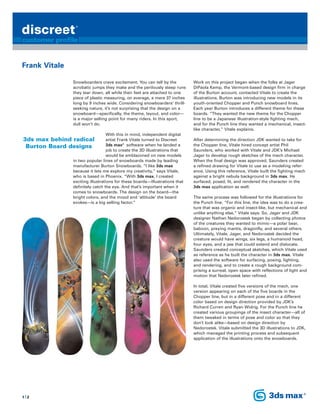
After determining the direction JDK wanted to take for
the Chopper line, Vitale hired concept artist Phil
Saunders, who worked with Vitale and JDK’s Michael
Jager to develop rough sketches of the mech character.
When the final design was approved, Saunders created
a refined drawing for Vitale to use as a modeling refer-
ence. Using this reference, Vitale built the fighting mech
against a bright nebula background in 3ds max. He
surfaced, posed, lit, and rendered the character in the
3ds max application as well.
The same process was followed for the illustrations for
the Punch line. “For this line, the idea was to do a crea-
ture that was organic and insect-like, but mechanical and
unlike anything else,” Vitale says. So, Jager and JDK
designer Nathan Nedorostek began by collecting photos
of the creatures they wanted to mimic—a polar bear,
baboon, preying mantis, dragonfly, and several others.
Ultimately, Vitale, Jager, and Nedorostek decided the
creature would have wings, six legs, a humanoid head,
four eyes, and a jaw that could extend and dislocate.
Saunders created conceptual sketches, which Vitale used
as reference as he built the character in 3ds max. Vitale
also used the software for surfacing, posing, lighting,
and rendering, and to create a rough background com-
prising a surreal, open space with reflections of light and
motion that Nedorostek later refined.
In total, Vitale created five versions of the mech, one
version appearing on each of the five boards in the
Chopper line, but in a different pose and in a different
color based on design direction provided by JDK’s
Richard Curren and Ryan Widrig. For the Punch line he
created various groupings of the insect character—all of
them tweaked in terms of pose and color so that they
don’t look alike—based on design direction by
Nedorostek. Vitale submitted the 3D illustrations to JDK,
which managed the printing process and subsequent
application of the illustrations onto the snowboards.
Snowboarders crave excitement. You can tell by the
acrobatic jumps they make and the perilously steep runs
they tear down, all while their feet are attached to one
piece of plastic measuring, on average, a mere 37 inches
long by 9 inches wide. Considering snowboarders’ thrill-
seeking nature, it’s not surprising that the design on a
snowboard—specifically, the theme, layout, and color—
is a major selling point for many riders. In this sport,
dull won’t do.
With this in mind, independent digital
artist Frank Vitale turned to Discreet
3ds max®
software when he landed a
job to create the 3D illustrations that
would be emblazoned on new models
in two popular lines of snowboards made by leading
manufacturer Burton Snowboards. “I like 3ds max
because it lets me explore my creativity,” says Vitale,
who is based in Phoenix. “With 3ds max, I created
exciting illustrations for these boards—illustrations that
definitely catch the eye. And that’s important when it
comes to snowboards. The design on the board—the
bright colors, and the mood and ‘attitude’ the board
evokes—is a big selling factor.”
3ds max behind radical
Burton Board designs
Frank Vitale
1|2