Beginners Guide to TikTok for Search - Rachel Pearson - We are Tilt __ Bright...
RebootBranding
1. C L U B R E B R A N D I N G
reboot
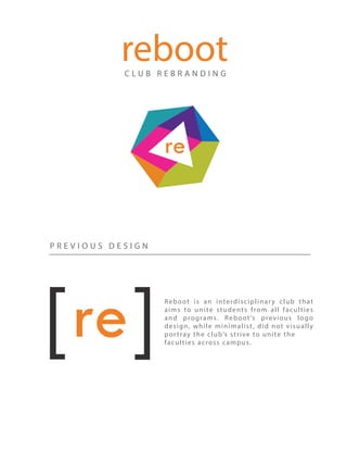
P R E V I O U S D E S I G N
Reboot is an interdisciplinary club that
aims to unite students from all faculties
and programs. Reboot’s previous logo
design, while minimalist, did not visually
portray the club’s strive to unite the
faculties across campus.
2. T H E N E W D E S I G N
The final design pulls together all of the faculty
colors in the shape of a hexagon to create a
sense of uniformity and cohesision.
The “re” in the center of the logo was pulled from
the previous design to maintain some of the
club’s previos branding identity.
3. T H E W E B S I T E
I was tasked with designing and co-developing the club’s website using
HTML, CSS and GITHUB for version control. The site is fully responsive
which provides an optimal viewing and interaction experience across a
number of different devices. The site can be viewed at:
http://reboot.build/
4. F A C U L T Y I C O N S + B A N N E R
Faculty icons were used on the club’s website to further emphasize
Reboot’s collaborative nature. We wanted to make sure that it was
clear to students that the club is actively seeking participation from
all faculties.