
Recommended
More Related Content
More from Elliezambakides
More from Elliezambakides (20)
Recently uploaded
Recently uploaded (17)
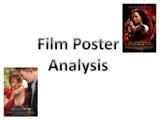
Film poster analysis
- 2. Lionsgate - Lions Gate Entertainment Corporation is a leading independent film and television production company based in Canada. - The company's founder, Frank Giustra, stepped down as CEO in June of that year and his place was taken by former Sony Pictures executive Jon Feltheimer.
- 3. Financial Success - Cost $130 million. - $10 million on visual effects. - It grossed an estimated $493,000 in the first 49 days. - Biggest November opening weekend of all time ($58.1 million).
- 4. USP - USP – Strong female protagonist, survivor to revolutionary. - Jennifer Lawrence, Josh Hutcherson, Lenny Kravitz, Liam Hemsworth, Woody Harrelson, Elizabeth Banks, Donald Sutherland, Stanley Tucci. - Based off the books.
- 5. Image The main image on the poster is of Jennifer Lawrence who plays Katniss Everdeen, the strong and powerful image of the protagonist holding a bow and arrow is very captivating and striking. She looks very fierce and in control, which many would find appealing and refreshing to see an empowered female lead and are likely to go and see the film. She takes up most of the front cover to show her importance in the film/story line. Her face is oblique left/almost profile. To extenuate her jaw line and make her face shape more prominent to exaggerate her strength in the photo and portray that into her character. Additionally, despite the more profile angle of her face, she is looking directly into the lens of the camera, implying that she is looking directly at you. Moreover, the bow and arrow she is holding is both her signature weapon in the film and also has connotations of power, fearlessness and courage. In addition the way she is holing her weapon as if she is hunting and the eye match suggests she is hunting us and we are her target, which will attract people’s attention. The colours used in the image are very dark colours eg black and red. The purpose choice of these colours symbolise danger, anger and rage. The darkness of her hair and forearm of her sleeve and body suit have negative connotations. The indexible signifier is her holding the bow and arrow as if she is aiming and ready to fire and the image has been taken as though it is a still and she is aiming. Billing Block At the bottom of the poster in very small writing is the cast and crew of the film, who it is produced by, film companies, directors, screenplay etc. it is in very small writing because it is important by it is not compulsory to read and doesn't want to distract from the main image/sell line. Film Title A large part of a film poster is the title of the film. ‘The Hunger Games: Catching Fire’ is a sequel to the first film. It is very eye catching and prominent and stands out against the background/main image of the poster. The writing is in gold letters that darken at the edges to give it an almost 3D effect. The gold letters represent importance, success and status, as well as being visible against the background. Release Date At the bottom of the poster it tells us the release date of the film. This is important so the audience knows when they are going to see the film. Moreover it is in big letters but not too big as it is not the main focus of the poster. Colour Scheme The colours used are very dark reds, oranges, blacks and gold's. The red represents danger and aggression, it is a very noticeable colour. The black signifies something darker and dangerous, it also allows the other colours used to stand out more. The oranges mixed with red replicate fire, symbolising destruction and chaos. The running cold writing has connotations of power and success. Tag Line ‘Remember who the enemy is’ this is a very thought provoking and powerful tag line as it seems like the protagonist is aiming at her enemy (or audience). Its also telling her to be cautious.
- 6. Enigma The tag line of the poster reads ‘remember who the enemy is’ despite the fact this is not literally a question, it has an underlying question of ‘who is the enemy’. We want to find out who the enemy is by going to see the film. The poster has a slight mystery to it as the title is ‘catching fire’ the background is flaming, and Katniss (the lead character) is known as ‘the girl on fire’ however to make the relation between all three things you need to see the film. Moreover, she looks as though she is aiming at someone which then links to the tag line and posses the question, who is she aiming at. Which will make the audience want to see the film to figure out the mystery. What Does the Poster Tell Us The poster is very dark and mysterious and tells us that something or someone is being targeted. Additionally, the poster tells us the film will have an element of action and danger and that the lead is going to end or start some sort of uprising. This is created from the fire behind her and the bow and arrow she is holding. We also learn that the film is probably aimed at 12-30 years olds as the actress on the front is very popular and current. This is also because people of that age group are more likely to have read the books and therefore be more inclined to see the film. However, it will appeal to elder people as well as it is an all round action adventure. Furthermore, it tells us that the lead is a strong and empowered female which is more unusual to see. Director The director of catching fire is a man called Francis Lawrence. In his films he tends to use quite dark lighting and creates quite angled shots. His is the directed for all the hunger games films Ideology This has quite a feminist ideology as it subtly promotes gender equality by having a strong female lead as this is not that common. It shows that women can be powerful and revolutionary. This then links to the hegemonic norm, seeing as an independent and forceful woman is not the norm it is an inspiration for others and will attract people’s attention. Male gaze (the camera is always male) does not affect this film that much as the lead female is playing an action adventure role and is taking over the part that a male would usually play in this instance. Also seeing as the first half of the film is in the snow everyone is wrapped up very well and covered. High concept Film This is a high concept film as is considered easy to sell to a wide audience because it delivers upon an easy-to-grasp idea. The film can be summed up by an iconic image such as Jennifer/Katniss and the Mockingjay pin in the background. Things Associated With This Film The film can associated the idea of women dominance, it can also associate the Mockingjay pin in the background as that is a key symbol of the hunger games. Moreover, the books are significantly associated with the film as the film is based off the books. Signifiers The title ‘catching fire’ does not literally mean she is catching fire it signifies her rising from the ashes and taking control of her life/her situation. It further links the running theme of fire throughout the film as well.
- 7. Working Title - Working Title Films is a British film production company, based in London owned by Universal Studios. - Working Title Films was co-founded by producers Tim Bevan and Sarah Radclyffe in 1983.
- 8. Financial Success - The film became a surprise hit in South Korea, where it was watched by more than 3 million people, one of the highest numbers among the foreign romantic comedy movies released in Korea. It grossed the total of $23,434,443, which is the highest figure compared to the other countries.
- 9. USP - USP – a man who can time travel falls in love with a woman. - Domhnall Gleeson, Rachel McAdams, Bill Nighy, Lydia Wilson, Lindsay Duncan, Richard Cordery, Joshua McGuire.
- 10. Image The main image on the poster is of the two main characters in the film. Tim and Mary are the characters the actors play, and the image on the poster is of their wedding day. Both characters are very happy and joyful which is evident through their smiles. Our eyes go more towards Mary as she takes up more of the poster and we can see her smile/face better. Additionally, she is wearing a red dress which stands out on the poster as it is very vibrant and the brightest colour on the page. She looks ecstatic and the way we can see her face as if she is in mid movement portrays her joy even more as it is like she is in the moment and the audience is joining her. The happy emotions felt through the poster convey to they audience that the film will have some very sweet and up beat moments in it. Furthermore, the male in the image also looks delighted, however we have a profile view of him so he seems to not be as much of a focus in comparison. He feels the same emotions as she does and we can see this through his large grin. The clothes she is wearing are very eye catching and pretty/feminine, whilst the suit he is wearing is very smart. The film is a romantic comedy and the poster does a good job of reflecting the genre of film. The lighting is very bright and cheerful and the people look jubilant and in love. The colours are bright and vibrant and fresh. It is raining in the image, however, the couple do not mirror the mood that the weather is creating and throughout all odds seem to be unaffected by miserable things and focus on the good things. Billing Block At the bottom of the poster in very small writing is the cast and crew of the film, who it is produced by, film companies, directors, screenplay etc. it is in very small writing because it is important by it is not compulsory to read and doesn't want to distract from the main image/sell line. Release Date At the bottom of the poster it tells us the release date of the film. This is important so the audience knows when they are going to see the film. Additionally, the white writing stands out against the red dress. However the writing is not too big and bold that we are distracted from the rest of the poster. Tag Line ‘What if every moment in life came with a second chance?’ this highlights and suggests that the film will include life lessons. The film is about time travel hence the play on words that life comes with a second chance. The tag line is central of the poster as they want it to be seen however the text is not too big so it does not capture our immediate attention. Film Title A large part of a film poster is the title of the film. ‘About Time’ has the word ‘about in non capitals and normal text. Whilst the word ‘time has a capital letter and is in bold, to attract more attention to the word time as it is a film about time travel. The white writing is easy to read. Colour Scheme The colours in the poster are very bright and light and symbolise a happy atmosphere and reflect the colours that most rom-coms will use in a poster. The red dress symbolises love and passion between the two characters. The bright lighting highlights that the film will be up beat at times.
- 11. Enigma The tag line of the poster reads ‘What if every moment in life came with a second chance?’ the question is a subtly suggesting that the plot of the story has something to do with second chances. As the film is about time travel this is the ‘second chance’ in life. It also poses the question that gets the audience thinking if they had a second chance in life. The mystery in the title ‘about time’ further hints at the idea of time travel. Furthermore, the characters seem very happy and we ask ourselves why they are smiling so much and this links back to the tag line as maybe their second chance in life has made them happy. What Does the Poster Tell Us The poster is very bright and colourful suggesting that the film will be a romantic comedy as the red symbolises passion and love but the brightness of the posters has a light feel to it. This is created through the smiles on their face and the juxtaposing pathetic fallacy as the weather is not reflecting their mood which further constructs the light mood. The poster also tells us that the film is predominantly aimed at females from the ages of 15-30 year olds. This is due to the emotional content of the film. Moreover, women and people of that age group are more likely to connect with the film and get emotional (plus it is a love story and they tend to be more geared towards women). Although it could appeal to anyone who likes a very emotional love story/romantic comedy. Director The director of About Time is a man called Richard Curtis. He commonly directs/writes romantic films and uses bright imagery and he has done a few working title films. He has directed films like Love Actually, and worked on films like Notting Hill. Ideology This has a very common gender stereotype that a woman and a man will fall in love. It is very often that you will find a poster with a man and a woman on the front that promote a heterosexual love affair. This is a hegemonic norm as an attractive set couple of people fall in love and promote the idea of an aspirational love that people wish they could have. People will be captured by the possibility at a perfect romance. Male gave does slightly affect this as the image captures more of the woman and she is wearing a slightly revealing dress. Also it portrays the idea that a man initiates his feelings fro the woman and then she falls in love with him. Things Associated With This Film The film can associated the idea an ideal romance between a man and a woman, and the happiness that comes with this. Moreover, it associates the idea that when you’re in love nothing can ruin it (and in reference to the poster this would be the rain). Signifiers The title ‘about time’ symbolises the concept that time has an incredible impact on our life. It also links with the idea of time travel. Furthermore, it continues the aspect that time is incontrollable, and we cannot have control over time. Concept Film Whilst this is not a high concept film, however the film did do quite well. There are no iconic images in this as it is an individual film and has no prequels or sequels. However, they use a famous actress ( Rachel McAdams) on the front/in the film to draw in an audience.