Innovations in London's Transport: Big Data for a Better Customer Service
TheInsAndOutsOfTheNewYorkCitySubwaySystem
1. The Ins and Outs of the New York City
Subway System
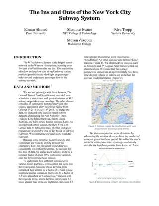
Eiman Ahmed
Pace University
Shannon Evans
NYC College of Technology
Steven Vazquez
Manhattan College
Riva Tropp
Yeshiva University
INTRODUCTION
The MTA Subway System is the largest transit
network in the Western Hemisphere, boasting over
five and a half million trips per day. The availability
of inflow and outflow data at each subway station
provides possibilities to shed light on passenger
behavior and understand passenger flow in the
subway network.
DATA AND METHODS
We worked primarily with three datasets. The
General Transit Feed Specification provided train
schedules, transit times, and geo-coordinates of 487
subway stops taken over two days. The other dataset
consisted of cumulative turnstile entry and exit
counts, aggregated every four hour period from
October 1st
2014 to July 18th
2015. To merge the
data, we included only stations extant in both
datasets, eliminating the Port Authority Trans-
Hudson, Long Island Railroad, Staten Island
Railway, and New Jersey Transit stations. Later, we
incorporated a third dataset, the New York City
Census data by tabulation area, in order to display
population variation by time of day based on subway
ridership. We constrained our analysis to weekday
ridership.
Because some turnstiles do not log exits and
commuters are prone to exiting through the
emergency door, the exit count in our data was
consistently lower than the entries. To account for
this loss of data, we scaled each station’s exits by a
constant factor of about 30%, with some variation
over the different four hour periods.
To understand how different stations serve
various transit purposes, we classified the stops into
three categories. Stations whose daytime exits
outranked their entries by a factor of 1.3 and whose
nighttime entries outranked their exits by a factor of
1.3 were classified as ‘Commercial.’ Stations with
the opposite trend, where daytime entries were 1.3
times greater than exits and nighttime exits were 1.3
times greater than entries were classified as
‘Residential.’ All other stations were termed ‘Link’
stations (Figure 1). We identified key stations, such
as Fulton St and 7th
Avenue Penn Station to test our
classifications. We found that the average
commercial station had an approximately two-three
times higher volume of entries and exits than the
average residential station (Figure 2).
Figure 1: Stations colored by classification, with sizes
proportionate to average daily entries.
We then computed net exits of stations by
subtracting the number of entries from the number of
exits in a given four hour period. We added the area’s
net-exits to its census data, counting cumulatively
over the six four-hour periods from 4 a.m. to 12 a.m.
Figure 2: Comparison of net exits per station classification
2. Figure three contrasts the census population
with our improved metric at noontime. Population in
commercial areas, such as Midtown, Soho, and the
financial district increased as much as tenfold while
population in Queens’ and Brooklyn’s residential
areas decreased. The net-exits also revealed how
regions’ populations vary sharply throughout the day.
Incorporating census information with geographically
correlated net-exits provided one view of New
York’s changing populations. To get a clearer
impression of how subway passengers traverse the
regions of New York throughout the day, we decided
to compute the flow of passengers over the MTA
transit network.
Using an adjacency matrix, we defined a
directed graph where nodes represented stations
whose lines were freely accessible, without cost to
transfer. Edges were then defined as rail-links
between adjacent stations, with edge costs defined as
the amount of time it took to travel between two
stations according to the official schedule. Demands
were then assigned to each node as the net hourly-
rate of exits. Our flow defined, for each edge, the rate
at which people travel between stations.
Since subway passengers look to minimize
travel-time, we used a minimum cost flow algorithm
to model behavior over the network. For each edge
between stations, the flow contained a direction and a
magnitude proportionate to the volume of net traffic.
Flows directions across the network were classified
as inbound if the station their flow was going towards
was closer to Grand Central and outbound if the
converse was true.
As the census figures suggested, morning
passengers flow towards Midtown Manhattan while
evening passengers flow towards residential Queens,
Bronx, and Brooklyn areas. In accordance with
findings of the high volume of commercial stations
compared to their residential counterparts, flow size
increases by proximity to Manhattan (Figure 4).
APPLICATIONS
Quantifying the behavior of New Yorkers over
the largest transit network in North America opens up
a multitude of possibilities for future examination.
Studies involving population-based rates can be
improved by incorporating our more accurate
metrics. Subway-flow can also be utilized for a
variety of research areas, such as epidemiology
where the flow of bacteria through NYC can be
studied. In addition, inner and cross city bus systems
can be incorporated into our computed flow for an
even more complete picture of the city’s shifting
populations.
ACKNOWLEDGMENTS
We thank our mentors Justin Rao, Sebastian
Lahaie, Jake Hoffman, Amit Sharma, Sharad Goel
and Jenn Vaughan for their mentorship as a part of
the 2015 Microsoft Research Data Science Summer
School.
Figure 3: The leftmost map includes raw census information. The Noon and Late Night figures take net-exits into account.
Figure 4: Flow computations during the morning and
evening. Stations colored by classification, sized by
magnitude of flow.