3. CJT Portfolio 2016 Layout
ChristopherJThomson
CommunicationsCouncialAustralia
cjthomson.com
1110
Communications
Council
publication.
layout.
print.
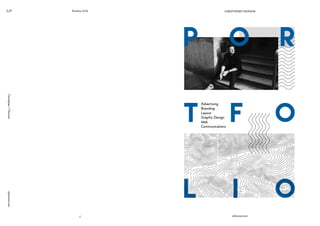
A workshop run by the Communication
council and spoke by the Thought Police,
The workshop aims to communicate the
art and science behind digital and social
media. With the content discussing spread,
visual imagery of spreading ink was used
to connect the concept with something
as simple as liquids moving on paper. The
visual update and organisation of content
was to make the workshop more engaging
and provide attendees with a booklet that
would be used and valued, rather than
having simple print outs that would just be
thrown away.
4. Portfolio 2016
ChristopherJThomsoncjthomson.com
12
CJT Branding
13
Cultiv8
Having a large amount of fresh, farm
grown produce available but not enough
awareness about their existence, Cultiv8
was born to provide a business with a
more professional and fun image in which
to market to the wider community. The
name and branding are to exhibit fun
and colourful personality to fruit and
vegetables; the shop offering 8 items
each day it is set up. The branding was
applied to not just car decals and signage,
but also a presence on social media that
makes ingredient fun, while also providing
a personal element to connect with the
community.
branding.
logo design.
social media.
Cultiv8
5. CJT Portfolio 2016
ChristopherJThomsoncjthomson.com
14
Branding
15
MoxieBrew
Owners of the popular Mingle bar in
Canberra decided to sell the bar and
open up a new Espresso Bar and canapé
business in an area predominantly
frequented by government employees
and business people. The concept for the
bar was to revolve around Edmund Barton,
whether in historical imagery or from his
name. MoxieBrew was created to embody
the personality of Barton through the
concept of his determination and wit to
becoming prime minister.
branding.
logo design.
Visual ID.
MoxieBrew
6. CJT Portfolio 2016
ChristopherJThomsoncjthomson.com
16
ChrysalisSmatterings
Social & Digital
jobactive
17
jobactive
The Department of Employment launched
its jobactive campaign in 2015. The
initial implementation was to include
social media posts, with Facebook
as the designated platform. With the
content often being advertising and of
a subject that is harder to communicate
and persuade. More engaging visuals
that are more eye catching and different
from typical governmental social media
posts are created to improve the reach of
message and encourage them to engage.
social.
illustration.
print.
7. CJT Portfolio 2016
ChristopherJThomsoncjthomson.com
18
ChrysalisSmatterings
Exhibition Design
jobactive
19
Chrysalis
With the University of Canberra holding
creative show-cases for their graduating
classes a call out was made for exhibition
design and set up. To encompass the idea
of students making their break into the
job market and the ‘real world’, the idea
of chrysalis was born. The transitional state
into a butterfly, the concept of the theme
was to represent people transitioning.
Bold graphical elements for text, and 3
geometric shapes to represent each stage
of chrysalis were developed; accompanying
illustrations for each to provide a range of
imagery to promote the exhibition.
exhibition design.
branding.
illustration,
8. CJT Portfolio 2016
ChristopherJThomsoncjthomson.com
20
ChrysalisSmatterings
Web
jobactive
21
Smatterings
Smatterings is a news and culture website
to launch in September 2015. Branding
and Web element design featured bold
text and geometric shapes to represent
the actualization of the concept of ‘just
a smattering’ of content. Being a media
publishing site focused on politics, culture
and news the design had to be clean and
professional but attempt to stand apart
from other similar sites.
web.
branding.