1. 1 SLIDE
The topic of this research is climate change and povertu in developing countries as the title
suggests. Personally, I chose this topic because I have always been interested in climate change and
its possible effects. However, before running this research I read some articles and reports which
point out a correlation between natural disasters due to climate change and poverty.
2 SLIDE Nothing to say
3 SLIDE
For example, the report…...Indeed, The World Bank Group…..Also a Global Facility for Disaster
Reduction and Recovery lead economist supported this thesys, saying countries are enduring….for
this reason, the only way…..
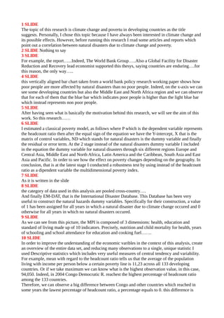
4 SLIDE
this vertically aligned bar chart taken from a world bank policy research working paper shows how
poor people are more affected by natural disasters than no poor people. Indeed, on the x-axis we can
see some developing countries but also the Middle East and North Africa region and we can observe
that for each of them that the blue bar which indicates poor people is higher than the light blue bar
which instead represents non poor people.
5 SLIDE
After having seen what is basically the motivation behind this research, we will see the aim of this
work. So this research……
6 SLIDE
I estimated a classical poverty model, as follows where P which is the dependent variable represents
the headcount ratio then after the equal sign of the equation we have the Y-intercept, X that is the
matrix of control variables, ND which stands for natural disasters is the dummy variable and finally
the residual or error term. At the 2 stage instead of the natural disasters dummy variable I included
in the equation the dummy variable for natural disasters through six different regions Europe and
Central Asia, Middle East and North Africa, Latin America and the Caribbean, South Asia and East
Asia and Pacific. In order to see how the effect on poverty changes depending on the geography. In
conclusion, that is at the latest stage I conducted a robustness test by using instead of the headcount
ratio as a dipendent variable the multidimensional poverty index.
7 SLIDE
As it is written in the slide
8 SLIDE
the category of data used in this analysis are pooled cross-country….
And finally EM-DAT, that is the International Disaster Database. This Database has been very
useful to construct the natural hazards dummy variables. Specifically for their construction, a value
of 1 has been assigned for all years in which a natural disaster due to climate change occured and 0
otherwise for all years in which no natural disasters occured.
9 SLIDE
As we can see from this picture, the MPI is composed of 3 dimensions: health, education and
standard of living made up of 10 indicators. Precisely, nutrition and child mortality for health, years
of schooling and school attendance for education and cooking fuel…….
10 SLIDE
In order to improve the understanding of the economic varibles in the context of this analysis, create
an overview of the entire data set, and reducing many observations to a single, unique statistic I
used Descriptive statistics which includes very useful measures of central tendency and variability.
For example, mean with regard to the headcount ratio tells us that the average of the population
living with income per person below a certain poverty line is 11,23 across all 133 developing
countries. Or if we take maximum we can know what is the highest observation value, in this case,
94,050. Indeed, in 2004 Congo Democratic R. reachest the highest percentage of headcount ratio
among the 133 countries.
Therefore, we can observe a big difference between Congo and other countries which reached in
some years the lawest percentage of headcount ratio, a percentage equals to 0. this difference is
2. showed by range. We can then convert the 0,766 mean of the natural disasters dummy variable in
percentage, in this way we can say that 76 % represents the percentage of years in which natural
disasters occured in all 133 countries.
11 SLIDE
Apparently this scatterplot shows a relationship between headcount ratio and natural disasters that
has not correlation because we can see how the points do not show any pattern
13 SLIDE
We can say the same thing with respect to this scatterplot which shows the relationship between
MPI and natural disasters. In fact, also in this case data point spread is very random
14 SLIDE
In order to assess the significance of the natural disasters regression coefficient I run the so called t-
test. Here, we can see that the test statistic is greater than the critical t-value this simply means that
we cannot reject the null hypothesis, therefore, we failed to reject the null hypothesis. Also we can
observe that the p-value for the natural disasters regression coefficients is greater than the level of
significance, once again this suggests us that we cannot reject the null hypothesis and therefore we
conclude that there is probably no effect or statistically significant relationship between poverty and
natural disasters.
15 SLIDE
In order to assess the overall significance of the model, I run the F-test. Here, we can see that the
significance of f is lower than the level of significance. Since the significance F……...the p-value
for the average years of schooling is lower than the level of significance. This simply means that is
statistically significant. As we can see also rural population, people using…..are statistically
significant. The only indipendent varible that is statistically unsignificant is urban population.
16 SLIDE
In this summary output which shows the pooled regression analysis between MPI and Natural
Disasters we can see that also in this case the natural disasters dummy variable regression
coefficient is positive which means like in the case of the pooled regression analysis between
Headcount ratio and Natural Disasters that natural disasters have a positive impact on poverty.
17 SLIDE
First of all, we can see that the p-value column and the significance F which is in few words the p-
value for the overall model are highlighted in blue because we previously used this values to run the
F and T test.
Than, we can observe that we have a positive coefficient for natural disasters dummy variable,
average household size,…...and a negative coefficient for labor force participation…..
A positive coefficient indicates that as the value of the indipendent variables increase, so as the
value of natural disasters, average household size…..increases the mean of the dependent variable
also tends to increase, so the mean of the headcount ratio also tends to increase. On the contrary, a
negative coefficient suggests that as the value of the indipendent variable increases, so as the value
of labor force participation rate, people….increases the mean of the dependent variable tends to
decrease, the mean of the headcount ratio decreases. Another important value that we can observe
here is the so called coefficient of determination that is often used to evaluate the overall goodness
of fit for the model. However, when we have more than a indipendent variable it is more
appropriate to look at the adjusted coefficient of determinatio. We can see that the adjusted
coefficient of determination is 68 % this means that these 10 indipendent variables that we used in
this regression analysis explain 68 % of the variation in the dependent variable, that is the
headcount ratio. In general, the higher the R squared , the better the model fits the data. However, it
is important not to judge regression results based solely on the coefficient of determination value
obtained.
18 SLIDE
In this summary output which shows the pooled regression analysis between MPI and Natural
Disasters we can see that also in this case the natural disasters dummy variable regression
3. coefficient is positive which means like in the case of the pooled regression analysis between
Headcount ratio and Natural Disasters that natural disasters have a positive impact on poverty
19 SLIDE
As I said at the biginning the aim of this work is also to examine the impact of natural disasters due
to climate change on poverty through 6 different regions. And here from this summary output we
can see which region is positively correlated with poverty. Europe and Central Asia, Sub-Sahara
Africa…...are positively correlated with poverty whereas Middle East and North Africa, South
Asia…..are negatively correlated. In particular, we can see that the region which has a bigger
impact on poverty is the Sub-Sahara Africa which is also statistically significant for our research.
21 SLIDE
In conclusion, we can say that this research…..