SlideShare a Scribd company logo
1 of 5
Download to read offline
stephanie cardon
Using color, pattern, and geometric forms, Stephanie Cardon
explores what she refers to as “intermediary spaces” in her art.
Beacon, Cardon’s first large-scale, outdoor sculpture, is a commission
for deCordova Sculpture Park and Museum. It consists of two eleven-
foot concrete towers connected by a high canopy of two layers of
thin, yellow vinyl-coated steel cables (Cover and Fig. 1). The sculpture
is fully realized as an artwork when viewers walk through, around, and
under its gateway and engage with its spatial and visual qualities.
The yellow wires produce shifting optical effects, which vary with the
viewer’s angle of approach. When observed from the hillside above,
Beacon’s canopy appears as a solid field of color. Walking towards
the work, the planes of color separate into two rows. Standing
directly beneath it, the canopy separates into individual strands.
A further optical effect occurs when the two sets of lines are seen
at an angle, creating irregular waves that seem to ripple, a kinetic
effect known as a moiré pattern. Placed out in the landscape, the
sculpture’s hues are distorted by sun and shadow, as dappled light
filtered through the adjacent trees generates camouflage designs
along the yellow wires and blue-gray concrete columns. The viewer
discovers that Beacon’s monumental structure belies its true nature
as a form in a constant state of flux affected by light, weather, and
changing perspective.
PLATFORM 17 Stephanie Cardon: Beacon
As inspiration for her simultaneous interest in dynamic optical
effects and architectural stability, Cardon cites sources as
varied as the trompe l’oeil wall murals of ancient Roman villas
and the interactive sculptures and installations of the 1950s
Brazilian Neo-Concrete movement. Neo-Concrete artists felt
that abstract geometric art (known as Concrete art) was too
cerebral and closed off from the external world. They sought
ways to enhance the viewer’s corporeal relationship to a work
of art. Hélio Oiticica, one of the leaders of the movement, was
known for his Penetrables (or Penetráveis) from the 1960s
and 1970s. These installations encouraged the viewer to walk
within labyrinths and chambers made of painted walls, plastic
panels, and textiles, fostering an immersive experience of
color and form. Cardon’s Beacon similarly involves the viewer’s
body and mind as one meanders through and around the
sculpture, observing its color and geometric forms.
	
Cardon’s previous sculptures are low-standing concrete block
and bamboo thread constructions. As with Beacon, it is the
space between these works’ anchoring architectural elements
that carries the work’s visual and conceptual weight. Titles
such as Lyre and Oil vs. Water enrich these otherwise abstract
Fig. 2: Soo Sunny Park, SSVT Vapor Slide, 2007
brazed chain link fence, plastic cups, paper
clips, river rocks, cotton strings, iron oxide, latex
paint, artificial light, daylight, 9’10” x 23’ x 42’
Courtesy of the Artist
forms with evocative associations. The suspended threads of Lyre recall
instrumental strings in the same way that Beacon’s title and bright color
suggestively evoke beams of light or a watchful lighthouse. Oil vs. Water
(Fig. 2) connotes instability: its intersecting blue and yellow panels of
strings will never blend into a unified entity.
	
Cardon’s sculptures are informed by her earlier experiments with
photography, specifically camera-less cyanotypes, in which she
incorporated elements of pattern interference. Cyanotypes are made
using light-sensitive paper that develops a white imprint when a
negative form or an object is placed on it. Areas exposed to light turn
rich blue or cyan. Like Cardon’s use of bright yellow in Beacon, the color
blue adds an expressive quality to these works. Cardon refers to author
Rebecca Solnit’s concept of a “blue of longing,” in which landscapes
become layered with a blue tone when viewed from a faraway distance.1
Inspired by the way in which color can convey meaning, Cardon’s
cyanotypes draw attention to the intermediary spaces between distinct
colors, lines, or patterns. In Untitled (Dot on Checkers) (Fig. 3), a design
of small circles layered over a tight grid generates an entirely new visual
effect that Cardon says encapsulates “not being in one place or another,
[but] existing in the space between, a third space.”2
	
This articulation of space created through distance or layering is a
recurring motif in Cardon’s work. Born in the United States to a French
father and American mother, she was raised in France, studied in the
United Kingdom, and for the last several years she has lived in
Boston. Autobiographical connections to her intercontinental
life surface in her art. The sculpture Transatlantic (the weight
of water) (Fig. 4) is exemplary of such sources in her work.
A long, twisted band of blue knitted wool that droops at
the center to the floor imbues the physical heaviness of the
material with the psychological weight that can accumulate
while traversing between different cultures.
	
Cardon’s focus on the “in-between” and creation of a “third
space” in Beacon relates to a broader cultural context.
Contemporary lives are built across enormous distances due
to immigration, opportunity, and chance. Yet, despite these
distances, the contemporary world is becoming ever more
interconnected. The resemblance of Beacon’s electric yellow
cables to telephone wires evokes this connectivity, which
Cardon reinforces by referring to them as “channels of
communication and exchange.”3
The constantly changing
optical patterns created by the cables echo the plurality of
vision with which we experience the world today.
Helen Lewandowski
Koch Curatorial Fellow
	
1
Solnit, Rebecca. “The Blue of Distance.” In A Field Guide for Getting Lost. New York:
Viking, 2005.
2
Artist in conversation with author. October 22, 2015
3
Ibid.
IMAGES
Cover: Stephanie Cardon, Beacon (detail), 2015, 186 x 432 x 60 inches, concrete, wood, and vinyl
coated steel cable. Courtesy of the artist.
Fig. 1: Stephanie Cardon, Beacon, 2015, 186 x 432 x 60 inches, concrete, wood, and vinyl coated
steel cable. Courtesy of the artist.
Fig. 2: Stephanie Cardon, Oil vs. Water, 2013, cement and bamboo string, 11 x 36 x 15 ½ inches.
Courtesy of the artist.
Fig. 3: Stephanie Cardon, Untitled (Dot on Checkers), 2013, cyanotype, 10 ¼ x 7 ½ inches.
Courtesy of the artist. Photograph by HV-Studio, Brussels.	
Fig. 4: Stephanie Cardon, Transatlantic (the weight of water), 2014, mohair and wool yarn,
linen rope, and cement, 2 x 20 feet (installation dimensions variable). Courtesy of the artist.
July 2015–May 2016
deCordova | Sculpture Park and Museum
51 Sandy Pond Road
Lincoln, Massachusetts 01773
781.259.8355 decordova.org
biography
Stephanie Cardon (b. 1978) was born in New York and raised
in France. She earned her MFA from Massachusetts College of
Art and Design, Boston, and a graduate certificate from The
International Center of Photography, NY. Cardon was for-
merly the Executive Editor at Big Red & Shiny, a Boston-based
non-profit organization and online publication committed
to contemporary art. She teaches at Massachusetts College
of Art and Design and University of Massachusetts, Boston.
Cardon has exhibited her work nationally and internationally
at venues including the Boston Sculptors Gallery; Center for
Maine Contemporary Art, Rockport; Fondazione Forma per
la Fotographia, Rome; Galerie Michèle Chomette, Paris; and
Kingston Gallery, Boston.
PLATFORM
PLATFORM is a series of one-person commissioned
projects by early- and mid-career artists from New
England and the world, that engage with deCordova’s
unique landscape. The PLATFORM series is intended as
a support for creativity and the expression of new ideas,
and as a catalyst for dialogue about contemporary art.

More Related Content

Similar to PLATFORM 17 draft 4

Visual elements
Visual elementsVisual elements
Visual elementsZalevskaya
 
Name Professor Katharine Ward ARH 206 10 Novembe.docx
Name Professor Katharine Ward ARH 206 10 Novembe.docxName Professor Katharine Ward ARH 206 10 Novembe.docx
Name Professor Katharine Ward ARH 206 10 Novembe.docxdohertyjoetta
 
"L'espoir: Makoto Hatori" at Suruga-Dai Gallery, Kanda, Tokyo, 1969
 "L'espoir: Makoto Hatori" at Suruga-Dai Gallery, Kanda, Tokyo, 1969 "L'espoir: Makoto Hatori" at Suruga-Dai Gallery, Kanda, Tokyo, 1969
"L'espoir: Makoto Hatori" at Suruga-Dai Gallery, Kanda, Tokyo, 1969Makoto Hatori
 
GCSE Art Exam fragments SOW
GCSE Art Exam fragments SOWGCSE Art Exam fragments SOW
GCSE Art Exam fragments SOWMelanie Powell
 
Week 2: Researching Practices
Week 2: Researching PracticesWeek 2: Researching Practices
Week 2: Researching Practicescharlesrobb
 
The architectural review (2002-2005)-part 1
The architectural review (2002-2005)-part 1The architectural review (2002-2005)-part 1
The architectural review (2002-2005)-part 1Invisible Architect
 
Catalogue Becky Buchanan
Catalogue Becky BuchananCatalogue Becky Buchanan
Catalogue Becky BuchananVictoria Clarke
 
ART WEEK 2 8.30.pptx
ART WEEK 2 8.30.pptxART WEEK 2 8.30.pptx
ART WEEK 2 8.30.pptxEvaBorer2
 
ClyffordStill_finalpdf_2015
ClyffordStill_finalpdf_2015ClyffordStill_finalpdf_2015
ClyffordStill_finalpdf_2015Grace Kwon
 
REPLY TO THE DISCUSSIONS· DIS 1Trace the evolution and dev.docx
REPLY TO THE DISCUSSIONS· DIS 1Trace the evolution and dev.docxREPLY TO THE DISCUSSIONS· DIS 1Trace the evolution and dev.docx
REPLY TO THE DISCUSSIONS· DIS 1Trace the evolution and dev.docxchris293
 
RobertStuart_Essay_VoicesofArt_2004
RobertStuart_Essay_VoicesofArt_2004RobertStuart_Essay_VoicesofArt_2004
RobertStuart_Essay_VoicesofArt_2004Mary Mikel Stump
 
Introduction to Art History
Introduction to Art HistoryIntroduction to Art History
Introduction to Art HistoryJohn Ricard
 

Similar to PLATFORM 17 draft 4 (20)

Art Analysis Form
Art Analysis FormArt Analysis Form
Art Analysis Form
 
Chapter 2
Chapter 2Chapter 2
Chapter 2
 
Visual elements
Visual elementsVisual elements
Visual elements
 
Name Professor Katharine Ward ARH 206 10 Novembe.docx
Name Professor Katharine Ward ARH 206 10 Novembe.docxName Professor Katharine Ward ARH 206 10 Novembe.docx
Name Professor Katharine Ward ARH 206 10 Novembe.docx
 
Season powerpoint 2012-13
Season powerpoint 2012-13 Season powerpoint 2012-13
Season powerpoint 2012-13
 
Chapter2
Chapter2Chapter2
Chapter2
 
BARBARAKERWINART_45pp
BARBARAKERWINART_45ppBARBARAKERWINART_45pp
BARBARAKERWINART_45pp
 
Art Analysis Essay
Art Analysis EssayArt Analysis Essay
Art Analysis Essay
 
tribune path
tribune pathtribune path
tribune path
 
"L'espoir: Makoto Hatori" at Suruga-Dai Gallery, Kanda, Tokyo, 1969
 "L'espoir: Makoto Hatori" at Suruga-Dai Gallery, Kanda, Tokyo, 1969 "L'espoir: Makoto Hatori" at Suruga-Dai Gallery, Kanda, Tokyo, 1969
"L'espoir: Makoto Hatori" at Suruga-Dai Gallery, Kanda, Tokyo, 1969
 
GCSE Art Exam fragments SOW
GCSE Art Exam fragments SOWGCSE Art Exam fragments SOW
GCSE Art Exam fragments SOW
 
Week 2: Researching Practices
Week 2: Researching PracticesWeek 2: Researching Practices
Week 2: Researching Practices
 
Maya lin
Maya linMaya lin
Maya lin
 
The architectural review (2002-2005)-part 1
The architectural review (2002-2005)-part 1The architectural review (2002-2005)-part 1
The architectural review (2002-2005)-part 1
 
Catalogue Becky Buchanan
Catalogue Becky BuchananCatalogue Becky Buchanan
Catalogue Becky Buchanan
 
ART WEEK 2 8.30.pptx
ART WEEK 2 8.30.pptxART WEEK 2 8.30.pptx
ART WEEK 2 8.30.pptx
 
ClyffordStill_finalpdf_2015
ClyffordStill_finalpdf_2015ClyffordStill_finalpdf_2015
ClyffordStill_finalpdf_2015
 
REPLY TO THE DISCUSSIONS· DIS 1Trace the evolution and dev.docx
REPLY TO THE DISCUSSIONS· DIS 1Trace the evolution and dev.docxREPLY TO THE DISCUSSIONS· DIS 1Trace the evolution and dev.docx
REPLY TO THE DISCUSSIONS· DIS 1Trace the evolution and dev.docx
 
RobertStuart_Essay_VoicesofArt_2004
RobertStuart_Essay_VoicesofArt_2004RobertStuart_Essay_VoicesofArt_2004
RobertStuart_Essay_VoicesofArt_2004
 
Introduction to Art History
Introduction to Art HistoryIntroduction to Art History
Introduction to Art History
 

PLATFORM 17 draft 4

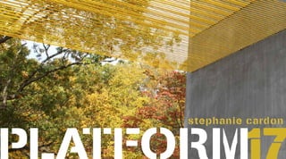
  • 2. Using color, pattern, and geometric forms, Stephanie Cardon explores what she refers to as “intermediary spaces” in her art. Beacon, Cardon’s first large-scale, outdoor sculpture, is a commission for deCordova Sculpture Park and Museum. It consists of two eleven- foot concrete towers connected by a high canopy of two layers of thin, yellow vinyl-coated steel cables (Cover and Fig. 1). The sculpture is fully realized as an artwork when viewers walk through, around, and under its gateway and engage with its spatial and visual qualities. The yellow wires produce shifting optical effects, which vary with the viewer’s angle of approach. When observed from the hillside above, Beacon’s canopy appears as a solid field of color. Walking towards the work, the planes of color separate into two rows. Standing directly beneath it, the canopy separates into individual strands. A further optical effect occurs when the two sets of lines are seen at an angle, creating irregular waves that seem to ripple, a kinetic effect known as a moiré pattern. Placed out in the landscape, the sculpture’s hues are distorted by sun and shadow, as dappled light filtered through the adjacent trees generates camouflage designs along the yellow wires and blue-gray concrete columns. The viewer discovers that Beacon’s monumental structure belies its true nature as a form in a constant state of flux affected by light, weather, and changing perspective. PLATFORM 17 Stephanie Cardon: Beacon As inspiration for her simultaneous interest in dynamic optical effects and architectural stability, Cardon cites sources as varied as the trompe l’oeil wall murals of ancient Roman villas and the interactive sculptures and installations of the 1950s Brazilian Neo-Concrete movement. Neo-Concrete artists felt that abstract geometric art (known as Concrete art) was too cerebral and closed off from the external world. They sought ways to enhance the viewer’s corporeal relationship to a work of art. Hélio Oiticica, one of the leaders of the movement, was known for his Penetrables (or Penetráveis) from the 1960s and 1970s. These installations encouraged the viewer to walk within labyrinths and chambers made of painted walls, plastic panels, and textiles, fostering an immersive experience of color and form. Cardon’s Beacon similarly involves the viewer’s body and mind as one meanders through and around the sculpture, observing its color and geometric forms. Cardon’s previous sculptures are low-standing concrete block and bamboo thread constructions. As with Beacon, it is the space between these works’ anchoring architectural elements that carries the work’s visual and conceptual weight. Titles such as Lyre and Oil vs. Water enrich these otherwise abstract
  • 3. Fig. 2: Soo Sunny Park, SSVT Vapor Slide, 2007 brazed chain link fence, plastic cups, paper clips, river rocks, cotton strings, iron oxide, latex paint, artificial light, daylight, 9’10” x 23’ x 42’ Courtesy of the Artist forms with evocative associations. The suspended threads of Lyre recall instrumental strings in the same way that Beacon’s title and bright color suggestively evoke beams of light or a watchful lighthouse. Oil vs. Water (Fig. 2) connotes instability: its intersecting blue and yellow panels of strings will never blend into a unified entity. Cardon’s sculptures are informed by her earlier experiments with photography, specifically camera-less cyanotypes, in which she incorporated elements of pattern interference. Cyanotypes are made using light-sensitive paper that develops a white imprint when a negative form or an object is placed on it. Areas exposed to light turn rich blue or cyan. Like Cardon’s use of bright yellow in Beacon, the color blue adds an expressive quality to these works. Cardon refers to author Rebecca Solnit’s concept of a “blue of longing,” in which landscapes become layered with a blue tone when viewed from a faraway distance.1 Inspired by the way in which color can convey meaning, Cardon’s cyanotypes draw attention to the intermediary spaces between distinct colors, lines, or patterns. In Untitled (Dot on Checkers) (Fig. 3), a design of small circles layered over a tight grid generates an entirely new visual effect that Cardon says encapsulates “not being in one place or another, [but] existing in the space between, a third space.”2 This articulation of space created through distance or layering is a recurring motif in Cardon’s work. Born in the United States to a French father and American mother, she was raised in France, studied in the
  • 4. United Kingdom, and for the last several years she has lived in Boston. Autobiographical connections to her intercontinental life surface in her art. The sculpture Transatlantic (the weight of water) (Fig. 4) is exemplary of such sources in her work. A long, twisted band of blue knitted wool that droops at the center to the floor imbues the physical heaviness of the material with the psychological weight that can accumulate while traversing between different cultures. Cardon’s focus on the “in-between” and creation of a “third space” in Beacon relates to a broader cultural context. Contemporary lives are built across enormous distances due to immigration, opportunity, and chance. Yet, despite these distances, the contemporary world is becoming ever more interconnected. The resemblance of Beacon’s electric yellow cables to telephone wires evokes this connectivity, which Cardon reinforces by referring to them as “channels of communication and exchange.”3 The constantly changing optical patterns created by the cables echo the plurality of vision with which we experience the world today. Helen Lewandowski Koch Curatorial Fellow 1 Solnit, Rebecca. “The Blue of Distance.” In A Field Guide for Getting Lost. New York: Viking, 2005. 2 Artist in conversation with author. October 22, 2015 3 Ibid. IMAGES Cover: Stephanie Cardon, Beacon (detail), 2015, 186 x 432 x 60 inches, concrete, wood, and vinyl coated steel cable. Courtesy of the artist. Fig. 1: Stephanie Cardon, Beacon, 2015, 186 x 432 x 60 inches, concrete, wood, and vinyl coated steel cable. Courtesy of the artist. Fig. 2: Stephanie Cardon, Oil vs. Water, 2013, cement and bamboo string, 11 x 36 x 15 ½ inches. Courtesy of the artist. Fig. 3: Stephanie Cardon, Untitled (Dot on Checkers), 2013, cyanotype, 10 ¼ x 7 ½ inches. Courtesy of the artist. Photograph by HV-Studio, Brussels. Fig. 4: Stephanie Cardon, Transatlantic (the weight of water), 2014, mohair and wool yarn, linen rope, and cement, 2 x 20 feet (installation dimensions variable). Courtesy of the artist.
  • 5. July 2015–May 2016 deCordova | Sculpture Park and Museum 51 Sandy Pond Road Lincoln, Massachusetts 01773 781.259.8355 decordova.org biography Stephanie Cardon (b. 1978) was born in New York and raised in France. She earned her MFA from Massachusetts College of Art and Design, Boston, and a graduate certificate from The International Center of Photography, NY. Cardon was for- merly the Executive Editor at Big Red & Shiny, a Boston-based non-profit organization and online publication committed to contemporary art. She teaches at Massachusetts College of Art and Design and University of Massachusetts, Boston. Cardon has exhibited her work nationally and internationally at venues including the Boston Sculptors Gallery; Center for Maine Contemporary Art, Rockport; Fondazione Forma per la Fotographia, Rome; Galerie Michèle Chomette, Paris; and Kingston Gallery, Boston. PLATFORM PLATFORM is a series of one-person commissioned projects by early- and mid-career artists from New England and the world, that engage with deCordova’s unique landscape. The PLATFORM series is intended as a support for creativity and the expression of new ideas, and as a catalyst for dialogue about contemporary art.