
Recommended
More Related Content
Similar to 3 Nations Floorball League Manual
Recently uploaded
Recently uploaded (20)
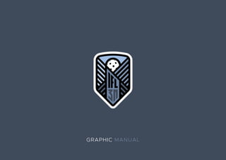
3 Nations Floorball League Manual
- 2. AN IDEA After a successful rookie season of International Floorball League we represent you a new visual identity of the extended compe- tition between top 3 clubs from Austria, Slovenia and Hungary. We came to an idea to combine one symbol that relates to all three countries. Because the ea- gle is connected in many of the history tales, we decided to put a little touch of the wings in the logo itself. Combining the wings with the floorball ball and the name of the league is the result of the mini- malistic and simple identity that can be used in a modern graphic design.
- 3. MAIN LOGO This is the full version of the logotype that is used for men’s competi- tion in multicolor design. It is intended for the use on the plain white back- ground in three different blue shades. This is the full version of the logotype that is used for women’s competi- tion in multicolor design. It is intended for the use on the plain white back- ground in three different pink shades.
- 4. LOGO ALTERNATIVES The same exact logo with the white background can be used on coloured backgrounds and for the photo watermarks. Also for the creatives, graphics for the social media and banners. This is the negative version of the logo that must be used only in the white color. It should be used on a darker backgrounds and also can be used as a photo watermark.
- 5. BLACK AND WHITE This basic black and white logo- type version have only black and white lines for the stamps, rinks and markings for the field.
- 6. BRAND NAME The name of the league has been changed after the negotiations with International floorball league about league identity which had a lot more global meaning. It is now called 3 Nations floorball league, where the shorter name (3N Floorball league) will also be used. Former brand name IFL is going to be represented only in the logotype. The name of the league can be used separately from the brand only in the league tables or headers where design doesn’t allow us to use taller graphic design.
- 7. USAGE OF COLORS Usage of the colors is important to distinguish two different types of leagues. Blue colors are used for the men’s league and the pink shades are selected for the women’s league. Dark blue | #3e4959 | C: 77% M: 64% Y: 46% K: 32% | R: 63 G: 74 B: 90 Original blue | #7186a5 | C: 60% M: 42% Y: 21% K: 1% | R: 114 G: 135 B: 166 Light blue | #9fbbe2 | C: 36% M: 18% Y: 0% K: 0% | R: 159 G: 188 B: 226 Dark pink | #a6596a | C: 32% M: 74% Y: 45% K: 8% | R: 166 G: 90 B: 106 Original pink | #f19bad | C: 1% M: 48% Y: 14% K: 0% | R: 242 G: 155 B: 174 Light pink | #f8bcca | C: 0% M: 32% Y: 6% K: 0% | R: 248 G: 188 B: 203
- 8. USAGE OF TYPOGRAPHY AaBbCcDdEeFfGgHhIiJjKkLlMmNn OoPpRrSsTtUuVvZzXxQqWwYy!? AaBbCcDdEeFfGgHhIiJjKkLlMmNn OoPpRrSsTtUuVvZzXxQqWwYy!?- AaBbCcDdEeFfGgHhIiJjKkLlMmNn OoPpRrSsTtUuVvZzXxQqWwYy! AaBbCcDdEeFfGgHhIiJjKkLlMmN nOoPpRrSsTtUuVvZzXxQqWwYy! METROPOLIS LIGHT Use it in the titles with ALL CAPS and with 75 points of tracking. METROPOLIS REGULAR Use it in longer text with 25 points of tracking. METROPOLIS BOLD Use it for the big titles with a little text in the graphics. METROPOLIS BLACK Use it where only the title is used with the photo or graphics. Use 50 points of tracking.
- 9. WHITE SPACE Due to avoidance of a visual conflicts there are some rules about how to apply the brand into the graphic design. You should consider where to put the logotype. The white space around the brand with or with- out the name should be away from the corner at least in the radius of the ball which is drawn in the logotype (x mark). x x x x x
- 10. VISUALS
- 14. USAGE OF THE BRAND Try to avoid to use the logo as is shown in the examples above. LACK OF WHITE SPACE Space around should be wide as ball in the logo or more. ONLY WHITE COLOR There is a rule to use negative logo only in the white version. USE TEXT UNDER THE LOGO Don’t move the name anywhere except under the logo. USE SHIFT TO RESIZE Try to avoid shrink- ing the logo by pressing shift key when resizing. RESIZE CAREFULLY If you decide to use really small logo, use it without the name of the league.
- 15. Be so good they can’t ignore you. Steve Martin
- 16. Let the show begin. © Created by Anže Šneberger snebi89@gmail.com