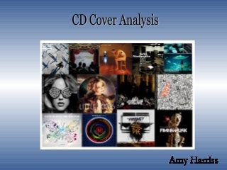
• This imagegives the
perception of the music being
simple, with just a man and a
piano.
• The lighting makes the
room look a bit dull .
•The room has not been
tidied for the image giving
the impression of what you
see, is what you get.
•They have used a font and
colour that goes well with the
colours in the picture.
•The piano looks well used
which looks as if he has
been sat there for hours.
•It is attracting a more
serious fan base with
this cover.
•The actual artist is in this
front cover. This makes it
more personal.
3.
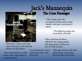
•This CD Coverlooks
very simple but
effective.
•The words riot
scribbled across the
front actually creates
the effect of a riot.
•You can tell from
this cover that the
music is going to be
rebellious.
•They have made one of the
“riots” in the cover larger than
the rest to stand out. They have
also made this orange. This
could be because the front
woman of the band is famously
known to have orange hair.
•This is very cost effective
and would have not cost
much to produce.
4.
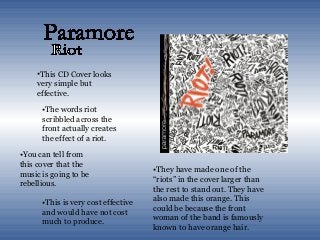
•This CD coverlooks very
complex.
•The man is being perceived as
a puzzle with one part missing.
This would be why the man is
in a frustrated position.
•The room is bare apart from
two men in the background,
this draws your attention to
the man on the stool.
•From this image, the music
seems very serious.
•The light being shone into the
room could be trying to shine
light on the man’s frustration
to find the puzzle piece which
is next to him.
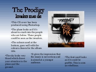
5.
•This CD coverhas been
produced using Photoshop.
•The plane looks as if it’s
about to crash into the people
who are below. These people
could be seen as the invaders.
•The colours used at the
bottom, goes well with the
colours chosen for the album
title.
•It gives the impression that
the music is not serious and
is aimed at a younger
audience.
•The font used looks
as if it could be
graffiti. This is seen
as rebellious.
•The sky looks very
bland which draws
your attention to the
plane and the
ground.
6.
•This image givesa very dark
feel which we assume the
music to be.
•It has been produced in
Photoshop as there would be
different layers.
•There are silhouettes in the
background which is most
likely to be the band.
•The splats of blood on the
front give a serious touch on
the cover.
•The images lining the bottom
of the cover makes it a bit
more interesting.
•The font used in for the
name is the bands logo,
which makes it stand out.
7.
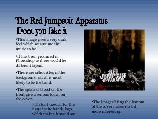
•This image givesa very dark
feel which we assume the
music to be.
•It has been produced in
Photoshop as there would be
different layers.
•There are silhouettes in the
background which is most
likely to be the band.
•The splats of blood on the
front give a serious touch on
the cover.
•The images lining the bottom
of the cover makes it a bit
more interesting.
•The font used in for the
name is the bands logo,
which makes it stand out.