1. THE SCALE OF PLAYFULNESS IN
BRANDED INFOGRAPHICS
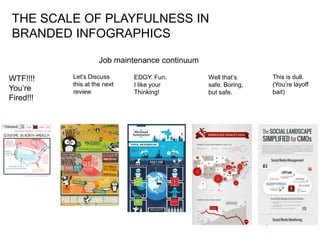
Job maintenance continuum
WTF!!!! Let’s Discuss EDGY. Fun. Well that’s This is dull.
this at the next I like your safe. Boring, (You’re layoff
You’re review Thinking! but safe. bait)
Fired!!!
2. Corporate doesn’t
do sex (or politics,
or religion, or
taxes)
However, legal
says Unruly
vaginas is alright.
Win!
Corporate doesn’t
do “shit”
Corporate doesn’t
do “manwhores”
either
Outcome:
Clean out your
desk (and look for
a job in
agencyland!)
3. Cute Parachuting,
Wait….I hope
armed animals,
those are
hmmm…
bananas…
Are those four
shades of orange
all on-brand?
At least the
violence isn’t
consummated.
Outcome:
You’ll keep your
job but this’d
better work
4. OK, It’s cartoony,
but I can dig it.
The script is short
& straight.
Wait. That dude’s
crying. Can
people cry on-
brand?
The palette is
pretty tightly
focused.
Outcome:
Just the right
amount of
compromise.
You’re safe!
5. Yeah, it’s visual, This actually went
but did you have straight into our
to boil ALL the annual report.
personality out of
it?
Two colours:
Crimson &
Accountant
Outcome:
Njeh. Safe, but
Not promotion-
time. (Bonus: Date
with Pam in
Finance!)
6. More boring than The story’s
a boring time in actually ok, but it’s
boringville as playful as a
wall of sheet rock
There’s that
accountant colour
again
Visual story:
Company logos &
social icons
Outcome:
“Yeah, love it. Say,
we’re having to
downsize, and…”