2. Masthead: The masthead is in a grungy font, which automatically attracts the readers as this magazine is known to feature more rock orientated artists and bands. The font of the title is also informal, which is again appealing to the readers as a magazine is supposed to be for leisure which they may get the feeling from when looking at the type of font. Kerrang, unlike NME always change the colour of their font to fit in with the general colour scheme, which although may flow better, I feel the masthead may not stand out as much, due to everything being colour coordinated. But as it is against a dark grey background it is does stand out more. Also the masthead like a lot of magazine covers, goes in front and behind the image which looks better as it doesn’t interfere with the image as much, but I feel it has been done less successfully here as one of the band mates has the masthead covering half his face. Front Cover Image: Like all music magazines having a band or artist on the cover, follows convention, but from this image there is an obvious hierarchy as the lead singer is in the front, dressed in colourful clothing, whereas the rest of the band have been dressed in darker clothing, drawing more attention to the lead singer. Although it works well as it signifies the obvious between who’s the lead singer, as her hair is a dominant part of the image to complement this they should have put the cover lines in orange.
3. Cover lines Unlike the other magazine I analysed, this magazine follows the usual convention of a magazine where there is a cover lines and the explanatory text follows. The main cover line is obvious instantly as it is a different font to the rest of the cover lines and is big on the cover. The placing of the main cover line is also successful as they placed it on a slant, where the lead singer is sloping her head, which by doing this the reader then knows that the band on the cover must be ‘Paramore’. Around this main cover line is the explanatory text which not only includes a quote from the band, but also what the interview may imply. By having a quote of the interview on the front cover, it makes the reader want to buy the magazine as because the band have said it, the reader feels obliged to read it as they may think they must be some truth in it. The cover lines all follow the same colour scheme throughout, where the cover lines are in yellow, in a black box. By doing this it heightens the impact of the font as by putting it in a black box, the extent of you now seeing these cover lines is improved. The explanatory text are then in white also in the black box, which is again very clear to see. Main Cover Line Cover Lines
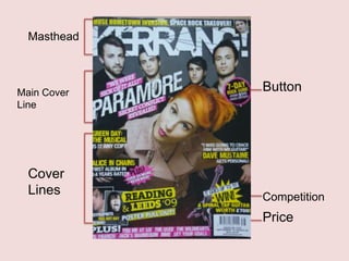
4. Other areas on the magazine. Additional Information: This is also like a button where extra information is added to make the magazine look more appealing to read. Also by having it in a different colour to the cover lines, it may make the reader want to read it more as it may be seen as important information. Button: By having a button it is often used when making a cover line look more appealing and is used to add more variety to the front cover Competitions: Readers like to receive extra pleasure from the magazine they buy, and by featuring a competition on the cover, the reader may feel more obliged to buy the magazine, as they gain an extra positive. Freebies with the magazine: By having a feature on the cover, saying that there will be a ‘poster pull out’ it draws in readers as they enjoy receiving freebies.
5. Eye flow Layout: Although this magazine has a sense of order and plan. When looking at it, it seems very busy and over designed. Due to the bombardment of cover lines, competitions and button, you can instantly tell that this is a weekly magazine as it has less order. Language: The language used in all indirect and there is no form of colloquial language used Colour scheme