The url as the genesis of responsive design
•Download as ODT, PDF•
0 likes•161 views

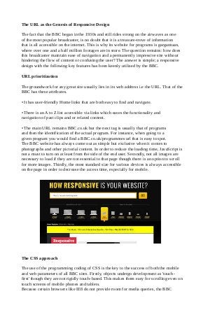
The fact that the BBC began in the 1930s and still rides strong on the airwaves as one of the most popular broadcaster, is no doubt that it is a treasure-trove of information that is all accessible on the internet. This is why its website for programs is gargantuan, where over one and a half million footages are in store. The question remains: how does this broadcaster maintain ease of navigation and a permanently impressive site without hindering the flow of content or confusing the user? The answer is simple; a responsive design with the following key features has been keenly utilized by the BBC.

Recommended
Recommended
More Related Content
Recently uploaded
Recently uploaded (20)
Featured
Featured (20)
The url as the genesis of responsive design
- 1. The URL as the Genesis of Responsive Design The fact that the BBC began in the 1930s and still rides strong on the airwaves as one of the most popular broadcaster, is no doubt that it is a treasure-trove of information that is all accessible on the internet. This is why its website for programs is gargantuan, where over one and a half million footages are in store. The question remains: how does this broadcaster maintain ease of navigation and a permanently impressive site without hindering the flow of content or confusing the user? The answer is simple; a responsive design with the following key features has been keenly utilized by the BBC. URL prioritization The groundwork for any great site usually lies in its web address i.e the URL. That of the BBC has these attributes. • It has user-friendly Home links that are both easy to find and navigate. • There is an A to Z list accessible via links which eases the functionality and navigation of past clips and or related content. • The main URL remains BBC.co.uk but the next tag is usually that of programs and then the identification of the actual program. For instance, when going to a given program you would find a BBC.co.uk/programmes url that is easy to spot. The BBC website has always come out as simple but exclusive when it comes to photographs and other pictorial content. In order to reduce the loading time, JavaScript is not a must to turn on at least from the side of the end user. Secondly, not all images are necessary to load if they are not essential to that page though there is an option to scroll for more images. Thirdly, the most standard size for various devices is always accessible on the page in order to decrease the access time, especially for mobile. The CSS approach The use of the programming coding of CSS is the key to the success of both the mobile and web parameters of all BBC sites. Firstly, objects undergo development as 'touch- first' though they are not rigidly touch-based. This makes them easy for scrolling even on touch screens of mobile phones and tablets. Because certain browsers like IE8 do not provide room for media queries, the BBC
- 2. uses simple breakpoints that can serve as hidden media queries without the browser interpreting them as such. Screen dimensions, where images, whether on mobile or desktop should be of the same native size, for the given device class is alright with this website. However, using icons is a problem because they do not represent the best appeal on different screens which are mainly differentiated based on the manufacturer. In initiating a website that uses content as its main driver, and this is the purpose of most if not all websites, there is a necessity for starting with dynamic URLs that are both simple and clear. Such web addresses help to maintain permanent, stable, optimal, accessible and shareable websites that then will eventually grow to become popular among millions of targeted users around the world.