Scatter diagrams

I invite you to join as a member of the PEX Network Group http://tinyurl.com/3hwakem, you will have access to Key Leaders Globally, Events, Webinars, Presentations, Articles, Case Studies, Blog Discussions, White Papers, and Tools and Templates. To access this free content please take 2 minutes for a 1 time FREE registration at http://tiny.cc/tpkd0 Process Excellence Network: A division of IQPC, (formerly known as Six Sigma IQ) provides access to a treasure chest of relevant content for Process Excellence practitioners. Providing critical knowledge on the development of Process Excellence including Business Process Management (BPM), Lean, Change Management, Operational Excellence, Six Sigma, Risk Management, Customer Experience and more, we provide the forum where key industry experts and organizations share their experience, knowledge and tools, and your practitioner peers connect with one another all over the world, both face-to-face and online. The Process Excellence Network is enhanced by an active online community of your professional peers, as well and face-to-face Summits and events that take place across the globe. Collectively we help you discover what the best are doing to get measurable results through Process Excellence and to seek actionable solutions to specific process problems through worldwide mass collaboration. None of us has the time for continuous trial and error learning. We must learn more and more from the experiences of others. Learning is nothing more than thinking with other people's ideas. We bring you the best ideas in a variety of media forms from outstanding academics and practicing professionals. In short, Process Excellence Network, (often known as PEX Network) enables you to advance your own process excellence journey by increasing your idea sources, widening your contacts and friendships and participating in ongoing formal and informal learning opportunities. In Summary: Process Excellence Network is uniquely positioned to provide a comprehensive library of both online and face-to-face content, including first-rate columns, articles, webinars, podcasts, video presentations, and of course globally renown industry events. Through every medium we strive to make your learning an exciting, dynamic, interactive experience. We are constantly striving to improve our content delivery methodologies. In 2011 we will be introducing many new ways for you to learn. Stay updated. The best is yet to come. Become a Process Excellence Network member today and you'll have continuous exposure to new and timeless tools, techniques, and technologies to extend your performance capacity and your organization's productivity. We also invite you to visit e-Zsigma for Lean Six Sigma Training and certification. e-Zsigma is Canada's leader in strategic Lean, Six Sigma and innovation deployment, project management, consulting and change leadership. http://www.e-zsigma.com

Recommended
Recommended
More Related Content
More from Kevin Egan
More from Kevin Egan (12)
Recently uploaded
Recently uploaded (20)
Scatter diagrams
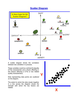
- 1. Scatter Diagram Is there hope for the Scatter Diagram? A scatter diagram shows the correlation between two variables in a process. These variables could be a Critical-To-Quality (CTQ) characteristic and a factor affecting it, two factors affecting a CTQ or two related quality characteristics. Dots representing data points are scattered Y on the diagram. The extent to which the dots cluster together in a line across the diagram shows the strength with which the two factors are related. X
- 2. What can it do for you? To control variation in any process, it is absolutely essential that you understand which causes are generating which effects. A cause-and-effect diagram can help you identify probable causes. Scatter diagrams can help you test them. By knowing which elements of your process are related and how they are related, you will know what to control or what to vary to affect a quality characteristic. Scatter diagrams are especially useful in the measure & analyze phases of Lean Six Sigma. How do you do it? 1. Decide which paired factors you want to examine. Both factors must be measurable on some incremental linear scale. 2. Collect 30 to 100 paired data points. This might mean measuring both factors at the same time, or measuring a starting condition or an in-process factor and the end result, but the data points all should be related in the same way. While you are at it, note any important differences such as equipment or machines used, time of day, variation in materials or people involved for each data point as you collect them. These differences might help you stratify the data later if the results are not clear. 3. Find the highest and lowest value for both variables. This will help you determine the length of the scales and the interval on your diagram. 4. Draw the vertical (y) and horizontal (x) axes of a graph. If the relationship of the data is cause to effect, place the cause values on the horizontal (x) scale and the effect values on the vertical (y) scale. Make the physical length of the scales about equal. Divide both scales individually into increments so that the high and low values of both variables fit on their respective scales. 5. Plot the data. (Follow along the x scale until you find the x value of your pair. Trace up to where the y value would intersect with that value on the y scale. Make a dot at the intersection.) If two or more data points fall on the same intersection, either place the additional dot or dots close to or touching the first one, or draw a small circle around the first dot for each additional data point. 6. Title the diagram. Show the time during which the data were collected and the total number of data pairs. Title each axis and indicate the units of measure used on it.
- 3. Now what? The shape that the cluster of dots takes will tell you something about the relationship between the two variables that you tested. If the variables are correlated, when one changes the other probably also changes. The strength of the correlation is a measure of the confidence you can have in that probability. Dots that look like they are trying to form a line are strongly correlated. If one variable goes up when the other goes up, they are said to be positively correlated. If one variable goes down when the other goes up, they are said to be negatively correlated. If the variables have a cause and effect relationship, a strong positive correlation would indicate that raising the x value would cause the y value to go up and lowering it would cause the y value to go down. If the variables are not directly related as cause and effect, a strong positive correlation could indicate that some other factor or factors are affecting both of the measured variables similarly. One way to determine if a significant correlation exists is to use the sign test table. First, find the median x & y values. To find the median values, separately rank the x & y values from the lowest to the highest. The value that is in the middle is the median. (If there is an even number of data points, the median value is halfway between the two points closest to the middle.)
- 4. Draw a vertical line through your scatter diagram representing the median x value. Draw a horizontal line representing the median y value. This will cut your diagram into four quadrants. Count the dots in quadrants I and III, and the dots in quadrants II and IV. Disregard any dots that are exactly on either of the median lines. Enter the sign test table using the number of total dots minus the dots on the lines as n. Reading across, compare your count for quadrants I Pr Lower Limit Upper Limit Pr Lower Limit Upper Limit Pr Lower Limit Upper Limit and III, and quadrants II n 1% 5% 5% 1% n 1% 5% 5% 1% n 1% 5% 5% 1% and IV with the 1% and 1 31 7 9 22 24 61 20 22 39 41 2 32 8 9 23 24 62 20 22 40 42 5% significance values in 3 3 33 8 10 23 25 63 20 23 40 43 the table. (Significance is a 4 4 34 9 10 24 25 64 21 23 41 43 measure of the likelihood 5 5 5 35 9 11 24 26 65 21 24 41 44 that your results did not 6 0 6 6 36 9 11 25 27 66 22 24 42 44 7 0 7 7 37 10 12 25 27 67 22 25 42 45 occur just by chance. A 8 0 0 8 8 38 10 12 26 28 68 22 25 43 46 significance value of 5% 9 0 1 8 9 39 11 12 27 28 69 23 25 44 46 means that there’s 95% 10 0 1 9 10 40 11 13 27 29 70 23 26 44 47 likelihood that the 11 0 1 10 11 41 11 13 28 30 71 24 26 45 47 12 1 2 10 11 42 12 14 28 30 72 24 27 45 48 correlation is real. A 13 1 2 11 12 43 12 14 29 31 73 25 27 46 48 significance of 1% means 14 1 2 12 13 44 13 15 29 31 74 25 28 46 49 you can be 99% sure.) 15 2 3 12 13 45 13 15 30 32 75 25 28 47 50 16 2 3 13 14 46 13 15 31 33 76 26 28 48 50 17 2 4 13 15 47 14 16 31 33 77 26 29 48 51 If the lower of your 18 3 4 14 15 48 14 16 32 34 78 27 29 49 51 quadrant counts (I plus III 19 3 4 15 16 49 15 17 32 34 79 27 30 49 52 or II plus IV) is equal to or 20 3 5 15 17 50 15 17 33 35 80 28 30 50 52 21 4 5 16 17 51 15 18 33 36 81 28 31 50 53 lower than the lower limit 22 4 5 17 18 52 16 18 34 36 82 28 31 51 54 values (and if the higher 23 4 6 17 19 53 16 18 35 37 83 29 32 51 54 count is equal to or higher 24 5 6 18 19 54 17 19 35 37 84 29 32 52 55 than the upper limit 25 5 7 18 20 55 17 19 36 38 85 30 32 53 55 26 6 7 19 20 56 17 20 36 39 86 30 33 53 56 values), the x and y 27 6 7 20 21 57 18 20 37 39 87 31 33 54 56 variables are significantly 28 6 8 20 22 58 18 21 37 40 88 31 34 54 57 correlated at the 29 7 8 21 22 59 19 21 38 40 89 31 34 55 58 30 7 9 21 23 60 19 21 39 41 90 32 35 55 58 confidence level indicated.
- 5. A scatter diagram is a way to show that a cause-and-effect relationship that you suspected actually exists. You must take that you do not misinterpret what your diagram means. Sometimes the scatter plot may show little correlation when all the data are considered at once. Stratifying the data, Y that is, breaking it into two or more groups based on some difference such as the equipment used, the time of day, some variation in materials or differences in the people involved may show surprising results. The reverse can also be true. A significant X correlation could appear to exist when all Unstratified the data are considered at once, but Stratification could show that there is no correlation. One way to look for stratification effects is to make your dots in different colors or use different symbols when you suspect that there may be differences in stratified data. Scatter Diagram with peaks and troughs Y X Stratified You may occasionally make scatter diagrams that look boomerang or bana na-shaped. As the x value increases, the y value first goes one direction and then reverses. To analyze the strength of the correlation, divide the scatter plot into two sections. Treat each half separately in your analysis.
- 6. Sometimes the range you choose for collecting data will create limitations in your conclusion about an existing correlation. Within the limited range shown, there is no correlation. But expanding the range would have shown a correlation that might have been helpful in understanding the variation that was going on in the limited range. Scatter diagrams can be used to prove that a suspected cause-and- effect relationship exist between two process variables. With the results from these diagrams, you will be able to design experiments or make adjustments to help center your processes and control variation. Steven Bonacorsi is the President of the International Standard for Lean Six Sigma (ISLSS) and Certified Lean Six Sigma Master Black Belt instructor and coach. Steven Bonacorsi has trained hundreds of Master Black Belts, Black Belts, Green Belts, and Project Sponsors and Executive Leaders in Lean Six Sigma DMAIC and Design for Lean Six Sigma process improvement methodologies. Author for the Process Excellence Network (PEX Network / IQPC). FREE Lean Six Sigma and BPM content International Standard for Lean Six Sigma Steven Bonacorsi, President and Lean Six Sigma Master Black Belt 47 Seasons Lane, Londonderry, NH 03053, USA Phone: + (1) 603-401-7047 Steven Bonacorsi e-mail Steven Bonacorsi LinkedIn Steven Bonacorsi Twitter Lean Six Sigma Group