Ian westbrook portfolio January 2016
•Download as PPTX, PDF•
1 like•497 views

A portfolio featuring work examples, methods of working, project deep-dives etc.

Recommended
More Related Content
Recently uploaded
Recently uploaded (20)
Featured
Featured (20)
Ian westbrook portfolio January 2016
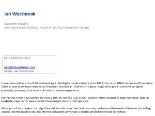
- 1. Ian Westbrook Customer insight, user experience strategy, research and ux/interaction design M: 07939 510 812 ian@futuredream.net Skype: ian.westbrook I have been online since 1994, and working in the digital media industry since 1995; first as an HTML author and then, since 2004, in user experience roles across Research and Design. I believe this gives me good insight into the entire digital production process, from code to finished customer experience. During that time I have worked for nearly 10% of the FTSE 100, as well as many other companies large and small, gaining invaluable experience across sectors from corporates to small agencies. My approach to a project is straightforward: to understand the business case, understand the needs of the user (including context, technographics etc) and then to collaboratively create a design which meets those objectives.
- 3. Research methodologies I have used many different research techniques across many projects. • Workshops and focus groups (Park Resorts, Spire Healthcare, BP) • In-depth user interviews (Tradepoint, B&Q, Spire Healthcare) • Surveys (HSCIC) • Card sorting (BP) • Ethnographic observation (RBS, P&O) • Lab-based testing using Axure prototypes (Tradepoint, B&Q, Vodafone, BP) • Guerilla testing (Tradepoint) • Traffic analysis – entry pages, exit pages, dwell times etc (B&Q, Vodafone) • Remotely polling Design Review Group (HSCIC) • Interacting with Contact Centre staff as proxy users (B&Q CC app)
- 4. Software
- 5. Responsive design – Daily Mail Using Axure to create responsive prototypes across desktop, tablet and mobile (breakpoints of 320, 768, 1024) Desktop / Tablet Mobile
- 6. Projects – Daily Mail (agile: two-week sprints per project) Subscriptions A trial (to be launched in Scotland first, Q1 2016) to test a proposition for a digital or digital/print bundle subscription One Account/MyMail Account An IAM project, rolling out a consistent user experience across the My Account areas of a fragmented estate
- 7. The scrum-master tending the KANBAN board Card template User story cards Initial sketching during a collaborative design session Agile working – HSCIC
- 8. Case study – HSCIC The Health & Social Care Information Centre is the part of the NHS which deals with the issuing and management of NHS smartcards which allow access to buildings and patient data on computer systems. There is – for obvious reasons - very strong governance around which roles (or ‘positions’ in NHS-speak) can access which information. The wrong information in the wrong hands – or the failure to allow access to the right information for the right people – can quite literally cost lives. When I arrived on the project (June 2014) I worked with one other UX practitioner; but when he rolled off in late July I was the sole UX resource, covering both UX Research and Design working across multiple stories simultaneously, working within GDS Design Principles (https://www.gov.uk/design-principles). One feature which differentiated the HSCIC project – for the better - was the abundant access to end users to help prioritise stories, specify requirements and validate designs. We had a Design Review Group (DRG) of c.200 end users, 2 of whom came into the office every Wednesday to take part in collaborative design sessions. This ensured that everything we did was informed by the needs of our users. Activities on the project included: • Interpretation of business requirements, working with the POs and scrum-master • Collaborative design/sketching sessions with POs, scrum-master, TAs, end users, devs etc to deep-dive into the story • Creation of all process flows and user journeys to understand the story end-to-end • Creation of wireframes/prototype in Axure • Validation of assets with POs, scrum-master, and with end-users via the DRG – does the proposed solution meet their needs? • Hand-off to devs (some on-shore, some off-shore), and tracking story through coding and testing to incorporation in the next Build • Working with subject-matter expert users to create training videos for the wider user community to quickly familiarise themselves with the new system Desktop only
- 9. Case study – HSCIC Desktop only Assets Dashboard – high-fidelity Axure prototype Flow – US0173 Modify Position Training video – one of 13 I produced Video production process included: • Writing script and coaching subject matter expert user through the script • Recording video in Camtasia • Post-production editing of video and adding of annotations • Uploading videos to Vimeo to a password-protected account • Dissemination of video URL (and password) to user community and collation of feedback
- 10. Case study – B&Q – www.DIY.com Responsive web The problem: • Very silo’d information on the B&Q web site (DIY.com) – if the user was on a product page there was no Help and Support content; if in the Help and Support there was no exposure to product info • Widespread customer disatisfaction at this siloing of content, the general lack of good, inspiring DIY support material, and an old-fashioned looking and tired web site design • Not optimised for any form factor other than desktop • Clunky checkout screens • Not reflective of a changing business (eg ‘Click & collect’ proposition) The solution: • Re-architect the site so that journeys became much more holistic, weaving product and support content together. ‘Support at the point of need’ became our mantra • Make the site responsive, so that it works as well on mobile or tablet as on desktop • Refresh the look-and feel to a more modern style, as befits the UK’s #1 Home Improvement (HI) company • Incorporate the new ‘Click & collect’ proposition to the site • Streamline checkout to improve completion and reduce drop-out My role: • In-depth customer insight interviews (conducted to my script) to understand customer behaviour: frequency of HI projects, the sorts of projects customers undertake, amounts spent, where they shop etc… • Taking that data and, with the rest of the UX team (4 of us in total), the creation of personas, and then mapping those personas’ interactions with B&Q across channels (in-store, CC, mobile, desktop, tablet) to get a clear view of all interaction touchpoints • Wireframing in Omnigraffle - including extensive annotations – for delivery to offshore devs • Working with graphic designers, creation of high-fidelity Axure prototypes for user testing (conducted by dedicated Test Manager)
- 11. Case study – B&Q – www.DIY.com Responsive web Whiteboard… …to scamp… …to wireframe… …to graphic design… …to Axure prototype for testing… To live! www.diy.com For each story…
- 12. Case study – B&Q – personas and journeys Responsive web Personas created based on: • Existing market research • Input from B&Q’s Customer Insight team • Output from the in-depth customer interviews Persona journeys mapped across across all channel touchpoints (top to bottom): desktop, tablet, mobile, contact centre, in-store
- 13. Case study – B&Q – selection of screenshots Responsive web Reworked primary nav: Inspiration, Projects, Shop, Help & Advice Popular products Surfaced Help & Support and marketing messages Home page Featured products
- 14. Case study – B&Q – selection of screenshots Responsive web Product shot, including alternative images and zoom options Delivery options, quantity selection and ‘Add to basket’ call to action Tabs for Product info, Product details, Help & Advice and Reviews Extensive use of commissioned video to illustrate/demonstrat e roducts Links to related content – in this case the Inspiration section Cross-sell related products Product page
- 15. Case study – B&Q – selection of screenshots Responsive web Product shot, including alternative images and zoom options Delivery options, quantity selection and ‘Add to basket’ call to action Tabs for Product info, Product details, Help & Advice and Reviews Extensive use of commissioned video to illustrate/demonstrat e roducts Links to related content – in this case the Inspiration section Cross-sell related products Project page
- 16. Case study – B&Q – selection of screenshots Responsive web Desktop Checkout – screenshots from desktop and mobile Mobile
- 17. Case study – Tradepoint – www.trade-point.co.uk Desktop only Tradepoint is Kingfisher’s B2B offering for the building trade, a members-only site that offers trade discounts to builders. Membership is proved with a Tradepoint card, available to applicants on proof (scan of business card/letterhead and/or photograph of their trade vehicle) that they have their own company.
- 18. Case study – Tradepoint – www.trade-point.co.uk Desktop only The brief: • To replace an existing piece of brochureware with a fully transactional new site • To enable easy creation of a web account for existing Tradepoint card-holders • To allow easy card application online • To enable easy login to the site for existing members • To only show prices on the site to logged-in members • To create easy, intuitive, browse-to-buy (or search) journeys • To create quick, easy checkout • NB: our recommendation was to create a responsive web site, but due to budget and time pressures the decision was taken by the business to create a site initially optimised for desktop My role: • Initially hired as Test Manager; working with UX designers and graphic designers to create high-fidelity graphic designs to then create Axure prototypes of activation / application / login journeys • Created test scripts and ran test sessions using those Axure prototypes • Fed results and conclusions back to the UX team to iterate the design • Ran guerilla test sessions at 3 stores local to B&Q HQ (Eastleigh, Hampshire) to quickly iterate through login designs • After 2 months moved across to UX design on the project, but continued to create Axure prototypes and run test sessions
- 19. Case study – Tradepoint – test sessions Desktop only Screenshot from one of the test sessions I ran; with Carl Briggs, one of the Hedge End store’s Top 100 customers. His conclusion? “It’s easy. My mum could use it!”
- 20. Case study – Tradepoint – test sessions Desktop only Notes captured in the test observation room by UX designers and business stakeholders, Eastleigh, Hampshire 2012.
- 22. Personal details Nationality: UK citizen Education: 9 ‘O’ Levels, 3 ‘A’ Levels (English, History, Geography) – King’s College School, Wimbledon Llb 2(ii) in Law, Exeter, 1987 Marital status: Married, 2 children Other: Full driving license