Beginners Guide to TikTok for Search - Rachel Pearson - We are Tilt __ Bright...
Magazine analysis (front cover)
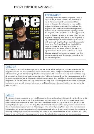
1. FRONT COVER OF MAGAZINE
TYPOGRAPHY
The typography used in this magazine cover is
very simple because it makes it a lot easier to
read. The cover mainly uses san serif font
because it makes it a lot easier to read and it
makes the audience intrigued to read into the
magazine. The text is in bubble writing which
makes it bolder which connotes a young vibe in
the magazine. The head title is in the biggest font
because it draws people in because “vibe” is a big
magazine company. The genre of the magazine is
rap so the typography needs to be big and bold
with not really bright colours but it also needs to
stand out. The fonts they chose was to fit the
target audience so that they would find it
appealing and attractive. Most of the text is in
capital letters, this is because it wants to show
this magazine off to have an energetic vibe. The
artist name is big so it draws more people in to
read this magazine.
COLOUR
The colours most used in this magazine cover are black, white and yellow. Black connotes that the
magazine is dark and not very fun it’s quite serious. The white and yellow both stand out from the
colour scheme, this helps the magazine to draw people in. The colours are very important that they
do not clash and on this magazine cover they don’t. The audience will see the colours as soon as they
look at the magazine and if they’re cool then it’s more likely they will like it. The colours used in this
magazine are conventional for a rap cover because they aren’t very bright colours which the target
audience would usually be more attracted to and then that would mean that they would probably
want to buy it.
IMAGE
The images in this magazine cover would appeal to the target audience because the main photo is of a
celebrity, the main music artist that is shown in the magazine is ‘Drake’ This audience pleasure is
called celebrity endorsement. This celebrity is used because he is a rap artist and he would target
teenage boys and girls (16-24yrs old). The celebrity only shows half his body so it’s a lot easier for
the audience to recognise who it is if the image of the celebrity is big. Most men who want to rap or
listen to rap will wear the same sort of clothes as the celebrity in this picture because the magazine is
basically saying if you wear clothes nearly the same as the celebrity then it means you’re a cool. The
image is conventional for the rap genre because the artist in this magazine perform rap music.
2. FRONT COVER OF MAGAZINE
LAYOUT
The layout of this magazine cover is that it has a lot of space so it’s a lot simpler for the consumer to
read and understand the magazine. The magazine looks a lot more formal than others, this connotes
that the magazine is aimed at more formal people and not young kids. The route of the eye is drawing
the audience across to the masthead to help the audience recall the magazine. The masthead is
conventional in this magazine front cover because it is placed right in the middle of the magazine
where the audience are most likely to look. The “exclusive” is near the picture so they link to draw the
audience in to looking at the magazine.
LANGUAGE/MODEOF ADDRESS
The language used in the front cover is very simply this is so that the audience only has to focus on
parts that are actually interesting and are more likely to sell the magazine to the consumer. It has on
the front cover “Chris brown the definitive interview”, this makes the reader want to look into this
magazine. The magazine is conventional for a rap magazine because it is relaxed and the man who’s
the celebrity is posing in a certain pose which younger people would try to copy because they think it
would make them look cooler. The magazine speaks to people who enjoy fast and angry song this
could be a relaxing feel about this magazine because the audience could read this after a hectic day at
work.