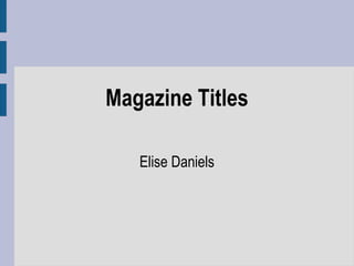
2. Title 1:
Title 1’s font is Poplar Std, with a text size of 100pt. I have
developed the text in a variety of colours so dependant on my
background colour, the text will correctly stand out. The text also
looks better in different colours. For example I personally think
that ‘DOPE BEATZ’ , stands out better in the pink colour as it’s
more vibrant and eye catching for people buying the magazine.
During the creation of my text I added Drop Shadows, Outer
Glows and Inner Glows. By adding these things to my magazine
title it enables the text to stand out more and stop it from looking
normal and boring. By adding shadows the darkened glow
around the edge makes it more eye catching and adds a type of
fade around the edges. This just adds more creativity and makes
the title more interesting. I personal prefer this title rather than
title 2. I believe its more creative and would suit the genre of my
magazine.
3. Example of a mini survey I
created to gain feedback
Which text do you find more eye catching and appropriate for a main title of a music
magazine?(Please tick one box)
Title 1 Title 2
Please state below what you found interesting about your chosen text? e.g. colour,
size etc.
____________________________________________________________________
____________________________________________________________________
____________________________________________________________________
If you could improve the text you have chosen in any other way, what would you do?
____________________________________________________________________
____________________________________________________________________
____________________________________________________________________
Thankyou for participating in this survey, all your feedback will be taken into
consideration.
4. Feedback From Title 1:
Feedback 1 : The first person I asked to decide which text
they found more appealing for a magazine. This person
chose Title 1 over Title 2. This reason this person chose
this text was based on the fact that it stands out better and
the variety of colours all work well and any would suit a
magazine.
I received feedback from other people who stated the
'BEATZ' which is italic adds even more creativity to the
text rather than just keeping it straight, which make it look
more simple.
5. Title 2:
Title 2 is Gill Sans Ultra Bold, with a size of 73pt in a variety of
colours. The text is very simple with drop shadows and
inner/outer glows. I used a variety of coloured outlines and black
drop shadows to help the text to stand out more on the page.
Compared to Title 1 I decided to keep this text more simple and
less complex just to compare the differences. I will then be able
to see which text people prefer and see which one stands out
better on my magazine. This type of text I believe doesn't stand
out as well. The text is very simple, which can sometimes be
positive as simple titles can be more eye catching. But in my
case I think it doesn't match the genre of my magazine and title 1
may be better.
I then decided to ask some people what they thought on Title 2
compared to Title 1 and find out which one they preferred.
6. Feedback From Title 2:
The feedback I gained from Title 2 showed mixed
opinions. Once asked many people found the text less
interesting and if I were to use it on a magazine they did
not find it as eye catching and appropriate for my
magazine. Also people found that the colouring on the
outline did not work very well. They said if I were to use
this text type, then maybe a straight black bold text may
have been more effective.
Although some people found it simply effective and said
this text may work well on my magazine.
7. Outcome -
Based on my personal opinion and the feedback I
received from participants, I decided that the best text
I could use is Title 1. This is based on the fact that it
stands out more,colours work better and it suits the
genre of my magazine. Also the effect of the 'BEATZ'
in italic. Therefore I used this prefered text type from
my main title on my cover page.