[IKEA] 9 Persuasive Principle Used by IKEA to Boost their Conversions
•
3 likes•2,462 views

Our Conversion Optimisation expert, Marcello Pasqualucci, has analysed the IKEA website conversion funnel and details here the positive aspects as well as areas that would benefit from improvement.

Recommended
More Related Content
Viewers also liked
Viewers also liked (15)
More from Convertize
More from Convertize (7)
Recently uploaded
Recently uploaded (20)
[IKEA] 9 Persuasive Principle Used by IKEA to Boost their Conversions
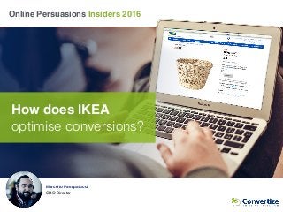
- 1. Marcello Pasqualucci CRO Director Online Persuasions Insiders 2016 How does IKEA optimise conversions?
- 2. 19 neuroscience ✔ principles 17 mistakes ✘ to correct 9 improvements to make An analysis of IKEA’s conversion process I reveal what’s working, what’s not working quite so well, and propose some changes to help increase the site’s income…
- 3. I’m looking to buy a desk lamp so I decide to turn to the Swedish giant IKEA. As a Conversion Optimisation Consultant, I take note of both the positives and the areas for improvement on the site. Join me on my user journey and discover some of the most relevant neuroscience principles for this site. The context
- 4. A path in 10 steps Homepage 1 2 3 4 Product ListCategory Subcategory Basket 6 7 Address 8 Delivery Info 9 Login Payment 10 5 Product
- 5. Homepage Homepage Product ListCategory Subcategory Product Basket Address Delivery InfoLogin Payment
- 6. Homepage I tried to read all the content on this carousel but I couldn’t; the slides change every 5 seconds and there’s no Call to Action on any of them! Homepage Paradox of Choice ✘
- 7. Homepage Nice images but what are they for? I can’t be bothered to read all the content (like a lot of Internet users, I’m lazy)! Picture Superiority Effect ✘ Homepage
- 8. Picture Superiority Effect ✔ I just clicked on “All departments” and they have icons next to all the category names, that’s a great help. Homepage
- 9. The search bar features dynamic preview, but when I type ‘desk lamp’, no suggestions come up. Am I the only one looking for a desk lamp?! Homepage Illusion of Control ✘
- 10. Here are the results for my “desk lamp” search. There are only 2 products and neither are really what I’m looking for. Maybe I’ll get luckier searching via the categories… Single Choice Aversion ✘ Homepage ‘Other results’ leads to this unpleasant page:
- 11. Category Homepage Product ListCategory Subcategory Product Basket Address Delivery InfoLogin Payment
- 12. High quality images that present the product category content clearly and in a visually effective way. Category Picture Superiority Effect ✔
- 13. Category Categories are a bit messy. It would be better to make the text clearer and easier to read. Proposal for improvement
- 14. Subcategory Homepage Product ListCategory Subcategory Product Basket Address Delivery InfoLogin Payment
- 15. Subcategory Hmmm… I’m in the lighting category, I’d rather see lighting suggestions and inspiration. Commitment & Consistency ✘
- 16. Products List Homepage Product ListCategory Subcategory Product Basket Address Delivery InfoLogin Payment
- 17. There are 3 menu bars! It’s a bit too much… Product List Paradox of Choice ✘ Products List
- 18. I’m not sure about this “Buyable online”… I am here to buy online. anyway Product List Products List Processing Fluency ✘
- 19. Paradox of Choice ✔ I can sort by: - relevance - name - price - or release date Having just a few well-chosen options is very efficient. Product List Products List
- 20. That’s a lot of empty space. It’s nice and clean but I can’t even see any products above the fold line. Products List Processing Fluency ✘
- 21. Products List Proposal for improvement I’ve replaced the category bars with a breadcrumb trail placed on the same line as the search tools so I can see some products above the fold line.
- 22. I assume it is something positive but what does ‘A++’ mean? Curse of Knowledge ✘ Product List Products List
- 23. Product List IKEA shows the more expensive products first. It’s a good way to set a high price standard in the mind of the user so that the following prices seem lower. Anchoring Effect ✔ Products List
- 24. The presentation of the products is uniform, the layout is clean, it's easy to browse and scan over the products Product List Products List Cognitive Fluency ✔
- 25. Product List available in other colours This lamp is available in different colours but I can’t see the variations on the category page and I don’t want to go in to a store. I would add an icon to provide this information. Single Choice Aversion ✔ Products List Proposal for improvement
- 26. Pain of Buying ✔ Hovering over the product allows me to add it to my basket in one click. It speeds up the process and thus makes the act of buying less painful. Product List Products List
- 27. Product Homepage Product ListCategory Subcategory Product Basket Address Delivery InfoLogin Payment
- 28. Product Where are the main product details like the material, the size and the type of bulb required? I actually have to scroll down and find the “Product information”. Information Bias ✘
- 29. Product The layout of the information is not hierarchical enough: I don’t know what to read first… It puts me off reading it at all. Processing Fluency ✘
- 30. Information Bias ✔ Clicking on the image allows me to zoom in closely and get great visual detail. Product
- 31. Product It would be great to see customer testimonials and ratings somewhere on the product page, it would reassure me of my choice. Top Customer Reviews By Rick on 14 August 2015 The light emitted is pretty clear and pleasant and will light up the room … See more By Summer on 21 September 2015 The light base is quite good for setting in different place with the flexible frame. However, the bulb is not durable at all … See more Bandwagon effect ✔ Proposal for improvement
- 32. Basket Homepage Product ListCategory Subcategory Product Basket Address Delivery InfoLogin Payment
- 33. The Call to Action is almost INVISIBLE (small and blue just like the menu bar and links). Von Restorff Effect ✘ Basket
- 34. Basket As there is only one complementary product at the moment, I would definitely suggest adding more related products. Commitment & Consistency ✔ Proposal for improvement
- 35. Login Homepage Product ListCategory Subcategory Product Basket Address Delivery InfoLogin Payment
- 36. This icon looks like a Call to Action… Login Von Restorff Effect ✘
- 37. Login Make the wording clearer and the Call to Action more visible. Processing fluency ✔ Proposal for improvement I would suggest moving the IKEA Family information and changing the design of the card itself.
- 38. Address Homepage Product ListCategory Subcategory Product Basket Address Delivery InfoLogin Payment
- 39. Processing Fluency ✔ Linear, clear form. It looks - and is - easy to fill in. Address marcello@convertize.com marcello@convertie.com
- 40. I entered the wrong email and IKEA clearly tells me what’s happened: Address The email addresses entered do not match Processing Fluency ✔ marcello@convertize.com marcello@convertie.com
- 41. I’ve removed the stars and reorganised the form into 2 sections. I’ve also replaced the link “click here” with a more simple tick box. Address Foot-in-the-Door Technique ✔ Proposal for improvement
- 42. Delivery Information Homepage Product ListCategory Subcategory Product Basket Address Delivery InfoLogin Payment
- 43. These 2 paragraphs are effective reassurance elements; using symbols would highlight them more. Need for Certainty ✘ Delivery Information marcello@convertize.com
- 44. A delivery fee has been discreetly added to my order… Ambiguity Effect ✘ Delivery Information marcello@convertize.com
- 45. Delivery Information I’ve reorganised the delivery information section to make it clearer. These are actual reassurance elements that I found on the site, displayed clearly using visuals and concise text. marcello@convertize.com Need for Certainty ✔ Proposal for improvement
- 46. Payment Homepage Product ListCategory Subcategory Product Basket Address Delivery InfoLogin Payment
- 47. Payment Ambiguity Effect ✘ marcello@convertize.com I can see the prices without VAT by ticking this box. Not really of interest to me though as I selected “private customer” earlier…
- 48. Why do I need to be reminded of this information? It’s unnecessary and taking up space, moving the payment section further away. Attention Ratio ✘ Payment marcello@convertize.com
- 49. Payment One solution would be to remove the whole order review from this page and add it to the previous page instead. Then only the payment section remains. Response Efficacy ✔ Proposal for improvement
- 50. Thank you for reading! I imagine you’re now thinking one of these 3 things: Or subscribe to our newsletter > Marcello Pasqualucci CRO Director Contact us ✔ to optimise your revenue 1 2 3 “Thanks, I know how to optimise my website.” In this case: Click here to discover 5 cognitive biases you might not know about. “I need an expert to optimise my website.” “I don’t have time to think about this.” Sounds like you’re suffering from the “Status Quo Bias” - read more here.