On both magazines the
 title is the biggest text on      The main storyline, the one
 the page, this proves my          that links to the image is the
 magazine uses the codes           second largest text on the
 and conventions of a music        cover. This informs the reader
 magazine. It is also the          that it is the most important
 most noticeable which is          article in the magazine. This is
 needed to be recognised           usually at the bottom of the
 easily. It is at the top of the   page or around the middle
 page which follows the            and goes cross the artists
 codes and conventions as          body. Therefore I have
 the text should be seen           followed the codes and
 from left to right                conventions.

                                    All the cover lines frame the
My main image is the only           main image. They are most
image in my cover, this             of the time in bold or
means the image has the             capitals to attract the
audience full attention             audience. It is usually the
when they look at the               artists name that stand out
cover. This is the same for         to the readers
Q magazine which my
magazine is based on                 The barcode and issue
‘British Music’                      date and number are
The artists face is never            usually in either of the
covered my any form of               bottom corners of the
text which is similar on             page. I have followed the
my cover, due to the                 codes and conventions
codes and conventions
The heading ‘contents’ is           I decided to add a small image
the largest font on the             of my front cover in the top
contents, this is so it is          corner by the title, this is so
noticeable to my audience.          people recognise the front
                                    cover when they are reading
                                    the contents.
There is a block of images, 3
in total. All have the page
number in the corner of the         I decided to highlight the most
picture so the reader can           important part of the articles in
find the article quickly. This is   my contents. This would mean
similar to the Q contents and       artists names would be
also follows the codes and          highlighted so they stand out to
conventions.                        the reader.

I decided to add a box with a       I decided to have my page
caption of the image inside. I      numbers in a different colour
chose these colours as they         so it is easier to recognise.
were the colours what came          Again, they are in red to
up in my questionnaire. They        match my theme of the
also match the British              British flag.
theme.
                                    I then added the section in the
My contents is split into 2         bottom left of the page which
sections, features and              state the name of the magazine,
regulars. These are split           the issue date and number and
up by a text bar stating            also the page number which is a
what the following                  different colour so it stands out
consists of.                        to the readers.
The title on the double page
    The opening stand first is in      spread is the largest text and         Finally I added page
    blue to make it more               a unique font to the rest to           numbers and the issue             I added a 3rd
    noticeable and also to attract     attract readers straight away.         date and number to                page to my
    the audience from the              This follows the codes and             the corners of each               article as I had
    beginning, causing them to         conventions                            page                              more writing
    read the rest of the article                                                                                that need to be
                                                                                                                included. I
                                                                                                                added the
                                                                                                                picture to break
I used drop
                                                                                                                up the text and
capitals in
                                                                                                                make it more
order to break
                                                                                                                appealing to the
the text up so
                                                                                                                eye
it didn't look
like a block of
text to the
reader. These
are used in
                                                                                                                The image I
music
                                                                                                                used bled
magazines as
                                                                                                                over onto the
well as quotes
                                                                                                                opposite
                                                                                                                page, some
                                                                                                                magazines to
  I highlighted my         The colour scheme I used matched             I added a quote from the article        this to add an
  first paragraph so       the colour scheme of ‘British’ music         onto the image on the opposite          effect
  it stood out to the      which is what my magazine is all             page, as usually the image is what
  reader, this is          about. So I used red, blue and white         most people look for so if they like
  usually done in all      to link to the Union Jack. Codes and         the quote they will read the article.
  music magazines          conventions stick to a colour scheme         All music magazines to this,
                                                                        following codes and conventions

Evaluation...use, develop, challenge codes and conventions

  • 2.
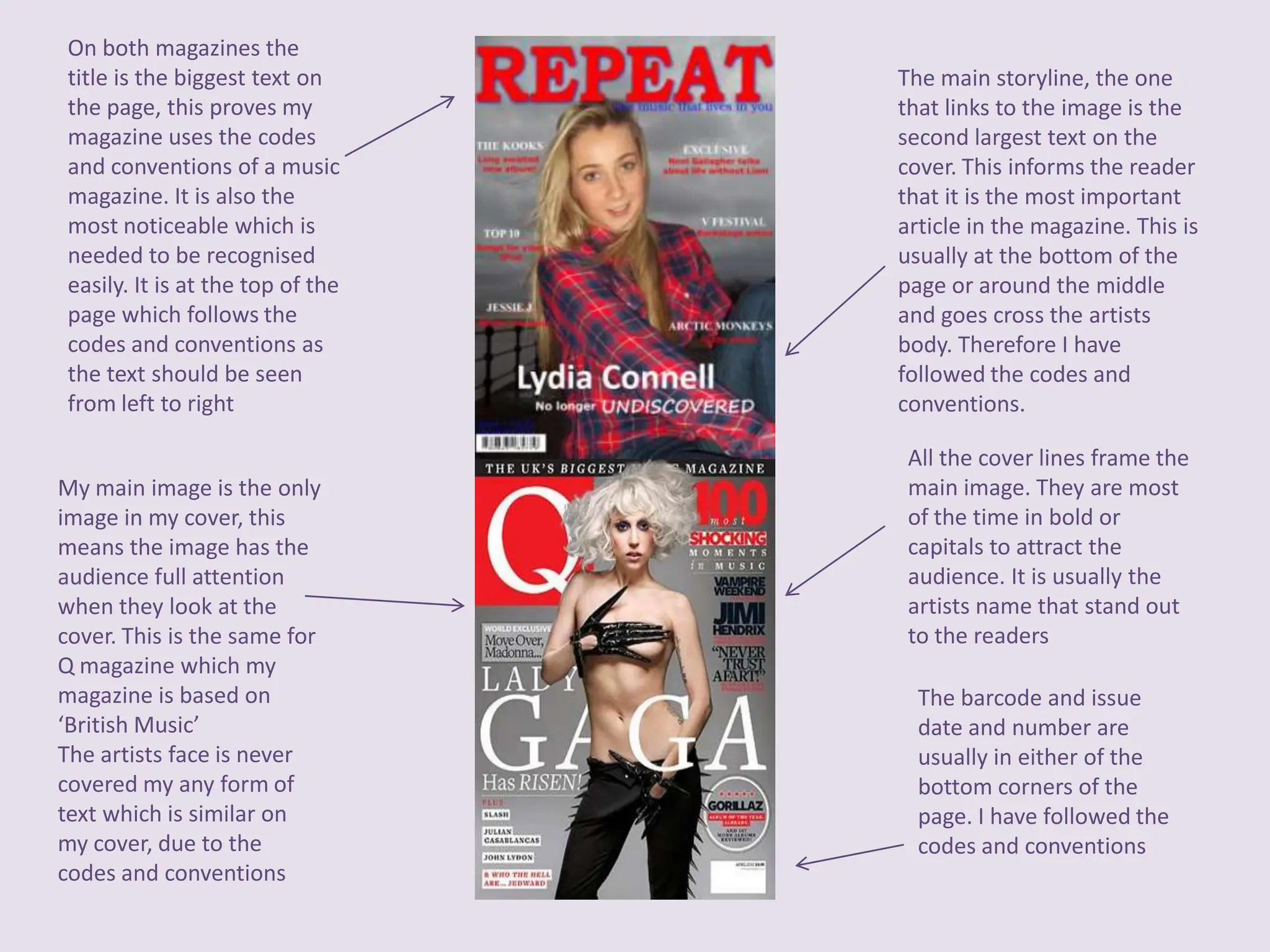
    On both magazinesthe title is the biggest text on The main storyline, the one the page, this proves my that links to the image is the magazine uses the codes second largest text on the and conventions of a music cover. This informs the reader magazine. It is also the that it is the most important most noticeable which is article in the magazine. This is needed to be recognised usually at the bottom of the easily. It is at the top of the page or around the middle page which follows the and goes cross the artists codes and conventions as body. Therefore I have the text should be seen followed the codes and from left to right conventions. All the cover lines frame the My main image is the only main image. They are most image in my cover, this of the time in bold or means the image has the capitals to attract the audience full attention audience. It is usually the when they look at the artists name that stand out cover. This is the same for to the readers Q magazine which my magazine is based on The barcode and issue ‘British Music’ date and number are The artists face is never usually in either of the covered my any form of bottom corners of the text which is similar on page. I have followed the my cover, due to the codes and conventions codes and conventions
  • 3.
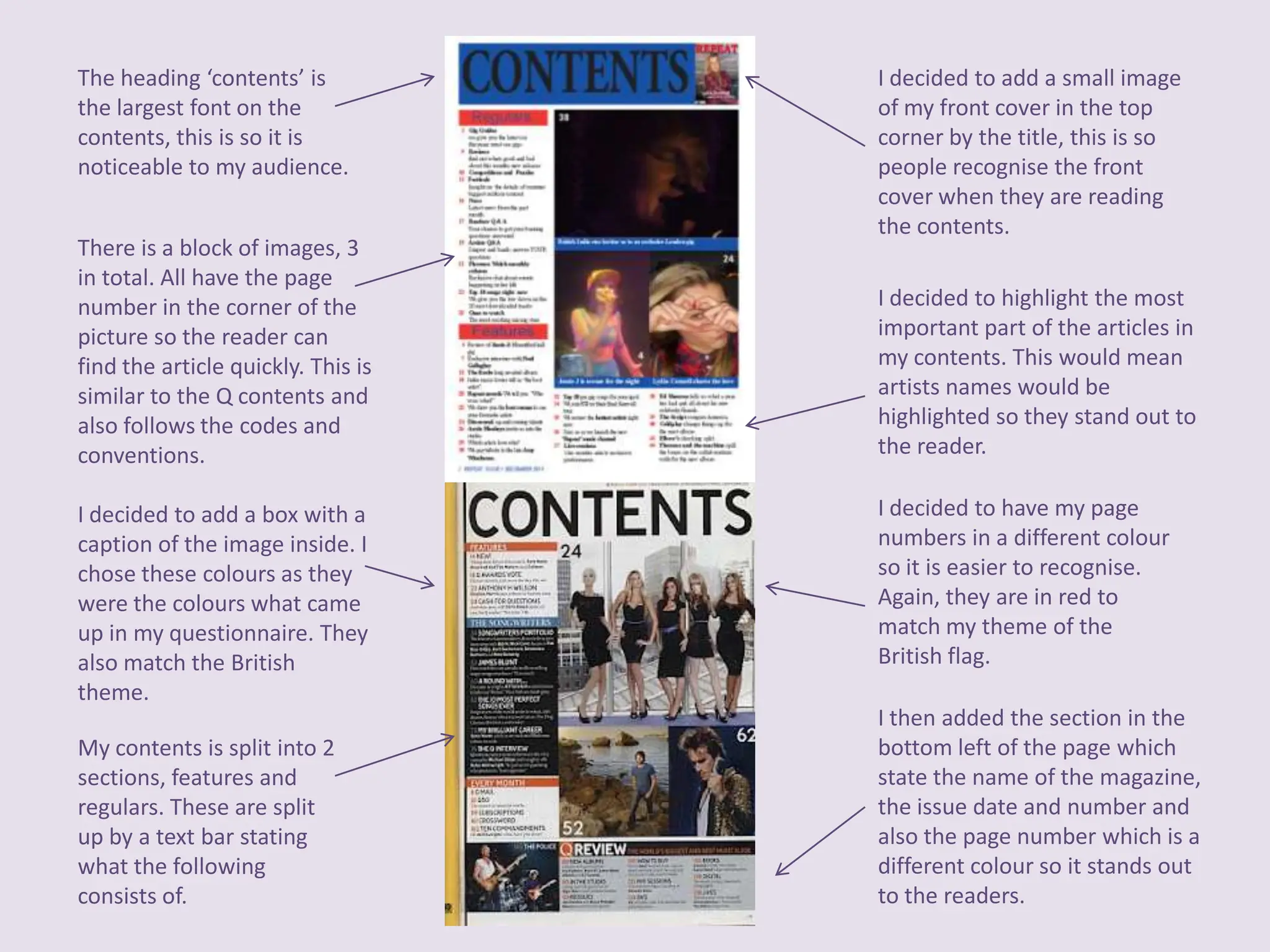
    The heading ‘contents’is I decided to add a small image the largest font on the of my front cover in the top contents, this is so it is corner by the title, this is so noticeable to my audience. people recognise the front cover when they are reading the contents. There is a block of images, 3 in total. All have the page number in the corner of the I decided to highlight the most picture so the reader can important part of the articles in find the article quickly. This is my contents. This would mean similar to the Q contents and artists names would be also follows the codes and highlighted so they stand out to conventions. the reader. I decided to add a box with a I decided to have my page caption of the image inside. I numbers in a different colour chose these colours as they so it is easier to recognise. were the colours what came Again, they are in red to up in my questionnaire. They match my theme of the also match the British British flag. theme. I then added the section in the My contents is split into 2 bottom left of the page which sections, features and state the name of the magazine, regulars. These are split the issue date and number and up by a text bar stating also the page number which is a what the following different colour so it stands out consists of. to the readers.
  • 4.
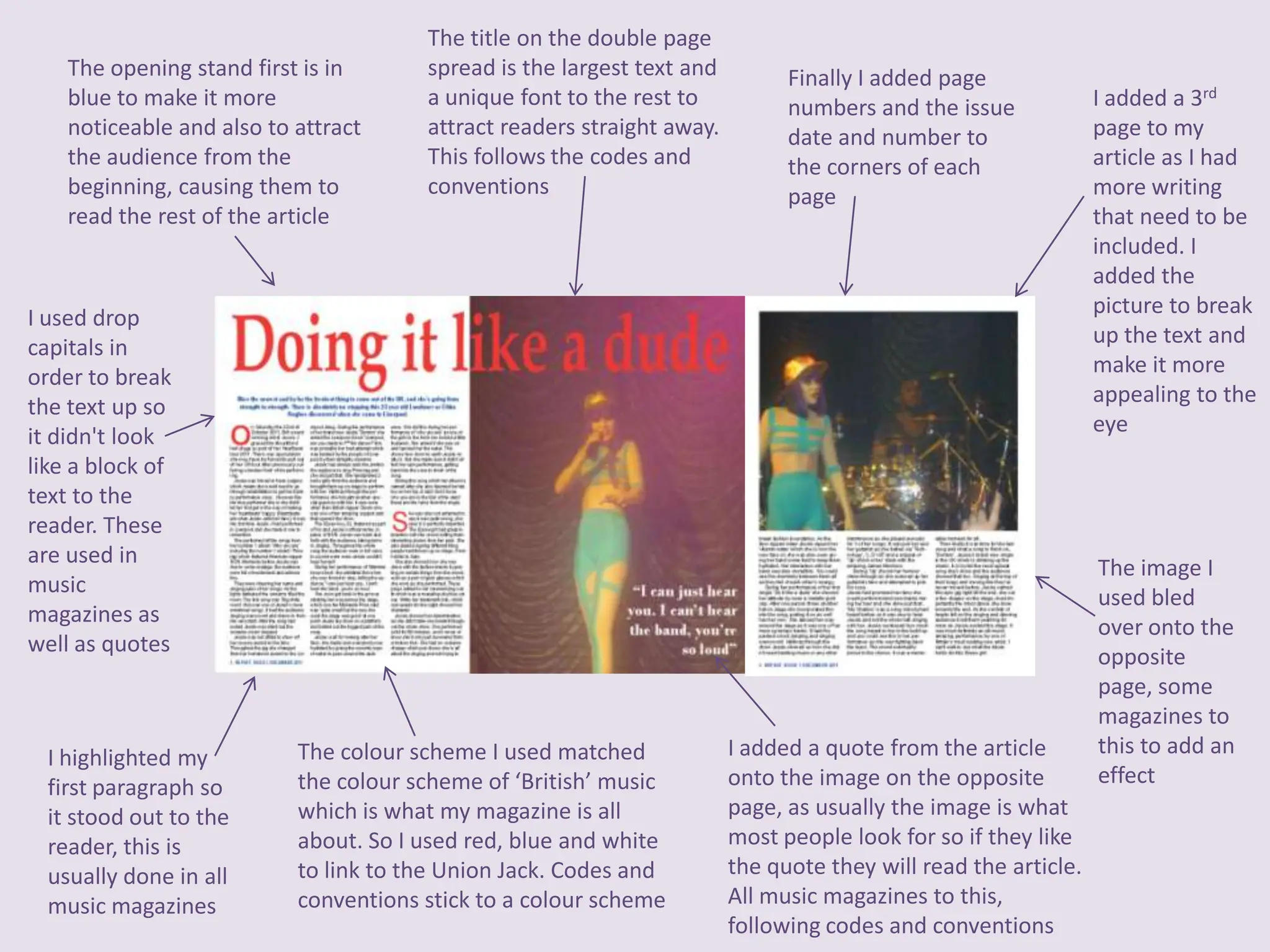
    The title onthe double page The opening stand first is in spread is the largest text and Finally I added page blue to make it more a unique font to the rest to numbers and the issue I added a 3rd noticeable and also to attract attract readers straight away. date and number to page to my the audience from the This follows the codes and the corners of each article as I had beginning, causing them to conventions page more writing read the rest of the article that need to be included. I added the picture to break I used drop up the text and capitals in make it more order to break appealing to the the text up so eye it didn't look like a block of text to the reader. These are used in The image I music used bled magazines as over onto the well as quotes opposite page, some magazines to I highlighted my The colour scheme I used matched I added a quote from the article this to add an first paragraph so the colour scheme of ‘British’ music onto the image on the opposite effect it stood out to the which is what my magazine is all page, as usually the image is what reader, this is about. So I used red, blue and white most people look for so if they like usually done in all to link to the Union Jack. Codes and the quote they will read the article. music magazines conventions stick to a colour scheme All music magazines to this, following codes and conventions