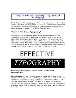
Why Mobile Design Typography is Important and Challenging?
1. "Web design is 95% typography : 95% of the information on the web is
written language. It is only logical to say that a web designer should get
good training in the main discipline of shaping written information, in
other words: typography." - By Oliver Reichenstein.
What is Mobile Design Typography?
Mobile Design Typography is an emerging technology which is the
foundation of web design. As mobile has small screen, so for you it
becomes a challenge to deign good typography with which users can
easily read your site, should work in different user environments and
should be visually appealing. It should be designed very carefully as it is
difficult and there are so many things to consider while designing which
includes size, shape, position, color, spacing and much more.
Some important aspects which are the key focus of
Typography:--
1) Readability: It is all about the text format which is used by the
designer while designing the Mobile Typography. The main focus should
be the end users because they are the one who will be reading and it
must be comfortable for their eyes. As it is all about the words that
matter the most. So make sure that the text written must be easy to read
and understand. Thus, choose the font size accordingly and it should be
presented well.
Why Mobile Design Typography is Important and
Challenging?
2. 2) Contrast: It is another important aspect. No one would want to read
the pink color text on red background. Right? So avoid using extremely
light colors instead, use dark colors. So that users can also see easily in
the sun. Thus, choose the colors carefully with attractive combinations to
avoid losing users and help them see better.
3) Space: Space is also a very important point to keep in mind as mobile
screen size is very small, so add some reasonable room to the margins,
between the lines, words and letters. It really doesn't matter if letters
size are big but if there is no ample space between them, then there is no
point. So with the help of spacing, there exists no difficulty while going
through the texts written. Thus, be careful enough as it plays a crucial
part in readability of your text.
4) Responsive Typography: Last but not the least responsive
typography is designed so well. With the help of this, the users will get
the best experience in surfing as the displayed items will exactly fit your
mobile screen and will be easily readable. Thus, it will easily adapt to
your screen, regardless of size and will help to easily navigate.
3. Thus, from all of the above points it can said that Mobile Design
Typography is important yet challenging. So for that you need to keep
some tips in mind:
You must start with small screens and then make some adjustments
and then with larger screen sizes to accommodate.
Opt for multiple columns means split text into more than one column
which will keep lines from getting too long.
Keeping it simple will help users read easily and avoid bells & whistles
as at small sizes cursives, scripts and other typefaces do not render
well.
Keep testing your design concept in multiple devices and also check
for different browser sizes.
Therefore, be very much careful in designing mobile Typography or you
can consult with any Web Design Company London or any other
developed countries. So that you will get your exact consequence and
4. what you want for your website.
Source: http://www.behance.net/gallery/Web-Design-London/9834819