Opening up Aid for enhanced Aid Transparency
•Download as PPTX, PDF•
1 like•602 views

This presentation was presented by Aleem Walji and myself to the International Aid Transparency Initiative in March 2013 and provides an overview of how open aid data can enhance aid effectiveness and empower citizen to hold international donors and governments more accountable.

Recommended
Recommended
More Related Content
What's hot
What's hot (20)
Viewers also liked
Similar to Opening up Aid for enhanced Aid Transparency
Similar to Opening up Aid for enhanced Aid Transparency (20)
More from Soren Gigler
More from Soren Gigler (9)
Recently uploaded
Recently uploaded (20)
Opening up Aid for enhanced Aid Transparency
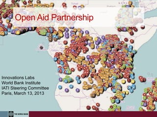
- 1. Open Aid Partnership Innovations Labs World Bank Institute IATI Steering Committee Paris, March 13, 2013
- 2. Why Open Aid and Why Maps Matter? 1. To enable visualization and accessibility of aid information 2. To advance transparency in line with IATI standards 3. To enable citizens and stakeholders to provide direct feedback on project results 4. To improve efficiency of increasingly scarce aid resources
- 3. OAP Objectives 1. Improve Aid Transparency: increase transparency on aid flows and public service delivery 2. Enhance Results: Better target, monitor, and coordinate aid flows within countries 3. Establish Feedback Loop: Empower citizens and CSOs to provide direct feedback on project outcomes Increase Aid Transparency and Citizen Engagement for Better Results
- 4. Key Componentsof Partnership • Open Aid Map a common platform to show locations of donor programs • Country Platforms for open aid flows and public expenditures • Capacity Development to empower CSOs and citizens to effectively use and generate data • Citizen Feedback Loops to promote citizen engagement in the delivery of public services • Impact Evaluations to assess the impact of open aid on development outcomes
- 5. 2,700+ projects 30,000+ locations 143 countries 13 countries Discussion & consensus on the focus for OAP Endorsement of OAP by 6 countries & the World Bank Partner Consul- tation Technical Workshops (Finland, Sweden) Implementation in 4 countries (Bolivia, Kenya, Nepal & Tanzania) Developing the geo- coding standard with IATI Develop Open Aid Map platform HL4 Busan Canada, Czech Republic, Estonia, Finland, the Netherlands, Spain, Sweden, the United Kingdom, AfDB, Foundation Center, ONE and InterAction 2012 Mapping for Results History
- 6. Regions Countries Sectors Projects Mapping for Results maps.worldbank.org
- 7. Better Targeting of Projects Select infant mortality as base map Select by Sector: Water and Health maps.worldbank.org/sa/india
- 8. • Over 540 projects mapped • Over 2,100 project activities mapped • Approximately $5.3 billion cumulative commitments covered for all AMP projects ongoing as of August 2011 2.0 Geo-coding Open Aid Map Malawi’s Open Aid Map Geo-coding of projects of 27 donors based on IATI standard: AfDB, AusAid, BADEA, CIDA, CDC, China, DfID, EU, FAO, FICA, GTZ, ICEIDA, IFAD, Irish Aid, Japan, JICA, KfW, Kuwait Fund, NORAD, OPEC Fund, UNAIDS, UNDP, UNHCR, UNIDO, USAID, WFP, World Bank
- 9. Aid Management Platform (AMP) Sub-national geographic location information Geo-coding Open Aid Map AMP 2.0AMP Evolution of Aid Mapping in Malawi
- 10. AMP 2.0AMP Geo-coding Open Aid Map Project Proliferation, Density & Poverty
- 11. AMP 2.0AMP Geo-coding Open Aid Map Project Proliferation & Population
- 12. AMP 2.0AMP Geo-coding Open Aid Map Sectoral Analysis of Project Activities
- 14. Nepal- On Track platform
- 15. Zambia: Lusaka Water & Sanitation Project
- 16. Initiatives Partners Next Steps 1. Broader endorsement by donors and other partners 2. Build upon existing IATI standards with geo-standards 3. Leverage as communications tools to promote transparency agenda
- 17. AMP 2.0AMP Open Aid Map Implementation Partners: Steve Davenport, Christian Peratsakis, Josh Powell Aleem Walji Director Innovations Labs, awalji@worldbank.org Bjorn-Soren Gigler, bgigler@worldbgank.org Johannes Kiess, Jkiess@worldbank.org Contact Information Mike Findley, Kate Weaver, Justin Baker, Sam Barrett, Sarah McDuff
- 18. EXTRA Slides
- 19. Are health projects in areas with the highest infant mortality?
- 20. Poverty and WB projects WB and USAID projects Public Expenditures Feedback Loop Nepal M4R Implementation
- 21. Open Aid Map – Moldova with V4 Countries
Editor's Notes
- 1. It is important to understand the distribution of aid flows within a country in order to better target aid, however research on the distribution of aid has almost exclusively been conducted at the cross-country level. This is in large part due to the lack of data available on sub-national locations. By providing this information, this would enable decision-makers to know how to more effectively allocate development resources at the sub-national level. This will enable better targeting of aid efforts once underserved regions are more easily identified. 2. Understanding the precise location of development activities allows governments, donors and citizens to monitor progress and outcomes, and would encourage those at the local level to provide feedback on development projects in their area. 3. Enabling donors to see where other donor projects are located allows them to avoid duplicating efforts in the same region and increases the efficiency of development resources. 4. The volume of information provided by donors can make it difficult to make sense of the data. Being able to visualize the locations of all development activities on a map can enhance understanding of patterns in aid allocation. Making this information easier to understand will increase accessibility and use of the data among a wide group of stakeholders. 5. The IATI encourages development organizations to make information the “Who, Where, and How” of development projects publicly available and easy to use and understand. Crucial to this is the Where- geographical information on where organizations are operating within countries. This information allows governments, citizens and donors to gain a more comprehensive picture of donor activities within countries, thus enabling better decision-making.
- This slides shows in the background infant mortality rates at the sub-national level in India. The Map shows thee location of WB-financed projects in the Water and Health sectorskey issues: 1) Are we targeting the areas with the largest needs?--- lagging States agenda 2) Muli-sectoral Analysis- Are we coordinating between sectors- Important Synergies between Health and Water, map however shows that water and health projects are concentrated in different States.