Link Color Affects Conversion Test Results
•
0 likes•283 views

Does link color directly influence people's decisions to click? Find out the results here!

Recommended
More Related Content
More from Matthew Woodward
More from Matthew Woodward (20)
Recently uploaded
Recently uploaded (20)
Link Color Affects Conversion Test Results
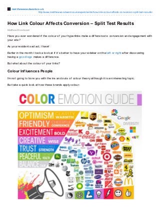
- 1. mat t hewwoodward.co.uk http://www.matthewwoodward.co.uk/experiments/how-link-colour-affects-conversion-split-test-results/ Matthew Woodward How Link Colour Affects Conversion – Split Test Results Have you ever wondered if the colour of your hyperlinks make a dif f erence to conversion and engagement with your site? As your resident sad act, I have! Earlier in the month I took a look at if it’s better to have your sidebar on the lef t or right af ter discovering having a good logo makes a dif f erence. But what about the colour of your links? Colour Influences People I’m not going to bore you with the ins and outs of colour theory although it is an interesting topic. But take a quick look at how these brands apply colour-
- 2. Colour can have a huge impact on behaviour and as such it directly inf luences conversion. This was seen when I changed the colour of a button to increase prof its. As a general rule of thumb any calls to action should stand out f rom the rest of the page. If you have a white/blue design – your calls to action should be red so they attract attention. Things that stand out get noticed. People click on things that stand out. Pink Links vs Red Links vs Blue Links When I setup the blog I changed the colour of the links to pink and headers to blue. This was so the links stand out f rom everything else on the page as I explained above. So the blog was already optimised to some degree in that respect, but can I take it f urther? Setting Up The Test I changed the colour of all links within blog post content using the instructions in this post. Link colours in the sidebar etc. were not changed. There were 3 possibilities- 1. Pink – This is the original link colour 2. Blue – This is the ‘classic’ blue links we are trained to click 3. Red – This is the ‘def ault’ #f f 0000 red The test ran f rom May 31st – June 12th and saw a total of 7,845 unique visitors between the 3 variations. The Results Are In I decided to look at how the change in link colour af f ected key metrics such as- 1. Bounce rate 2. Visit duration 3. Pages per visit 4. Conversion (email subscription/af f iliate click/resource downloads) I also decided to segment the data in 2 ways- 1. All Visitors – A look at all traf f ic both new & returning 2. New Visitors – Just new visitors – it is likely that returning visitors are already ‘trained’ to use the site. New visitors provide a ‘f resh’ look You can click on any of the images below to get the f ull versions. So f irst of all let’s take a look at how it af f ected all visitors.
- 3. All Visitors Bounce rate, visit duration & pages per visit are up f irst- And then conversion… Let’s break it down in table f ormat to make it a bit easier to read, digest & compare. Link Colour Pages/Visit Visit Duration Bounce Rate Goal Conversion Pink 2.65 00:05:53 47.82% 9.32% Blue 2.65 00:06:05 47.44% 10.22% Red 2.51 00:05:41 49.61% 9.84% The blue links delivered the longest visit duration, lowest bounce rate and the highest goal conversion. Seems like Microsof t did a good job of subliminally training us over the years with the classic blue link colour. Interestingly the red links perf ormed pretty poorly but stood out the most against the blue/pink theme of the site. More on why that is later. Perhaps visitors that haven’t seen the site bef ore will behave dif f erently. New Visitors Bounce rate, visit duration & pages per visit are up f irst-
- 4. And then conversion… Let’s break it down in table f ormat to make it a bit easier to read, digest & compare. Link Colour Pages/Visit Visit Duration Bounce Rate Goal Conversion Pink 2.23 00:03:45 53.13% 8.09% Blue 2.14 00:03:41 53.55% 8.85% Red 2.23 00:04:00 52.57% 9.56% When we look at just new visitors things are very dif f erent. This time the red links are the best perf orming in terms of visit duration, bounce rate and goal conversion. The pink and blue links perf orm at similar rates with the blue links edging f orward on goal conversion. But why did this happen? Want more great case studies like this? Just enter your email and click “Sign Me Up!” Wrapping It Up When both new and returning visitors were shown red links it had a negative impact when compared with the pink links. But when just new visitors were shown red links it had a positive impact. Why though? Returning Visitors I believe this is because my returning visitors are- 1) Already engaged with the site 2) Already f amiliar with the original pink link colour/brand The red links were also pretty ugly and I f elt like they decreased readability, so this was a ‘step back’ f or my loyal readers. My regular readers are already ‘trained’ to click pink links- However they couldn’t overcome the subliminal blue link colour that Microsof t has trained us to click on over the years. The blue links actually blended into the branding of the site better than the red links while still standing out as clear calls to action
- 5. New Visitors New visitors behaved dif f erently because they didn’t have the pre-conceived f amiliarity with the site and were seeing it f resh f or the f irst time. They didn’t have a benchmark of design or readability to f all back on like returning visitors. At the start of this post I said that “points of conversion should stand out like a sore thumb” and the red links certainly did that. They were upf ront and in your f ace to the point of distraction but this wasn’t a step back f or new visitors as it was their f irst step. So how on earth am I meant to pick a winner? Can You Retrain Visitors? Based on the data the logical thing to do is show new visitors red links and returning visitors blue links. But that doesn’t seem very practical and will lead to user conf usion long term. So that has me wondering…. Is it possible to reprogram my loyal readers to show the red links some love? If I just f orced the change on you guys you would have no choice and over time you would be ‘retrained’. That’s what Facebook do when they want to change things up right? Although that always goes down like a knackered lif t f or a f ew days. What colour do you think the links should be? Answers in the comments please – your f eedback decides this one!