
More Related Content
What's hot
What's hot (20)
Viewers also liked
Similar to Media Evaluation
Similar to Media Evaluation (20)
Recently uploaded
Recently uploaded (20)
Media Evaluation
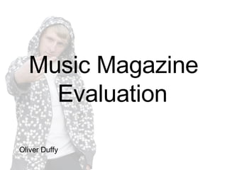
- 1. Music Magazine Evaluation Oliver Duffy
- 2. Introduction I decided to go for the music magazine option as oppose to creating a film. I worked on my own to create the magazine and used one of my friends to star in it. The artist is called Dioxide. I created the design of the magazine and also took the pictures. I thought up of the name ‘GEE’ for the magazine as I thought the name was quite catchy and linked to the term ‘Gangsta’ which relates to hip-hop, the genre which I decided to choose. The magazine is a UK hip-hop magazine, mainly focusing on UK rap artists although other rap artists from all over the world would feature in it. One magazine which I looked at closely was ‘VIBE’ as this was very similar to how my magazine would be laid out and is also a hip-hop magazine.
- 3. Chart Number of People Favourite I asked 10 people what there favourite genre of music was…
- 4. Chart I asked 10 people what they thought was a reasonable amount to spend on a monthly magazine…
- 5. Using, Developing and Challenging Forms and Conventions of Real Media Products Front Cover I used many conventions of the magazine genre. One of the main conventions was having the title at the top of the page. I got my friend who starred in the magazine to look directly into the camera for the front cover shot. This is very commonly used on magazines as it helps to draw in and involve the reader. I also decided to list other articles included in the magazine on the front cover and added a month, price, the web address of the magazine and a barcode, as all magazines include these elements. I also included a caption at the bottom of the magazine to try and convince readers that my magazine is better than other similar magazines available. I used bright, bold colours on the list of the articles used to make them stand out.
- 6. Using, Developing and Challenging Forms and Conventions of Real Media Products Contents I decided to add an advertisement to the bottom left of the contents page to try to get readers to subscribe to the magazine for a special price. I also thought that putting a unique code in each magazine would encourage more people to read the magazine because I thought it would be a good idea to give the reader an opportunity to win prizes, adding something a little different than to most magazines. I put another image of Dioxide in the contents page and at the top of the image wrote a page number on it. This is used regularly in magazines because the readers are drawn to images and if there is a page number with the image, the readers will tend to turn to the article. On the right-hand side of the contents page is a list of interesting articles. To keep the reader entertained I decided to add an ‘Hilarious Video of the Month’ in. This contained a link to a website where the reader can watch the video.
- 7. Using, Developing and Challenging Forms and Conventions of Real Media Products Feature Article My feature article was a two-page spread. The first page had information about Dioxide’s new album and included a competition to win two VIP tickets one of his concerts. The second page included an interesting interview with Dioxide including questions about who his inspirations are etc. At the top of the first page I included the heading of Dioxide’s album, to attract the readers attention. Used very regularly in magazines are interviews and so I thought it would be a good idea to do one. In magazines, interviews normally include a question to the artist in one colour, and the answer in another colour, to clearly layout and separate the question to the answer. I decided to use this method because I thought it looked very professional. I also used a ‘text grab’ making an interesting quote by Dioxide in a bigger font to stand out.
- 8. Using, Developing and Challenging Forms and Conventions of Real Media Products
- 9. Using, Developing and Challenging Forms and Conventions of Real Media Products I thought it would be a good idea to get some feedback about my magazine so I asked several friends to see what they thought. One of my friends thought the title, ‘GEE’, suggested that the magazine was about cool, hip-hop artists – exactly what I was trying to achieve with the name. Another said that ‘GEE’ related to ‘gangstas’ and rap artists. When I asked about whether you could tell if it was a rap magazine from the front cover, one friend pointed out that the slogan at the bottom says, “Britain’s No1 Hip-Hop Magazine”. This clearly shows what genre magazine this is. Another piece of feedback that I got was that the contents page looked professional because it included a subscription to the magazine at the bottom – something very popular in magazines. What made the contents look unprofessional was the uses of colour, the colour palette was very limited according to one friend. Something else which was said was that the feature article was laid out in a professional way because it was a basic layout, just like a real magazine.
- 10. Representing Particular Social Groups In my magazine I have represented teenagers. Dioxide is also a teenager and so teenagers can reflect from him. He is dressed casually, wearing a white t-shirt, a grey hoody and black pants, the way in which many teenagers dress today. Many teenagers like to feel rebellious and so the front cover shows Dioxide sticking up his middle finger, also being rebellious. The ‘bad boy’ image makes teenagers look up to him and aspire to be like him. The magazine is really aimed at older teenagers and this is reflected from the speech. The language used in the magazine has swearing in it – something which teenagers again see as rebellious and cool. The language also has slang in it, making it an easy and not too serious read. Rebellious
- 11. Dioxide is a stereotypical teenager, the type of teenager which we commonly see in the media. For example, in the soap Coronation Street, David Platt is also a very stereotypical teenager, very rebellious, getting up to all sorts of mischief. The audience have responded to the way the magazine represents social groups in the way which I wanted because they like the simple layout of the magazine and also like the fact that they can look up to Dioxide, thinking he’s cool. Representing Particular Social Groups
- 12. Distributing the Magazine After doing some research on the internet and looking at different magazine publishers, I found a publisher called Harris Publications Inc. Harris Publications publish many magazines, including XXL and Scratch magazine. They may be likely to publish my magazine because my magazine is a rap magazine, the same genre as XXL. The difference between my magazine and XXL is that XXL is an American magazine whilst mine is a UK magazine. GEE magazine could give Harris Publications the opportunity to publish UK magazines as well, making more profit. There aren’t many UK rap magazines out there, and so I think my magazine will sell well because there aren’t a lot of competitors in the UK. Also it gives people interested in the rap genre, who live in the UK, the opportunity to read about it. Another reason why I think my magazine will sell well is because it looks professional, is an easy read, it is aimed at teenagers – who read magazines an awful lot, and people have commented on the front cover saying it looks genuine. It is important for the front cover to look good because that is what sells the magazine.
- 14. Attracting and Addressing the Audience All hip-hop artists are seen to be rebels and this is reflected throughout the whole magazine. The audience would expect mischievous characters to be starred in it. The front page lists articles included in the magazine. This attracts the audience, because if they see an article of interest, they will be inclined to purchase the magazine. Bold black and red colours are used to make the articles really stand out – drawing the attention of the audience towards them. The contents page lists articles, some of other artists. This would attract fans of the other artists because they want to know everything about their favorite artists. A word search is also included on the contents page, this keeps the audience entertained.
- 15. Attracting and Addressing the Audience The first half of the feature article talks about Dioxide’s new album ‘Sick and Twisted’, which is also the title. ‘Sick and Twisted’ gives the audience the idea how Dioxide can be a bit crazy and in his interview he talks about having mad moments – the reason why he called his album that. The feature article mentions how the audience can win two VIP tickets to one of Dioxide’s performances, this would attract the audience, especially fans of Dioxide. Dioxide’s image on the first half of the article shows him looking serious with his arms folded. This gives the audience the idea that Dioxide ‘means business’ and helps to promote him as a ‘bad boy’. The text grab in the feature article says “My main inspiration would have to be Eminem. He is the shit!” This shows Dioxide’s feelings towards a well established artist and attracts the audience into reading the whole article. The second picture in the feature article shows Dioxide against a wall with graffiti on it. This shows that Dioxide is from ‘the streets’ and again links to how rebellious he is because of the graffiti. This again appeals to the audience as Dioxide appears to be ‘down to Earth’.
- 16. Attracting and Addressing the Audience The whole magazine is very light, the background for the contents page and the feature article are both white, this creates a feeling that the magazine isn’t too serious and is quite a cheerful and happy read, something which the audience want. The light background also suggests that the articles are enjoyable and aren’t dull, the audience don’t want to be bored!
- 17. Technology Since the start of this project, technology has played a big part. To record everything I have done I have used a blog. I have also researched other magazines and found images for ideas and inspirations, without the use of the internet this would not have been possible. I visited the Vibe website regularly to give me ideas, www.vibe.com . Two pieces of software which I used to edit and design the magazine was Photoshop and InDesign. I used Photoshop to edit images and InDesign to create the actually design and layout of the magazine. At all times I carried with me my pen drive so that I was able to save things on there and bring things home. Photoshop allows you to add effects to images and completely change the way they look. Photoshop can make an image appear more fresh, or change it from colour to black and white. There is so much stuff which can be done using Photoshop. It wasn’t new to me because I have used it several times before and so I haven’t really learnt anything new from it. InDesign on the other hand I had never used before and so this was entirely new to me. I found it quite easy to use and after a couple of goes on it, it became second nature. With InDesign I learnt how to structure my magazine and make it look professional.
- 18. Technology One thing with Photoshop which was very easy was cutting around images. Photoshop allowed me to cut out an image of Dioxide and have no background on it, perfect for the front cover. Technology has also made it easier for me to get audience feedback. After uploading my final product to my blog, friends were able to go on there and tell me what they thought without having an actual copy. This is effective because it saves printing out lots of copies for people to look at and also saves time.
- 19. Technology Image cut out using Photoshop…
- 20. Progression from Preliminary to Full Product I believe that my music magazine is far better than my preliminary task, the college magazine. The colours used in the college magazine look very unprofessional and the image of the person on the front, in my opinion, should be a bit bigger. The image also looks a bit dull and part of it hasn’t been cut out fully. The fonts don’t look very appealing and the font used for the title at the top looks childish. The title should also be bigger and more bold. The list of articles don’t seem big enough – they should really stand out and try and attract the audience’s attention. No colour scheme appears to have been developed with this magazine, random colours seem to be placed everywhere, green background for the list of articles and purple background for the film of the week.
- 21. Progression from Preliminary to Full Product The image of the person doesn’t really tell any sort of story or reveal anything. The article for which the image is for is about a student who has won an iPod. To improve this image, a picture of the student holding an iPod would look more appropriate and a lot more interesting. The music magazine front cover image has a lot more body language and the audience can get an idea of the type of person Dioxide is with the way he is dressed and what he is doing. The front cover image of the college magazine doesn’t give much away.
- 22. Progression from Preliminary to Full Product
- 24. Conclusion I think that I could have included more colour throughout the magazine as some of it looks a little plain, this could attract the audience more. The front cover could also contain more things on it such as “Win 2 VIP tickets to see Dioxide” or “Free poster inside”. I think overall though, the magazine looks quite professional and the article inside is interesting. The contents page is laid out how I like it and I think the image on the front cover suits it well with the colours used. The feature article is my favorite part and I think the way in which Dioxide’s new album is introduced first and then the interview after it looks really well. I think every page looks realistic which is because I tried to stick to the magazine codes and conventions as close as possible.