Champions of design vol #2
•
7 likes•8,735 views

Livro em PDF sobre cases de design de grandes marcas vol #2 Fonte: http://issuu.com/jonesknowlesritchie/docs/champions_of_design_2

Recommended
More Related Content
Viewers also liked
Viewers also liked (15)
Similar to Champions of design vol #2
Similar to Champions of design vol #2 (9)
More from Beto Lima Branding
More from Beto Lima Branding (15)
Recently uploaded
Recently uploaded (20)
Champions of design vol #2
- 1. Champions of Design 2 More observations on creativity for competitive advantage from jkr
- 3. Andy Knowles began his career marketing Heineken and Stella Artois at Whitbread before co-founding jkr. Now chairman, he’s as interested as ever in lively debate around what gets packaging noticed and chosen. Silas Amos was a founder designer at jkr in 1990. He writes our daily Design Gazette online and is focused on creative strategy as a day job. James Joice joined jkr in 2010. He spends his time scoping out opportunities, establishing new partnerships and helping brands use design to drive growth. jones knowles ritchie specialise in creating eye-catching design to help people choose quickly, happily and confidently. www.jkrglobal.com
- 4. We wish to express our thanks to the manufacturers of the products and services portrayed in this publication. Copyright of the images and trademarks used is that of the legal owner whose moral rights are acknowledged. All rights in the text used in this publication are reserved exclusively to Jones Knowles Ritchie Limited, except as may otherwise have been acknowledged. No part of this publication may be reproduced without the written permission of the copyright owner. First published by Jones Knowles Ritchie in December 2012. jkr Brand First Books 128 Albert Street London NW1 7NE
- 5. Champions of Design 2 More observations on creativity for competitive advantage from jkr By Andy Knowles, Silas Amos & James Joice With additional copy by John Naughton
- 7. Introduction It isn’t often that a design agency praises the work of its rivals but this year we are doing it for a second time, and with even greater enthusiasm. We have increased the number of our champions to thirty-five and tried to include more winners from the supermarket aisle, not just high-end shops. Our aim is to celebrate great works of design wherever we find them and to give credit equally to the people who created them and the clients who bought them. We collected their stories from a series called ‘Champions of Design’ that we publish throughout the year – not in design magazines but in Marketing. There is a little self-interest here. The more marketing people who grow to love great design and value its contribution to their brands the easier our job will be if we are fortunate enough to work with them. Over and above this we simply want to share our appreciation of these enthralling enterprises, they never fail to inspire us. They are confirmation classes in our own deep-held beliefs. Which are? 1. esign is not separate from the product, it is part of it. It should emerge so naturally D from the brand that it feels and sounds right, like the voice of a friend. If design is simply bolted on or used as wrapping paper the cracks will show and the product inside won’t last very long. 2. eople will pay a little more for something they want and a lot more for something they P want very much. (Think of the last thing you wanted desperately and ask yourself what part its design played in its attraction.) 3. s each of our champions illustrates, design pays for itself many times over. Few other A investments show such a great return. Of course we would say this, you might be thinking, but over 22 years as a design agency we have found it to be true. These are the main lessons we take from the case histories in this book but there is another. A truly great design is inimitable: once you have it it’s yours forever. Competitors may try to copy you but they will only come second at best. All of which may sound very fine in retrospect but how do you recognise a great design in the first place? Speaking for ourselves we think the answer is viscerally. We feel a mixture of admiration and envy. We wish we’d done it. If you share these feelings when you turn the pages this book will have done its job.
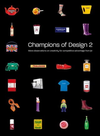
- 8. Contents Toblerone 8 Roberts Revival 44 Jägermeister 12 MTV 48 Perrier 16 Paul Smith 52 Staedtler 20 Yorkshire Tea 56 Hermès 24 Pez 60 Moleskine 28 Toms 64 illy 32 Pret A Manger 68 Playmobil 36 Monocle 72 Citroën 40 Muji 76
- 9. Contents Sailor Jerry 80 Dr Martens 116 Cohiba 84 Kiwi 120 Chanel No 5 88 Kenwood 124 Jif 92 Ricard 128 Hunter 96 Benefit 132 Wagamama 100 Supreme 136 Mulberry 104 Crayola 140 Tunnock’s 108 Chupa Chups 144 Howies 112
- 10. Toblerone How do you develop a USP when you’re just another chocolate manufacturer in Switzerland? Answer: fill your chocolate with a sticky nougat and mould it into a series of triangles which people subliminally assume to be a representation of the Alps. Toblerone might not be regarded as the highest quality Swiss chocolate, but it’s certainly the first one you’d pick out in an identity parade. In a very crowded marketplace, that is surely just as important. What defines an ‘iconic’ design? It’s an overused Rather it’s Toblerone and it resides in a category expression, but, by my reckoning, Toblerone of one. For proof of its genius, consider that fits the bill. For me, an iconic design features Albert Einstein (employed by the Swiss Federal a graphical or stylistic property that symbolises Institute for Intellectual Property in Bern) supposedly the brand’s values and attributes, thereby creating signed off the design – some endorsement. charisma. One also has to apply best practice: Another myth? Perhaps. But when the legend the tenacity, over many years, to focus on the core becomes fact, print the legend. iconography and keep investing it with meaning. A top tip: if struggling to separate the last two Toblerone has a distinctive shape and comes in segments of a big bar, use two fingers to push a distinctively shaped pack. One that looks like the mountain tips together. They will snap apart a mountain, of which you find many in Switzerland. with ease. Some designs you just love, in all their So this is definitively ‘Swiss’ chocolate. In truth, dimensions. This is one of them. SA mountains might not have inspired the original shape, but original intentions are irrelevant – myth and meanings attach themselves to iconic brands like iron filings to a magnet. It all sounds simple, but such apparent simplicity is a spark of genius. Over time, the iconography has allowed the pack to transcend its category. This is no longer another chocolate bar. 8
- 11. 9
- 12. Timeline 1868 Jean Tobler, the father of Theodor Tobler, opened a sweet shop in Bern, Switzerland. Toblerone logo 1900 Theodor took over the company. 1908 Vintage advertising Theodor and cousin Emil Baumann created the recipe for Toblerone. They chose a unique triangular shape for the bar. 1909 Theodor Tobler patented the process for making Toblerone tram Toblerone and the brand. 1969 A dark version of Toblerone was launched, followed four years later by a white-chocolate version. Advertising, 2009 2008 Toblerone celebrated its 100th anniversary. 2010 The chocolate bars became one triangle shorter to ensure the price stayed the same, despite the Toblerone Valentine’s Day box rising cost of ingredients. 10
- 13. Did you know? One of the following six pieces of information is bogus. Can you find the confection of deceit lurking below?* Toblerone ‘Welcome to the Jungle’ advertising, 2003. 1. he Croatian T 3. n 1995, Swedish I 4. Dragon’s teeth, 6. 0cc were originally 1 equivalent of politician, Mona pyramidal anti-tank called Toblerone, Toblerone is Sahlin, bought two fortifications first but were forced to called Kolumbo. bars of Toblerone used in World War II, change their name among other things are commonly known because of fears on a credit card as ‘Toblerone lines’. about copyright 2. A complex of supposed to be infringement. Manchester used only for University student government 5. he largest ever T flats on the Oxford business. The Toblerone bar Road with low ensuing scandal, weighed 102kg walls and a large known as the and is almost sloping triangular Toblerone Affair, one metre long. roof is known as forced her to ‘the Toblerones’. resign. A similar storyline was employed in the Danish political drama, Borgen. upon 10cc, but none of them was Toblerone. Six is therefore the ringer. *The Mancunian art rockers were known by a variety of names prior to settling 11
- 14. Jägermeister The marketing of Jägermeister is the stuff of legend. It has transformed an unknown, vaguely medicinal drink with an uncertain and slightly sinister past into a best-seller – synonymous with music, youth, sport and hedonism. The late marketing genius Sidney Frank is the man to take most credit for this. His techniques are widely studied, but he started with a simple premise. He simply described it as ‘the best drink in the world’. Like Danny DeVito, Jägermeister demonstrates We should, however, recognise that the initially that popularity need not depend on either stature unappealing package was imbued with charisma or beauty. Its packaging is a car-crash of an old- by the innovative marketing of wily distributors school Gothic logo-type atop a blaze of bright Sidney Frank Importing. Godfather to many a orange on a scrum-hooker bottle, but it oozes premium drink, including Grey Goose, they fuelled authenticity and power. Perhaps Jägermeister is Jägermeister’s export growth by first introducing so kitsch it’s cool? it to US drinkers with a squad of shapely ambassadors Among more sophisticated peers it is certainly in the on-trade. something of an iconoclast, but its butch name Jägermeister’s now triumphant place near the top and packaging bestow it with a character the logic of the global spirits sector is testimony to how of group discussion would never predict. distinctive design, if given the time to wear in, Logic be damned. Brands accrue meaning from provides enduring gain. AK use, not the other way around. Younger drinkers will frequently make traditional brands contemporary by bending them to their cause. The now ubiquitous Jägerbomb could be put down to a lucky bounce – like cider over ice. The idea was adopted and disseminated by cutting-edge consumers and bartenders. 12
- 15. 13
- 16. Timeline 1878 Wilhelm Mast opened a vinegar production plant. It served the nearby mines, which used it to cool the rocks before extraction. Advertising, 1970s 1947 His son, Curt Mast, who had branched out into spirit-making in the 1930s, resumed production following a hiatus during World War II. Sponsorship of Eintracht Braunschweig, 1973 1972 Jägermeister began sponsoring motor-racing, including teams in Formula One and the German Touring Car Masters. It continued until 2000. Jägermeister flying bar 1973 The Jägermeister logo appeared on the shirts of players at Eintracht Braunschweig football club. A brief legal battle with the German Football Association led to the brand becoming the first to advertise on team shirts in the German football league. Jägermeister Porsche Turbo RSR 2010 Jägermeister achieved record sales of 82.4 million bottles, despite the onset of the global economic crisis. The UK became the drink’s third-biggest market, following Germany and the US. ‘Live Loud’ campaign 2011 The drink once again achieved record sales, with 87.1 million bottles sold in more than 90 countries. Sales in the UK exceeded 5 million bottles for the first time. 14
- 17. Did you know? Hunt for the truth in one of these at your peril.* 1. hen the drink was W 3. Jägerbombs, 5. A (false) rumour 6. he company’s logo T launched in 1935, comprising a spread around has been interpreted Hermann Göring shot glass of mid-70s Baton erroneously as occupied the position Jägermeister mixed Rouge, Louisiana, a symbolic of Reichsjägermeister with Red Bull, have that the drink representation of and was on familiar been banned in contained opiates. the phrase, ‘Oh terms with the parts of Australia. After the story was Dear God.’ Perhaps liqueur’s inventor, picked up by the a familiar refrain to Carl Mast. Therefore, local paper, sales those who have Jägermeister became 4. Psychostick, rocketed from partaken too freely. known in some a self-styled 10 to 1,000 cases The surrounding quarters as ‘Göring- humorous band per month. circle is the ‘O(h)’, Schnapps’. from Arizona, the stag is ‘dear’ have written The and the cross Jägermeister Love Song. represents ‘God’. 2. Every bottle Sample lyric, ‘You of Jägermeister look your best contains eight when my vision is drops (0.4ml) blurry/That’s not of deer blood. what I meant, I can’t keep from slurring.’ of urban legend, it is categorically untrue. *Although the deer blood story at number two has become the stuff 15
- 18. Perrier Perrier is simultaneously a design classic and an eco-nightmare. Divorced from its teardrop-shaped bottle it doesn’t seem half the product. Yet, its strong sales continue to defy economic downturn and the flak directed at the whole concept of bottled water. Its perennially chic image will be put to even greater test over the coming years, but ever-inventive ad campaigns have so far been equal to the challenge. Although it pains us to admit it, there are some In recent times, growing concerns about French qualities we simply have to admire. sustainability and a stuttering economy have Perrier is the embodiment of many of them: taken some of the shine off bottled mineral effortlessly stylish, alluringly sophisticated and waters. Both our consciences and our wallets unapologetically stubborn. For while the droplet- find it a more difficult purchase to justify, shaped bottle is beautiful and distinctive, it is also a truth that the UNICEF Tap project has impractical. Its curvature and singular contact exploited to brilliant effect. point make it difficult to get down a production Perrier has found ways to stay relevant though. line with any speed. Its limited-edition designs with well-chosen That’s what makes it the genuine article; it’s too partners keep the brand feeling fresh. They also sure of itself to worry about such practicalities. demonstrate the distinctiveness of its core identity. Perrier is brimming with authenticity and that’s For even when it lends its pack canvas to someone why it sells 1 billion bottles a year. else, it remains unmistakably Perrier. JJ The brand didn’t just make mineral water an acceptable soft drink – it made it aspirational. As the line ‘the Champagne of waters’ brilliantly expressed, you really did feel like you were having a special moment when you fizzed open a bottle of Perrier. It was a truly status-affirming brand. 16
- 19. 17
- 20. Timeline 1863 Napoleon III gave mineral water status to a spring in Vergèze. La Femme Noire, Villemot 1898 Dr Louis Perrier bought a spring in southern France and began to sell bottled water from his spa. 1903 Sir Saint-John Harmsworth invested in the L’Etreinte, Villemot company, renaming the spring ‘Source Perrier’. 1985 Perrier with a twist was introduced, with lemon, lime and orange flavours. Le Couple Dansant, Villemot 1992 Nestlé acquired Source Perrier. 2001 The brand introduced a PET bottle after 11 years of Cocktail Mondain, Villemot research into which plastic would be most suitable. 2011 Perrier launched Dita Von Teese limited-edition packaging. La Rousse, Villemot 18
- 21. Did you know? One of the following facts just doesn’t hold water.* Perrier Dita Von Teese, 2011. 1. errier paid a P 2. errier was the first P 3. According to 5. The idea for the reported £250,000 sponsor of the Perrier’s marketing, distinctive shape of to have its product Edinburgh Comedy each bottle of its the original Perrier featured in the 2006 Awards. The first carbonated water bottle is said to have version of Casino winners in 1981, with contains 50 million come to Sir Saint-John Royale. It ran a their production The bubbles. Harmsworth when supporting ad Cellar Tapes, were the he was recuperating campaign featuring Cambridge Footlights, from a car accident. a bottle sporting comprising: Stephen 4. A 1950 advertising The shape of the a dinner jacket and Fry, Hugh Laurie, campaign for Perrier Indian clubs he used beneath it the words, Emma Thompson, declared: ‘Water in his physiotherapy ‘Eau Eau Seven.’ Tony Slattery, which springs out provided the Penny Dwyer as one opens it. inspiration. and Paul Shearer. Water that Laughs. Water like a handful of needles in 6. In 2002, Perrier the mouth.’ introduced a less gassy version of its drink called Eau de Perrier which is sold in blue bottles. *‘Eau James!’ There was no Perrier product placement in Casino Royale, so number one is a downright lie. 19
- 22. Staedtler The ubiquitous yellow and black pencils it produces are such a part of our cultural fabric that its name is almost invisible. But Staedtler has, with the humble Noris and slightly grander Mars, ensured the ongoing prosperity of an ancient company which still espouses old-fashioned financial planning allied to industry and endeavour. Staedtler products are both beautiful and useful, miniature masterpieces that we should never take for granted. For all its myriad innovations and ranges, it comes The black tail with HB coding is systematic and down to the branding of two pencils that has reassuringly functional. Note there is no rubber made Staedtler the definitive product in its on the tip: wielding this pencil you won’t make category. The yellow-and-black Noris got us mistakes. The Mars helmet icon says this is a pencil started at school; its distinctive livery can that means business – it knows you are going into transport us back to the classroom at a glance. battle against the tyranny of a blank sheet. As we grew up, those of us with a design leaning Poor workmen blame their tools, but a trained became aware of the Staedtler ‘Pro’ – the bright professional selects them with care. Staedtler’s blue Mars. As Apple endured its tough times as graphic purity shows confidence. This gives the the creatives’ computer brand, so the world brand charisma and cachet, and gets it into the respects the Staedtler because it is the weapon hands of designers with rectangular glasses and of choice for designers. wannabes alike. SA We love it because the design is Dieter Rams in a stick. I dislike semiotic mumbo-jumbo, but, in this case, I grudgingly observe there is a semiotic dimension. First the name. Those Germans are precise characters; one assumes they keep their pencils sharp too. The bright blue supports this – it’s a colour of care and consideration. It’s calm and measured, but also bold enough to suggest a bit of personality. 20
- 23. 21
- 24. Timeline 1835 The JS Staedtler company was established in Vintage Mars Lumograph box Nuremberg, Germany, following a long history of pencil-making in the area. 1866 Staedtler employed 54 people, with production reaching more than 2 million pencils a year. Staedtler pencil box, inside lid 1922 A US subsidiary was established, followed four years later by one in Japan. Mars eraser 1988 German production was relocated to a bigger site in Moosacher Strasse in North Nuremberg. 1997 The Staedtler Foundation, a non-profit Noris Club colouring pencils organisation that holds all shares in the Staedtler group, was set up. 2011 The Staedtler Triplus 426 retractable ballpoint Staedtler Warrior Patta footware, 2011 pen won a Red Dot Design Award. 2012 Staedtler’s annual sales of wood-cased pencils reached 65 million, including 33 million yellow- and-black Noris pencils. 22
- 25. Did you know? One of these pencil stories wants to lead you astray.* 1. n 2011, Staedtler’s I 3. Staedtler has 5. isitors to its V 6. he reason why T turnover was £220m. developed an factories are not Staedtler can claim The company has no anti-break system allowed to see the to be more debt and is reluctant for its coloured production line environmentally ever to borrow, pencils which it where the friendly is that it preferring to invest claims has boosted WOPEX pencil uses mashed-up profits in expansion sales. The extra is manufactured. wood in its pencil programmes thus, coating around the manufacture. This growing more slowly, pencil stops them enables roughly but sustainably. breaking when 80% of every tree sharpened. to be used rather than the 20% which 2. ohannes Bell and J is the norm in most Hermann Müller 4. n advert for A pencil manufacture. signed the Treaty Staedtler shows an of Versailles for actor playing Albert Germany using Speer arriving at Staedtler pens. Adolf Hitler’s office. The treaty was He says, ‘I only came so despised within to see your Staedtler,’ Germany, the but Hitler snaps it in company actively two and drops it to sought to suppress the floor. this information. it’s bogus in the first place. Number two is untrue. *No need to suppress that Treaty of Versailles story as 23
- 26. Hermès Uncompromising on quality as well as price, luxury goods manufacturer Hermès is proof that there is more than one way for a company to make itself recession proof. Still family run and still employing individual craftsmen to make luxury luggage items in their entirety, Hermès stands apart from all accepted wisdom about mass production. It successfully caters for that small (but sizeable) elite that never need to see the price tag. Here’s a brand that creates desire beyond reason, That lovely word ‘atelier’ comes to mind: yet succeeds through rigorous control of its craftsmen and women in workshops using the products as much as through emotional flights best materials and the best (often very traditional) of fancy. A brand famous for maximalist scarves methods, and hang the expense. and, conversely, its super-simple, but highly prized These skills are put at the service of ‘art’ – boxes. A brand continually innovating, while also from the stunning scarf designs to the bonkers remaining somehow faithful to its traditional roots. shop windows and the ultra-contemporary A brand with a cutting edge aesthetic, yet one that homeware. In Britain we might say that quality your granny would love to wear. In short, with should be known, not shown. In Europe it’s both, Hermès, the relationship between design and with knobs on. The marriage of art and craft – business has some inherent contradictions, is this not what all great design strives to be? but it all works beautifully. Eye-watering prices, offered without a blink, simply Perhaps it successfully embraces contradiction compound the impression of excellence. SA because all its designs share two fundamental qualities: skill and art. On the one hand, this is a brand of craftsmanship, from the high-end- saddle making to the ‘hand rolled’ hems of its scarves. As with a fine Cuban cigar, one knows ‘it’s the best’. 24
- 27. 25
- 28. Timeline 1837 Thierry Hermès established an elite harness workshop in the Grands Boulevards quarter of Paris. Satyr-winged saddlebag 1880 Thierry’s son Charles-Émile Hermès branched out into saddlery and relocated the shop to Hermès wallet 24 Rue du Faubourg Saint-Honoré, where it remains today. 1918 Thierry’s grandson Émile, noting the advent of the motor car, changed the firm’s direction toward the production of luggage. Hermès scarf 1935 The company introduced a leather Sac à Depêches, later known as ‘the Kelly bag’ after Grace Kelly held it in front of her in a 1956 photograph to hide her pregnancy. Hermès gift boxes 1937 Silk scarves were introduced. 1999 The company acquired a 35% stake in the Jean-Paul Gaultier fashion house. Advertising, China 2012 Hermès celebrated its 175th year in business with a London exhibition called ‘Leather Forever’. 26
- 29. Did you know? There’s fabrication afoot in the following.* Hermès flagship store Tokyo, 2011. 1. ne Hermès scarf, O 3. n 1918, Hermès I 5. ctress and throaty A 6. African dictator, normally costing brought out the chanteuse, Jane Mobutu Sese Soko, between £230 and first leather golfing Birkin, helped once bought the £500, is sold every jacket with a zipper. Hermès develop entire contents of 30 seconds. The a handbag after a a Parisian Hermès Carré, as it’s known, conversation with outlet and was famously used Jean-Louis Dumas threatened to kill by actress Sharon 4 . y the mid-90s, B when she the manager. He Stone for a bondage Jean-Louis Dumas complained that was subsequently scene in Basic Instinct. and all the Hermès her ‘Kelly bag’ banned for life from family were on the was not practical. all Hermès stores. Forbes ‘List of However, she Billionaires’. apparently no 2.The original Hermès longer uses a Birkin box was cream- herself as she coloured with gilded believes it gave edging. Shortages her tendonitis. during the war forced the company to use the only plain paperboard available – which happened to be the now legendary orange. but number six is 100% fake. *Don’t let the cat out of the hand-tooled bag, 27
- 30. Moleskine Moleskine notebooks might have a slightly fanciful history, but what sustains them in the present and underpins the company’s success is that they represent a little piece of affordable luxury. They elevate any piece of writing (even if it is just a shopping list) into something a little more pleasurable and, dare we say it, sensual. If that puts us a little closer to our inner Picasso or Wilde, where’s the harm in that? Moleskine gave the archetype of an artist’s journal Seeing it adopted by the world of business solid form, reviving a traditional format and serving meetings rankled with me. It seemed vainglorious it up as a definitive classic. to suggest that notes from a dreary meeting might follow in the footsteps of Hemingway. The design’s detailing transformed a fanciful tale of artistic provenance into a real brand. So I applaud the brand for also producing The paper quality, the elasticated binding, the ribbon humbler card-covered versions for these more bookmark and the inside pocket discreetly holding prosaic occasions. These ‘basic books’ have a slip of paper (on which the brand’s back story beautiful detailing. They show design can be about is told) all helps to convince us this is the real deal. quality that is known, not flaunted. Moleskine’s recognition as a status symbol has been achieved These touches got the brand stocked in and through design understatement – be it in the associated with all the right places. This took it boardroom or the backpack. SA from an arty niche to mainstream success. As with Filofaxes in the 1980s, plonking one down on a meeting table became a display of one-upmanship. As an early user I took the original leather-bound version backpacking, using it for its stated purpose – as a notebook for jottings and drawings. The robust design endured myriad climates and much bashing about, becoming a treasured companion. 28
- 31. Illustration by Raúl Gómez. 29
- 32. Timeline 1986 Writer Bruce Chatwin immortalised the name Moleskine in his book The Songlines, which later inspired the resurrection of the brand. Van Gogh sketchbook, c.1890 1996 Milanese publisher Modo Modo trademarked the Moleskine name. Production began in China and the notebook was hand-finished in Italy before hitting the market the following year. Moleskine designer Marti Guixe 2004 Photographer Armand Frasco started the fan site Moleskinerie.com. It went on to attract 5,000 visitors a day and Moleskine adopted the site as its official blog. Moleskine City notebooks 2006 Modo Modo was bought by an investment fund for €60m. The business was renamed under the Moleskine brand name. 2008 Limited-edition Lego Moleskine Moleskine America Inc was established, with headquarters in New York. 2010 Moleskine released a limited-edition range featuring Pac-Man to celebrate the video-game Moleskine iPad iPhone covers character’s 30th anniversary. Other special editions have featured Peanuts, Star Wars and artwork by film director Tim Burton. 30
- 33. Did you know? The veracity of one of these facts is paper-thin.* 1. n 2010, Moleskine I 3. odo Modo’s M 5. oleskine notebooks M 6. Each Moleskine had a turnover of co-owner, are ranked at notebook has £161m. It has grown Francesco Number 122 on an individual by 25% every year Franceschi, has the satirical blog, ID number. from 2006 onwards. conceded that Stuff White People Moleskine’s claims Like. ‘It’s a good of an authentic rule of thumb,’ 2. he first Moleskine T artistic heritage are the blog notes, notebooks were a fabrication. ‘It’s ‘that white people produced with an exaggeration,’ like anything that taupe-coloured he admitted to the old writers and pages, partly as a New York Times, artists liked: play on words ‘It’s marketing, not typewriters, journals, because taupe is science. It’s not the suicide, heroin and French for mole. absolute truth.’ trains are just a few examples.’ 4. here is no official, T accepted way to pronounce Moleskine. have taupe-coloured pages. So number two isn’t true. *Taupe is French for mole, but original Moleskines did not 31
- 34. illy Not every luxury brand can justify its price, but family-run illy, purveyors of premium coffee for three generations, can point to several good reasons for charging more than most. It pays its suppliers more, is more exacting in its standards and delivers a better and more consistent taste than its rivals. Simple, really. As a coffee-lover, it’s a treat to write about illy. There are no ‘bum notes’ – even the sugar sticks look Fresh and friendly, but possessing an extra shot like they’ve been loved. Product details and other of Italian sophistication, it is the definitive article. information keep a respectful distance from the logo, which is always set elegantly on white or silver. So what does illy teach us? Above all else, it is So, wherever you see it, illy appears loud and proud. a masterclass in how to leverage a logo. The red mark is brazenly stamped on anything and Lastly, the logo always seems to be in good company. everything: cups, awnings, ashtrays and any other Be it the sleek metal tins or the quirky espresso surface that can be found. Its signage epitomises cups, everything tells you that illy is mighty fine this approach – treated reverently, like a flag, coffee. Speaking of which, it might just be time ensuring you can’t miss it. for a cup… JJ There are three reasons why illy has made this simple strategy work so well. First, the brand has a really likeable logo at its heart. The typography is brimming with personality and housed by the bright-red background, it puts a spring in your step before you’ve even taken a sip. Second, it is consistently executed with care. 32
- 35. 33
- 36. Timeline 1995 Andrea Illy co-authored Espresso Coffee: the Chemistry of Quality, about the science and technology of coffee. illy espresso cup saucer 1996 Artist James Rosenquist designed the red square illy logo, which is still used across the brand’s products. illy FrancisFrancis! X1 espresso machine 2000 The University of Coffee was created. It has taught coffee culture, from bean to cup, to the 5,000 students who have attended to date. 2003 The company launched Espressamente illy, ‘Galleria illy’ advertising a chain of Italian-style bars with innovative design concepts. 2005 illy opened its first gallery in the SoHo district of New York City, displaying work from leading international artists and design students. Alioum Moussa ‘All create together’ can 2009 illy partnered Coca-Cola to launch a ready-to- drink coffee range, called illy issimo. ‘Galleria illy’, London 34
- 37. Did you know? One of these leaves the bitter aftertaste of deceit.* The illy Art Collection featuring designer espresso cups, 2010. 1. n 1991, illy began I 3. lly was the first i 5. Andrea Illy, boss 6. he illy logo was T a competition company to sponsor of the company, painted by the pop to find the best the Italian national disagrees strongly artist, James growers of sun- football team. with Fairtrade: Rosenquist. It dried arabica in ‘Our doctrine is was originally part Brazil. The prize that we will pay of a bigger painting for the winner 4. n 1988, illy I more for better which hangs in was to become its introduced a quality. Fairtrade Andrea Illy’s office. supplier. illy doesn’t computerised is about paying a use middlemen system for checking higher price for the and it pays every individual same goods. That is Brazilian farmers bean which rejects against the laws of the difference. those which don’t supply and demand.’ meet its rigorous selection criteria. 2 . s well as its A famous coffee, the illy group also produces teas, chocolate, jam and wine. *All truth has been filtered from number three. 35
- 38. Playmobil There is something joyous about a company succeeding while resisting the lures of movie tie-ins and merchandising opportunities. Instead, Playmobil has put its faith in children’s imaginations. The German company has not only shunned the advances of movie franchises, but even dares not to give its creations real names, lest it should discourage children from coining their own. When one trots out clichés about the Germans, Civilisation is a result of our mastering of tools great toymaking is not top of mind. But they do and our imaginative application of them. With the excel at it, with a tradition for making things very, learning tool that is Playmobil, whole civilisations very well. can be made in microcosm. Children can create and order their own particular universe, learning Playmobil is a case in point. On one level, we see about how everyone can play their part and how charming little characters inhabiting a jolly place, everything connects. No small achievement for their adventures played out under the packaging’s little toys that can be bought for almost pocket- blue skies. Nothing too dark is likely to happen. money prices. However, one look at the design blueprints reveals a totally considered product – Garish ‘cross-platform digitally interfacing’ ergonomically, aesthetically and conceptually. successes such as Moshi Monsters and Skylanders are likely to make Playmobil reflect on how it The folk are designed to fit into a child’s hand. might evolve and stay relevant. I hope not – Robust and collectable, it’s the interchangeable I think its own little world suits it just fine. SA nature of the little characters’ costumes and props that is the design’s stroke of genius. There is every chance a pirate might swap his cutlass for a baby’s stroller or his tri-cornered hat for a construction helmet. He may even end the day a princess. 36
- 39. 37
- 40. Timeline 1954 Horst Brandstätter joined the family company started by his grandfather in 1876. He moved into manufacturing plastic goods; its first Playmobil Cowboy set success was the hula hoop. 1973 Hans Beck created Playmobil for Brandstätter. Playmobil Adventure Brachiosaurus 1976 The first female figures were introduced. 2003 Playmobil celebrated its 30th birthday. A golden knight toy was produced to mark the occasion. Playmobil Dad’s BBQ 2006 Playmobil figures gained articulated feet in honour of the World Cup. Playmobil Pizza Guy 2011 Playmobil achieved turnover of €564m. Playmobil Speckled Horse 38
- 41. Did you know? ‘Shiver me timbers!’ Lurking among these is a lie that would make a posable pirate blush.* Image courtesy of Mark Wilson. 1. nusual Playmobil U 3. n Spain, Playmobil I 5. arketed under the M 6. Joy Division’s sets which have been is produced under title ‘Gaymobil’, September 1979 released include: a licence by the toy it’s possible to buy appearance on Knife-Throwing company, Famosa. a set of Village Something Else Circus Act, a Vulture It is marketed as People Playmobil performing Cow Carcass, a ‘los clicks de comprising: a ‘Transmission’ has Hazardous Materials Famobil’ with male construction worker, been recreated in Clean-up Team and dolls known as a Native American, stop-motion an Axeman. ‘clicks’ and females a cowboy, a animation with as ‘clacks’. policeman, a sailor Playmobil characters. and a motorbiker. 2. n April 1st 2011, O the ThinkGeek 4. Japan boasts toy website released figures similar to a spoof Playmobil those made by version of an Apple Playmobil and Store, released ‘to known as Kubricks, introduce children named in honour of to the magic the late film director. of Apple’. it does not sadly exist in reality, making a liar of number five. *Although a spoof version of said Village People exists on the internet, 39
- 42. Citroën Dogged by financial problems for much of its existence, Citroën has nevertheless survived and prospered in the 21st century. While the nostalgic might argue it has sacrificed quirkiness for the safety of the middle market, it remains a flagship of French technical expertise. Name a car that epitomises French style. How about Citroën has not always been so happy. With the Citroën 2CV? Or the DS? To create a vehicle weak cost management, its avant-garde designs that defines a national character is quite something. necessitated high prices and after the market To do so a second time, from the opposite end weakened due to the 1973 oil crisis, the company of the market, is a remarkable achievement. went under. Rescued by Peugeot, Citroën was left to pursue diluted designs built on shared components. As designers, we regularly glean the germ of our most successful ideas from the subtext in the However, mass mediocrity is ultimately brief. The 2CV, for example, took its inspiration unsustainable without cost-leadership. We should from the desire to ‘provide the peasantry with draw inspiration from Citroën’s recent success in a motorised alternative to the horse, capable of commanding higher prices following its return transporting a tray of eggs over cobbled roads’. to more progressive design with the new-look DS The resulting suspension had the travel of a coil- range. AK spring mattress. The aerodynamic DS was conceived in secret during the latter years of the German occupation. It was deliberately designed to reassert French pride and became so closely associated with General de Gaulle, it must have been created for him. Sadly, however, the story of 40
- 43. 41
- 44. Timeline 1923 A Citroën 5CV became the first car to be driven around Australia. The original vehicle, restored and in working order, is now owned by the National Museum of Australia. Eiffel Tower sponsored by Citroën, 1925 1925 Founder André-Gustave Citroën advertised the company by putting its name in lights across the Eiffel Tower. The sign remained there until 1934. Advertising, 1960s 1937 Pierre-Jules Boulanger became president of Citroën and a year later joint managing director of Michelin. Citroën 2CV, 1979 1961 Flaminio Bertoni designed his last car, the Ami 6. Though no match for the 2CV and DS 19, elements influenced 1960s car design. Citroën C1 Airplay, 2006 1974 Peugeot acquired a stake in Citroën, increasing it to a majority shareholding two years later, creating the PSA Group – later renamed PSA Citroën DS3 Racing car, 2011 Peugeot Citroën. 2009 Celebrating its 90th anniversary, Citroën refreshed its brand with an updated logo and new slogan, ‘Créative technologie.’ It also introduced a premium car range, bringing back the DS name. 42
- 45. Did you know? One of these car facts is definitely a ringer.* Citroën Metropolis concept car, 2010. 1. he first motorised T 2. French President, 3. Although seemingly 5. he Citroën logo T crossing of the Charles de Gaulle ill-equipped to star in of two inverted ‘V’s Sahara desert, from was travelling in a car chase, a Citroën is actually a graphic Algiers to Timbuktu, an unarmoured 2CV featured in representation of was undertaken Citroën DS (The arguably the most a herringbone in December 1922 by Goddess) when memorable scene gear-wheel design, a convoy of Citroën he survived an in 1981 Bond film, reflecting the fact Half Tracks assassination For Your Eyes Only, that early Citroën (Autochenilles). attempt in the when it provided models used a It took 21 days Parisian suburb an unlikely means herringbone bevel to complete the 2,000 of Petit-Clamart of escape for gear final drive in mile expedition. in August 1962. Roger Moore. the rear axle. De Gaulle attributed his survival to the 4. Dusseldorf electro 6. y the end of its first B unique suspension pioneers, Florian day on display of the car which Schneider and Ralf at the Paris motor enabled it to escape Hütter of show of 1955, a at full speed despite Kraftwerk, both staggering 12,000 having two tyres collect Citroën people had paid shot out. The HY vans. deposits to own the attempt was new Citroën DS. recreated in the opening scene of The Day of *Zut alors! Nombre four is built on a chassis of deceit. the Jackal. 43
- 46. Roberts Revival There’s a good chance that a Roberts radio played a part in the formative memories of many a baby boomer. Its renaissance, in the form of the Roberts Revival, has in part been driven by that generation’s delight in being able to purchase a part of its childhood. True to its pioneering spirit however, Roberts has been reborn by embracing change rather than simply appealing to nostalgia. It is proof that modern technology fused with classic design is a potent combination in any era. Today the idea of a radio that does only radio is, offer. It means they should retain relevance long arguably, an anachronism. Roberts was part of after the vintage fad has faded and the ‘Keep calm’ broadcasting when ‘wireless’ didn’t mean streaming poster has been removed from the kitchen wall. audio via a PC. Nevertheless, the Roberts Revival Roberts still looks stylish because its compact, is a good example of a particular kind of ‘vintage’ simple form followed function. If it had really design; it’s progressive retro. Which is to say it embraced the design fashions of the time it might might look as ‘home and hearth’ as a brown have aged less successfully. Today there are plenty teapot, but under the skin it’s bang up-to-date. of funky modern alternatives around, but I suspect Trying to switch on an internet-linked model your PC will be obsolete or look old-fashioned far at a pal’s house recently, the minimal buttons quicker than a Roberts. SA proved too modern for me to figure out myself and I had to ask for help. It might look old enough for a free bus pass, but I was the one left having a ‘senior moment’. Roberts still has a twinkle in the eye and contemporary engineering inside. Being progressive retro puts it in good design company, alongside the Aston Martin DBS, the Coke Classic aluminium bottle, Gucci by Gucci and suchlike. These are brands using nostalgia that also have an ‘of-the-moment’ quality or product 44
- 47. 45
- 48. Timeline 1940 Harry Roberts received a letter telling him the Queen had personally purchased a Roberts M4D model in the radio department of Harrods. Advertising, 1951 1959 Roberts modified one of its existing sets at the request of St John’s College, Cambridge, for a battery-powered shortwave radio to take on an expedition to Colombia. Roberts R505 1961 The company produced a special-edition, solid-gold-cased radio. The publicity stunt attracted worldwide attention when it was stolen from a department store. ‘The Digital Radio Collection’ 1969 Harry Roberts died and was succeeded by his son, Richard, as chairman and managing director. 2000 A special edition ‘Revival’ was created for the Queen Mother to commemorate her 100th birthday. Cath Kidston Roberts 2012 The brand marked its 80th anniversary with a red, white and blue range celebrating the Queen’s Diamond Jubilee. Swarovski Roberts 46
- 49. Did you know? One of these is broadcasting on FM (Flagrantly Mendacious).* Jack Train (ITMA’s Colonel Chinstrap) drawing the crowds at Earls Court in 1956. 1. oberts launched the R 3. or many years F 4. n the company’s I 5. Roberts is the only first solar-powered Roberts radios were earliest days, company permitted DAB radio. the only type of founders Harry to engrave BBC transistor allowed in Roberts and Leslie World Service UK prisons as their Bidmead were on its products. cases could be easily offered a free 2. The Roberts Sports removed in any weekend in a hotel 984 radio was the search for in Cornwall if world’s first 3-band contraband. The they could 6. Canadian singer- personal stereo and 1975 Rambler 2 demonstrate that songwriter, Robbie was designed model was even one of their radios Robertson and the primarily with designed with the would work there. late broadcaster, cricket-lovers in prison population Robert Robinson, mind as it was in mind. both featured in capable of picking advertising for up Test Match Special Roberts radios in which was then the 1970s. broadcast on Long Wave. 1970s ad campaigns, making number six the all-too-obvious fib. *Band frontmen and combed-over quizmasters played no part in the company’s 47
- 50. MTV When MTV has been at its most successful, the hair displayed on its screens has always been big. From the luxurious manes of the New Romantics to the backcombed edifices witnessed on Jersey Shore, coiffures of magnitude have served as a barometer to the station’s fortunes. That the barnets in question no longer have anything to do with music might also be significant. Through MTV’s formative decade, its logo acted ‘The MTV generation’ defined an entire era and as a canvas for the whims of generations of when a design helps put your brand at the heart designers, as it was constantly reinterpreted of popular culture, success will surely follow. and played with. Unlikely to win a typographic That was then. Look on YouTube for compilations beauty contest, the design instead developed a of MTV idents. They predate the current approach, big personality. Like one famous early version, which is telling. The logo remains, but it’s less planted by an astronaut on the moon, it was a spirited and colourful. It was a creative springboard; pioneer. The design application’s kinetic exuberance now it’s a corporate anchor. It makes strategic was a fantastic complement to the shouted slogan sense, as the brand has diversified, and the less ‘I want my MTV’; it looked like a cheery yell. soulful expression seems fitting for the home of As a design lesson it was proof that the medium Jersey Shore. We get the designs, culture and media can be the message. What I mean is that the we demand. SA myriad funky ways in which it was expressed made it visually reflective of the channel’s fast-cut video content. It defined the style of the ‘video age’ as much as represented it. Which came first, the wonky claymation versions of the logo, or the video for Peter Gabriel’s ‘Sledgehammer’? 48
- 51. 49
- 52. Timeline 1989 The world premiere of Madonna’s ‘Like A Prayer’ video aired on the channel. 1989 MTV Unplugged aired for the first time, showcasing acoustic performances from acts such as Nirvana and LL Cool J. 1992 Presidential candidate and Arkansas governor Bill Clinton answered young people’s questions in the first of MTV’s Choose Or Lose forums covering politics. 2000 Comedy show Jackass debuted on the channel, produced by Johnny Knoxville, Jeff Tremaine and director Spike Jonze. 2002 The world’s first celebrity reality TV show, The Osbournes, was broadcast by MTV. 2009 Jersey Shore became the number-one show on US TV and MTV’s most successful series yet in terms of ratings. 2011 Mike Judge’s Beavis and Butthead returned to MTV. It initially ran from 1993 to 1997. 50
- 53. Did you know? One of these is to truth what Jersey Shore is to reality. And truth.* 1. he first words heard T 3. uring a mid-90s D 5. ussell Brand was R 6. he last book Gore T on MTV, spoken by slump in the sacked from his job Vidal completed John Lack, were: channel’s fortunes, at MTV when he before his death in ‘Ladies and The Simpsons turned up to work 2012 was A Shore gentlemen, mocked it by having dressed as Osama Thing written by rock and roll!’ Bart write on his bin Laden on Snooki from MTV’s chalkboard, September 12th reality show, ‘I no longer want 2001. He has since Jersey Shore. 2. MTV show, Beavis my MTV.’ presented both the and Butthead, was channel’s music and accused of inspiring video awards. a series of arson 4. Ex-Monkee, Mike incidents because Nesmith, is seen by of children imitating some as the Beavis and his ‘hot godfather of MTV love for fire’. Beavis because he is partly modelled produced a half- on Barry Manilow. hour pilot for a music video show, Popclips. He had the option of shares in the fledgling MTV but opted for a flat fee instead. joined the choir invisible without having sampled the delights of Snooki’s magnum opus. *Heaven forfend that number six should be true! As far as we know, Gore Vidal 51
- 54. Paul Smith Big in Japan and thriving in most other parts of the world, Paul Smith has been the most visible face of British fashion on the international stage for the past 30 years. In that time, Smith has cultivated an instantly recognisable but never clichéd brand of tailoring that has reflected the classic British look with a twist, which has been his signature from his earliest days. That the man has the same near-universal appeal as his brand only makes the success more deserved. ‘I give classics just a little kick,’ says the great man, The brand’s design is also about the judicious use and that pretty much sums it up; but Paul Smith is of contrasts: those lairy, stripy colours are set off being rather modest. That ‘kick’ works only because by the dark wood floors; the flash of colour on a of the quality of the design and manufacture, and buttonhole is set against a dark grey suit. For we resonates only because it has a genuine sense of repressed chaps stuck with sludgy or monochrome spirit, rather than being something ‘bolted on’. wardrobes, all those bright stripy accessories deliver the equivalent of a pick-n-mix sugar rush Paul Smith’s work feels like the output of an to a five-year-old. enthusiast – from the playful windows to the curating of various art books and objects at the Some brands have consumers; Paul Smith tends back of the shops. One gets a sense of genuine to have fans. A case of getting back what you give, pleasure being taken. You can’t fake this stuff: perhaps? Now, if he could only give an occasional when it’s real you can almost smell it. My art teacher ‘little kick’ to his sometimes snooty staff, life would in the brand’s Nottingham hometown was flown be sublime. SA to Tokyo in the 1980s to paint a trompe l’oeil £5 note on the floor of the brand’s flagship store. That’s pretty bonkers in purely business terms, but success can fall out of such a spirit. 52
- 55. 53
- 56. Timeline 1970 Smith opened his first shop, in Nottingham. 1976 Paul Smith in his Nottingham store, 1970s First London shop opened in Floral Street, Covent Garden. 1991 Paul Smith received the British Designer Paul Smith Mini Cooper for Industry Award and launched his childrenswear range. 1993 Launched accessories range and the first Paul Smith Women collection. ‘Is that a Paul Smith coat?’ 1995 The company was awarded The Queen’s Award for Industry for export achievement. 2000 Paul Smith received a knighthood. Bertram chair, Paul Smith 2006 Licensee Itochu bought 40% of the business. Paul Smith patchwork shoes, 2009 2011 Paul Smith received Outstanding Achievement in Fashion Design accolade at the British Fashion Awards. 54
- 57. Did you know? The truth has been materially altered in one of the following.* 1. he knighthood T 3. fter making an A 5. In 2001, in 6. n 1976, Smith I given to Paul Smith off-the-cuff remark recognition of his needed £30,000 to was only the second about rabbits long-standing love buy his first premises ever given to a bringing him good of the comic, The on Floral Street in designer, the first luck, Smith has Beano featured Paul Covent Garden from being the Queen’s found that he is Smith as a designer a retired baker. His dressmaker, sent between 10 visiting the Bash bank manager at Hardy Amies. and 20 rabbit- Street School and Barclays wouldn’t themed gifts from lecturing the kids lend him anything around the world in Class 2B. – ‘he didn’t like the 2. mith published his S every week. fact that I had long first book in 2001. hair and a red scarf.’ Entitled, You Can But he scraped Find Inspiration in 4. he rent on T together £20,000 and Everything, it was Paul Smith’s first the baker let him described by Smith boutique in have it for £25,000. as his ‘brain on Nottingham, Paul the page’. Smith Vêtement Pour Homme, was 50p a week. The shop was scented with Christian Dior Eau Sauvage to mask the smell of he has not featured in an episode of The Bash Street Kids. his Afghan hound. *Sorry reader, but while Paul Smith does indeed love The Beano, 55