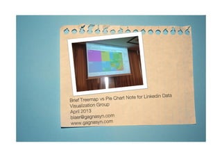
Linkedin treemap vs pie chart note data viz group victor blaer
•
1 like•1,507 views

Report
Share
Report
Share
Download to read offline

Recommended
More Related Content
Featured
Featured (20)
Product Design Trends in 2024 | Teenage Engineerings
Product Design Trends in 2024 | Teenage Engineerings
How Race, Age and Gender Shape Attitudes Towards Mental Health
How Race, Age and Gender Shape Attitudes Towards Mental Health
AI Trends in Creative Operations 2024 by Artwork Flow.pdf
AI Trends in Creative Operations 2024 by Artwork Flow.pdf
Content Methodology: A Best Practices Report (Webinar)
Content Methodology: A Best Practices Report (Webinar)
How to Prepare For a Successful Job Search for 2024
How to Prepare For a Successful Job Search for 2024
Social Media Marketing Trends 2024 // The Global Indie Insights
Social Media Marketing Trends 2024 // The Global Indie Insights
Trends In Paid Search: Navigating The Digital Landscape In 2024
Trends In Paid Search: Navigating The Digital Landscape In 2024
5 Public speaking tips from TED - Visualized summary
5 Public speaking tips from TED - Visualized summary
Google's Just Not That Into You: Understanding Core Updates & Search Intent
Google's Just Not That Into You: Understanding Core Updates & Search Intent
The six step guide to practical project management
The six step guide to practical project management
Beginners Guide to TikTok for Search - Rachel Pearson - We are Tilt __ Bright...
Beginners Guide to TikTok for Search - Rachel Pearson - We are Tilt __ Bright...
Linkedin treemap vs pie chart note data viz group victor blaer
- 3. Easy to colorcode regionscorrespondingto change invalues withinsectors Over50 squares withsize of square correspondingto weight of total andcolor indicatingvalue increase or decrease Try doing that with a pie chart
- 4. Lots of info– yet easy to see relativeproportionto total. Try comparingthe usa blockcompared to the entire treemap/other countries. Brushingand linking allowforeasy drilldownaccess.
- 5. Highlightthe bottom countries whilstkeepingthe total inview
- 6. Drilldown andfiltered uponthe smallercountries
- 7. Color& labelsused to represent different countries
- 8. Colorused to encode value