tutorialsplane
Angular Material Card
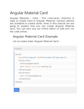
Angular Material – Card : The <md-card> directive is
used to create Card in Angular Material. Various options
are available to create cards. Here in this tutorial we are
going to explain how you can create Angular Material
card. You can also use our online editor to edit and run
the code online.
Angular Material Card Example
Let us create basic Angular Material Card –
If you run the above example it will produce output
something like this –
Following options are available –
 <md-card-header> – Header for the card, holds
avatar, text and squared image
 <md-card-avatar> – Card avatar
 md-user-avatar – Class for user image
 <md-icon> : Icon directive
 <md-card-header-text> :– Contains elements for the
card description
 md-title :– Class for the card title
 md-subhead – Class for the card sub header
 <img>: – Image for the card
 <md-card-title>:- Card content title
 <md-card-title-text>:– Card Title Directive Text.
 md-headline:-Class for the card content title
 md-subhead: – Class for the card content sub header
 <md-card-title-media>: – Squared image within the
title
 md-media-sm :– Class for small image
 md-media-md :– Class for medium image
 md-media-lg: – Class for large image
 <md-card-content>: – Card content
 md-media-xl : – Class for extra large image
Thank You

Angular Material Card | tutorialsplane.com

  • 1.
  • 2.
    Angular Material Card AngularMaterial – Card : The <md-card> directive is used to create Card in Angular Material. Various options are available to create cards. Here in this tutorial we are going to explain how you can create Angular Material card. You can also use our online editor to edit and run the code online. Angular Material Card Example Let us create basic Angular Material Card –
  • 3.
    If you runthe above example it will produce output something like this – Following options are available –  <md-card-header> – Header for the card, holds avatar, text and squared image  <md-card-avatar> – Card avatar  md-user-avatar – Class for user image  <md-icon> : Icon directive  <md-card-header-text> :– Contains elements for the card description  md-title :– Class for the card title  md-subhead – Class for the card sub header
  • 4.
     <img>: –Image for the card  <md-card-title>:- Card content title  <md-card-title-text>:– Card Title Directive Text.  md-headline:-Class for the card content title  md-subhead: – Class for the card content sub header  <md-card-title-media>: – Squared image within the title  md-media-sm :– Class for small image  md-media-md :– Class for medium image  md-media-lg: – Class for large image  <md-card-content>: – Card content  md-media-xl : – Class for extra large image
  • 5.