
Recommended
More Related Content
Similar to Methods of data presentation.pptx
Similar to Methods of data presentation.pptx (20)
Recently uploaded
Recently uploaded (20)
Methods of data presentation.pptx
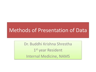
- 1. Methods of Presentation of Data Dr. Buddhi Krishna Shrestha 1st year Resident Internal Medicine, NAMS
- 2. • The main sources for collection of medical statistics are: 1. Experiments 2. Surveys 3. Records.
- 3. The statistical data obtained from the above sources can be divided into two broad categories: 1. Qualitative (or Discrete) Data • No notion of magnitude or size of the characteristic or attribute • Only one variable • Example: attacked, escaped, died, cured etc 2. Quantitative (or Continuous) Data • The quantitative data have a magnitude. • The characteristics is measured either on an interval or on a ratio scale. • There are two variables—the characteristics and the frequency. • Example: Height, weight, blood pressure etc
- 4. Principles of Presentation of Data • Data should be arranged in such a way that it sparks interest in reader • Data should be made sufficiently concise without losing important details • Data should be presented in simple form to enable the reader to form quick impressions and to draw some conclusion, directly or indirectly.
- 5. • Should facilitate further statistical analysis • Should define the problem and suggest its solution
- 6. METHODS OF PRESENTATION • The first step in statistical analysis is to present the data in an easy way to be understood. • There are two main methods of presenting frequencies of a variable character or a variable. 1.Tabulation 2.Drawing
- 7. Rules and guidelines for Tabular Presentation 1. Table must be numbered 2. Brief and self explanatory title must be given to each table 3. The heading of columns and rows must be clear, sufficient, concise and fully defined. 4. The data must be presented according to size of importance, chronologically, alphabetically or geographically 5. If data includes rate or proportion, mention the denominator 6. Figures needing comparison should be placed as close as possible
- 9. Tabulation • Tabulation are devices for presenting data from a mass of statistical data. • Preparation of frequency distribution table is the first requirement. • Can be simple or complex depending upon the number of measurements of single set or multiple sets of items
- 10. Simple table Diseases Cases Hypertension 25000 Diabetes Mellitus 38000 Cancer 2000 Total 65000 Number of Cases of Non Communicable diseases in XYZ Hospital in 2019
- 11. Frequency Distribution Table with Qualitative Data Cases of COVID-19 in adults and children in the months of July and August 2020 in XYZ Hospital
- 12. Frequency Distribution Table with Quantitative Data Systolic Blood Pressure Level in Hypertensive Patients at the diagnosis
- 13. • After classwise or groupwise tabulation, the frequencies of a characteristic can be presented by two kinds of drawings: Graphs and diagrams. • Presentation of quantitative, continuous or measured data is through graphs • Presentation of qualitative, discrete or counted data is through diagrams.
- 14. Presentation of quantitative, continuous or measured data is through graphs. The common graphs in use are: •Histogram •Frequency polygon •Frequency curve •Line chart or graph •Cumulative frequency diagram •Scatter or dot diagram.
- 15. Presentation of qualitative, discrete or counted data is through diagrams. The common diagrams in use are: •Bar diagram •Pie or sector diagram •Pictogram or picture diagram •Map diagram or spot map.
- 16. • Used for Qualitative, Continuous, Variables • It is used to present variables which have no gaps eg. age, weight, height, blood pressure, blood sugar etc. • It consist of a series of blocks • The class intervals are given along horizontal axis and the frequency along the vertical axis Histogram
- 17. Histogram showing tuberculin reaction in 206 persons, never vaccinated
- 18. • Frequency Polygon is an area diagram of frequency distribution over a histogram • It is a linear representation of a frequency table and histogram, obtained by joining the mid points of the histogram blocks • Frequency is plotted at the central point of a group Frequency Polygon
- 19. Frequency polygon showing tuberculin reaction in 206 persons never vaccinated
- 21. • Here the frequency of data in each category represents the sum of data from the category and the preceding categories • Cumulative frequencies are plotted opposite the group limits of the variable • These points are joined by smooth free hand curve to get a cumulative frequency diagram or Ogive Cumulative Frequency Diagram or O'give
- 23. • Also called the correlation diagram, it is useful to represent the relationship between two numeric measurements, each observation being represented by a point corresponding to its value on each axis • In negative correlation, the points will be scattered in downward direction, meaning that the relation between the two studied measurements is controversial i.e. if one measure increases the other decreases. While in positive correlation, the points will be scattered in upward direction. Scatter/ Dot diagram Scatter/ Dot diagram
- 24. Scatter diagram showing positive correlation
- 25. Scatter diagram showing negative correlation
- 26. • It is diagram showing the relationship between two numeric variables ( as the scatter) but the points are joined together to form a line ( either broken line or a smooth curve) • Used to show the trend of events with the passage of time Line Diagram
- 27. Time to achieve maximum antiplatelet effect with 75 mg aspirin/day. It is maximum in first day then declines unless taken next day again
- 28. Bar Diagram • Widely used, easy to prepare tool for comparing categories of mutually exclusive discrete data • Different categories are indicated on one axis and frequency of data in each category on another axis • Length of the bar indicate the magnitude of the frequency of the character to be compared
- 29. • Spacing between various bar should be equal to half of the width of the bar • 3 types of Bar diagram: 1. Simple Multiple 2. Compound Component 3. Proportional
- 31. • Each observation has more than one value, represented by a group of bars • Percentage of males and females in different countries, percentage of deaths from heart diseases in old and young age, mode of delivery ( caserean or vaginal) in different female age groups Multiple Diagram
- 32. Multiple or Compound Diagram
- 33. • Subdivision of a single bar to indicate the composition of the total divided into sections according to their relative proportion • For example two communities are compared in their proportion of energy obtained from various food stuff, each bar represents energy intake by one community,the height of the bar is 100, it is divided horizontally into 3 components ( Protein, Fat and Carbohydrate) of diet, each component is represented by different color or shape Proportional or component bar diagram
- 35. • Consist of a circle whose area represents the total frequency (100%) which is divided into segments • Each segment represents a proportional composition of the total frequency Pie diagram
- 36. Pie diagram showing alcohol drinking status of 391 alcohol drinkingsubjects under medical and ocular history of Bhaktapur (Nepal) vision impairmentand glaucoma study.
- 37. Pictogram or Picture Diagram • It is a popular method to impress the frequency of the occurrence of events to common man such as attacks, deaths, number operated, admitted, discharged, accidents, etc. in a population.
- 38. AIDS in developing and industrially developed countries. The burden of disease caused by HIV infection is clear.
- 39. Map Diagram or Spot Map • These maps are prepared to show geographical distribution of frequencies of characteristic.
- 40. THANK YOU
Editor's Notes
- Nos. 1 and 2 are specially applied to generate data needed for specific purposes while the records provide ready-made data for routine and continuous information.
- In most of the studies, the information is collected in large quantity and the data should be classified and presented in the form of a frequency distribution table as shown in Tables 2.1 and 2.3. This is a very important step in statistical analysis. It groups large number of series or observations of master table and presents the data very concisely, giving all information at a glance. All the frequencies considered together form the frequency distribution