
Recommended
More Related Content
Similar to MIRAE (Branding & Identity) Explained.pdf
Similar to MIRAE (Branding & Identity) Explained.pdf (20)
Recently uploaded
Recently uploaded (20)
MIRAE (Branding & Identity) Explained.pdf
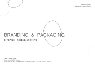
- 1. BRANDING & PACKAGING RESEARCH & DEVELOPMENT Client: Ghazala Ahsan Brand name: MIRAE (future) The brand MIRAE is a brand for skin care products which is for both men and women PROJECT GR3333 A project by UMME AIMON
- 2. 1. PROJECT BRIEF 2. CLIENT PREFERENCE 3. COMPETITORS 4. MOOD BOARDS 5. Logo Design 6. Logo Mark 7. Assets for label 8. Colour Palette 9. Label Design 10. 2D Mock-up TABLE OF CONTENTS
- 3. ABOUT: MIRAE is a skin care brand that provides a line of products for Indian market. The brand will consist of variety of products that will be focused on betterment of the natural skin. The brand will not only focus on targetting women but men as well. Their main focus is to crate a brand for all skin types to find their natural glow with their products. MISSION: Their mission is to create a friendly and homemade skin care product brand for all skin types and for all gender to help them take care of their skin the way it needs to be taken care of. COMPETITORS: OBAGI, elta mD, 111SKIN TARGET AUDIENCE: Gender: All Age: 20-30 Problems: find it hard to get products which suit all skin type. Even though there are brands that claim to have been made with natural, harmless ingredients, they seem to loose the trust of thier customers after being tried out. GOALS: Build brand awareness, create an eco friendly brand, promote caring for ones skin. DESIGN SOLUTION: Soft vibe, inviting, pastel colours, promoting the protective nature of their products for skin, modern and clean take on the branding. BRAND STRATEGY & CREATIVE DIRECTION
- 4. LOGO DESIGN: Since MIRAE is a skin care brand which is targetting women and men, the logo design should be inclusive in all aspect for both the gender to feel comfortable buying. INGREDIENTS: A few of the ingredients that will be common in almost of the products will be aloe vera and rosemarry. COMPETITORS: OBAGI, elta mD, 111SKIN These brand target all the genders but they all seem to be too mdeical driven which does not have much of frangrance. TARGET AUDIENCE: Gender: All Age: 20-30 Since, the target audeince are mainly GEN Z, the brand should look modern yet rooted to it’s ground as the products are handmade and contains natural componenets. GOALS: Build brand awareness, create an eco friendly brand, promote caring for ones skin. DESIGN: Flowy yet bold enough to make a statement type of design, Soft vibe, pastel colours, modern and clean take on the branding. CLIENT PREFERENCE
- 5. Medicinal look to logo design Too much information on the packaging Colour used for the packaging is too strong to suggest it is for all skin type and for men and women COMPETITORS
- 7. Through the market research into the indian skin care brands, following were some points to take note of while creating the branding and identity of MIRAE: 1. Indian colours (bold adn vibrant) are better to use for Indian market since consumers feel related and familiar to the brands 2. Since MIRAE is a brand that is focusing on natural feel, too modern look will not suit it’s identity. 3. Mostly brands that are into no chemical policy make their identity too medicinal which the client does not want for thier brand MIRAE. 4. Usage of natural elements will be preferable for what the brand stands for. RESEARCH ON INDIAN SKIN CARE BRAND
- 8. MOOD BOARDS
- 9. For every gender Natural element used in the logo Ayurvedic vibe Pastel colours Clean & Modern look Illustration used Flowy logo style
- 10. For every gender Soft vibe Natural ingredients used Pastel colours Handwritten type of logo for brand PREFERED MOODBOARD Natural elements used Non typographical logo design
- 11. LOGO DESIGN
- 12. According to the preference of the client, I researched on a few font styles such as Century Gothic, Magesta, Khairaissa, qanoar personal use, that could make a statement just from the brand name. I chose to develop more with the font ‘Magesta’ since the font is stylish which can make the brand logo look modern as this is inspired by chopper font relesed in August 9th 2021. magesta typeface support multilingual languages, unique uppercase and lowercase ligatures. After selecting a few fonts for deciding which one to choose for the brand logo, I typed it out in all types of style.
- 14. The ‘M’ has an element which is designed to showcase the reliablity of the brand as shown in the design and protection for others as shown in the design when the element extends over the letter ‘I’. Each letter is designed in a way that it represents the connected, caring and supportive nature of the brand for customer’s skin as shown by the letters ‘r’, ‘a’,and ‘e’. Since the demand for the brand logo was to look modern yet connected, The logo is designed with the persepective of the targetted customers (GEN Z) and it is designed with the inclusitivity of all genders to find comfort in buying their products. Inspired from Aloevera plant shape, which is one of the common ingredient that is going to be used in the products.
- 15. LOGO MARK
- 16. A logo mark is brand identity and is an image or symbol used to represent a company. I chose to work with elements that i could take out from the brand logo so that the brand identity can be strong enough. Keeping in mind the brand mission, I chose to come up with a design that can represent a brand which provides home made chemical free products targeting men and women.
- 18. Through the brain storming, ideation and market research, there was something missing in the approach I had choosen to go with. Therefore, looking at the brand as a whole, a better approach would be to make it feel chemical free and homemade. I then decided to design the logo mark with different perspective.
- 19. The two joined hands not only represent home made but also represent the genders (men and women). As a whole , the logo mark is designed keeping in mind about what the brand stands for and through market research, design also incorporates a modern and harmless feel to it. The petal is taken from the ‘a’ and ‘e’ of the brand logo which represents final product. This element was also take from the brand name to create connection between the brand logo and logomark. This represents a product being made by hand.
- 21. ASSET FOR THE LABEL
- 23. COLOUR PALETTE
- 24. Through market research and client preference along with making sure the brand stood out, I looked for pastel colours at first but through indian skin care brand research I then then chose to choose the colour scheme from various gender neutral colours.
- 25. Through market research on the indian brands and the colour scheme that customers feel connected to, I chose to work with the following colour palette. The colours below are gender neutral as well as gives a good base to the logomark and the logo for suggesting home made and chemical free brand.
- 26. LABEL DESIGN
- 38. 2D MOCK-UPS