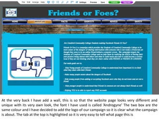
1. At the very back I have add a wall, this is so that the website page looks very different and
unique with its very own look, the font I have used is called ‘Androgyne’ The two box are the
same colour and I have decided to add the logo of our campaign so it is clear what the campaign
is about. The tab at the top is highlighted so it is very easy to tell what page this is
2. After experimenting with my two pages I have come up with the similar design for my second
page, the boxes are quiet different to each other, however I have added images to make this
page look interesting as some people like looking at images rather than just written information.